Download
1 / 4
40 likes | 194 Vues
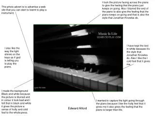
I took the picture facing across the piano to give the feeling that the piano just keeps on going. Also I blurred the end of the piano to also give the feeling that the piano keeps on going and that is also the style that Jonathan Knowles do.

E N D
I took the picture facing across the piano to give the feeling that the piano just keeps on going. Also I blurred the end of the piano to also give the feeling that the piano keeps on going and that is also the style that Jonathan Knowles do. This photo advert is to advertise a web site that you can start to learnt to play a instrument. I have kept the text in white because it’s the style that Jonathan Knowles do. Also I like the t cold feel that it gives me. I also like the way the light shines on the keys as if god is telling you to play the piano. I made the background Black and white because the picture is blurred and in colour it look bad and I felt that in black and white it gives the picture a sense of holly and cold feel to the whole piece. I wanted to capture the light going through the piano because I like the holly feel that it gives me it also gives the feeling that the piano is larger than life. Edward Alford
I put the Marshall logo in bright yellow so that it stands out and I did that because if you play a instrument through a loud amp you stand out and this picture is all about being loud and standing out. The whole idea of having the picture of the Marshall amp is the picture is called Live Loud and what better way of living loud with a big Marshall amp. I've kept the white text to kept the picture in the Jonathan Knowles style. I have put the controls in green because they are the controls that can make the amp loud so this is the most important part of the picture. Also the reason for putting the Marshall logo in yellow is to give the feeling god has come from the sky and told you to turn the amp up so I wanted to bring the holy feel to the photo. I still make the background dark because I like the dark atmosphere of the picture and I like the holly feel to the picture. Edward Alford
All the things that I have coloured like the strings and the controls is all the things that I touch when I’m playing the guitar so it was meant to give the effect of were my fingers has been. This picture is all about standing out and being different. I have kept the text white again so that it keeps the Jonathan Knowles style to the picture. The other good thing about me colouring the guitar parts in is that it stays with the Jonathan Knowles style because in the Guinness advert the bottle stand out and in this picture the main thing on the guitar stands out to. I kept the black and white background to give the guitar a old feel and that is to say that music will never end music will never leave us. And it gives a holly feel to the picture which is like Jonathan Knowles pictures. Edward Alford
This picture is all about being loud and standing out . Drums are really loud and I have put the bars bright so that it stands out really well. I wanted a dark picture so then I can make parts of the picture stand out and also give the picture a holly feel. I have kept the white text because it is in the same style as Jonathan Knowles. I took this picture because I like how it captures the light down the middle of the drum kit which adds a Holly feel to the picture which also Jonathan Knowles does in the Guinness advert picture. The parts that I have brightened is the important part of the drum kit its how the drum kit stays together. Edward Alford