Download
1 / 8
80 likes | 389 Vues
Types of Charts. 6 Common types of charts. Column Chart Stacked Bar Chart Line Chart. XY Scatter Chart Pie Chart Exploded Pie Chart. Column Chart. Column Chart - used to make comparisons and generalizations about groups of data. Column Chart is a series of vertical chart

E N D
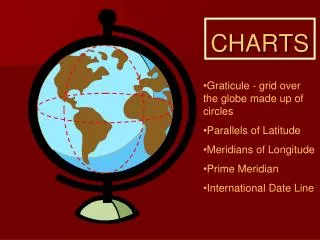
6 Common types of charts • Column Chart • Stacked Bar Chart • Line Chart • XY Scatter Chart • Pie Chart • Exploded Pie Chart 4.02 Understand charts/graphs used in business.
Column Chart • Column Chart - used to make comparisons and generalizations about groups of data. • Column Chartis a series of verticalchart columns, each representative of a data series. 4.02 Understand charts/graphs used in business.
Stacked Bar Chart • Stacked Bar Chart - used to represent the sum of more than one value and compare the contribution of individuals to the whole. • such as, to compare the total sales for three components/departments to the whole sales for a store. • Baror Stacked Bar Chart- series of horizontal bars, each representative of a data series. • Each bar is divided into two or more parts • The length of the stacked bar represents a total. 4.02 Understand charts/graphs used in business.
Line Chart • Line Chart is used to show trends or changes in data over time. • such as, growth in sales over several quarters. • Line Chart is a series of data points connected by horizontal lines, each representing a series of data. 4.02 Understand charts/graphs used in business.
XY Scatter • XY Scatter Chart - used to indicate the correlation of two or more sets of data. • correlation between stress rates and wait time in a doctor’s office. • correlation between pulse rates and wait time in the principal’s office. • Businessexample of an XY Chart is one that represents the effect (if any) of caffeine on worker productivity. 4.02 Understand charts/graphs used in business.
Pie Chart • Pie Chart-used to represent only one series of data. • Represents Part of a Whole • Shows the contribution of each componentof one series of data to the whole. • What is the percentage of each part to the whole?” 4.02 Understand charts/graphs used in business.
Exploded Pie Chart • Exploded Pie Chartis a pie chart in which the individual components are enhanced. • Used to emphasize one or more portions of the data (one piece of the pie is enhanced). 4.02 Understand charts/graphs used in business.