Download
1 / 14
150 likes | 318 Vues
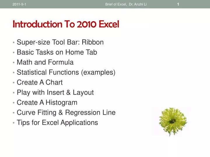
Introduction To 2010 Excel. Super-size Tool Bar: Ribbon Basic Tasks on Home Tab Math and Formula Statistical Functions (examples) Create A Chart Play with Insert & Layout Create A Histogram Curve Fitting & Regression Line Tips for Excel Applications. Supersize Toolbar: Ribbon.

E N D
Brief of Excel, Dr. Anzhi Li Introduction To 2010 Excel • Super-size Tool Bar: Ribbon • Basic Tasks on Home Tab • Math and Formula • Statistical Functions (examples) • Create A Chart • Play with Insert & Layout • Create A Histogram • Curve Fitting & Regression Line • Tips for Excel Applications
Brief of Excel, Dr. Anzhi Li Supersize Toolbar: Ribbon • The Ribbon is designed to help you quickly find the commands to complete a task • Commands are organized in logical groups under tabs. Each tab relates to a type of activity • For example: the principle tabs are: ◙File ◙Home ◙Insert ◙Page layout ◙Formula ◙Data
Brief of Excel, Dr. Anzhi Li Basic Tasks Under Home Tab ◙ Copy & Paste ◙ Style ◙ Font ◙ Insert (cell, row), cell format ◙ Alignment ◙ Editing ◙ Number
Brief of Excel, Dr. Anzhi Li Math & Formula ♫ Do math under any tab ♫ Click the cell (B32) where put the result mean, and next to fxtype: average(B2:B31) ♫ (B2:B31) is define the data range ♫ Equal sign “=“ always before a formula ♫ You can define a formula yourself ♫ Find a function under Formula tab ♫ Find functions library: Formula ▬▬▬ more functions ▬▬▬ Statistical ▬▬▬ function list
Brief of Excel, Dr. Anzhi Li Statistical Functions (Exampes) • MEDIAN median(a2:a55) • MEAN average(a2:a55) • FIRST QUARTILE quartile(a2:a55, 1) • THIRD QUARTILE quartile(a2:A55, 3) • STANDARD DEVIATIONstdev(b2:b43) • MINIMUM min(a2:a67) • MAXIMUM max(a2:a67) • SUM sum(b2:b43) • CORRELATION COEFFICIENTcorrel(b2:b105,c2:c105)
Brief of Excel, Dr. Anzhi Li Create A Chart/Plot ♫ Highlight the data for plotting ♫ Click Insert tab, showing different plots available: ◙ column ◙ bar ◙ line ◙ scatter ◙ pie ♫ Select bar plot for example ♫After chart is inserted, more commands show up under Chart Tool ♫ Click inside chart – chart tool appear click outside chart – chart tool gone ♫ Chart tool - Layout tab – sub commands ◙ chart title ◙ axis title ◙ axes ◙ plot area ◙ gridlines ♫ Using above sub-commends to complete a plot
Brief of Excel, Dr. Anzhi Li Play With Insert Tab • Highlight data • Click “Insert” • Select a chart to present data
Brief of Excel, Dr. Anzhi Li Play With Chart Tool - Layout ♫Make Chart tool available (keep cursor inside chart) ♫Select layout under Chart tool ♫Sub-commands show up to fill detail of the chart
Brief of Excel, Dr. Anzhi Li Play With Sub-command Sub-command example: ◘Axis Title ◘ Plot Area To add a axis title ◙ Insert ▬ Chart Tools ▬ Layout ▬ Axis Titles ▬ Horizontal Axis Title ▬ Title Below Axis To manage plot area ◙ Insert ▬ Chart Tools ▬ Layout ▬ Plot Area ▬ Plot Area Options : Fill: No fill Solid fill Gradient
Brief of Excel, Dr. Anzhi Li Create A Histogram: Install Analysis Toolpak ◙ In Excel 2010, click File tab then Options ◙ In Options sub-window, locate and click “Add-Ins” ◙ In the Manage list (bottom), select “Excel Add-ins, and then click Go ◙ In the Add-Ins dialog box, select the Analysis Toolpakcheck box, then click OK ◙ Under Data tab, click Data Analysis and highlight the Histogram tool, click OK
Brief of Excel, Dr. Anzhi Li Create A Histogram: Using Histogram Tool ♫We have data shown right: ◙ 1th col: data ◙ 2th col: bin range ♫In the Histogram window ◙ Input Range box: type D1:D36 ◙ Bin Range box: type E1:E6 ◙ Under Output Options, click New Worksheet Ply: ◙ Select Chart Output check box Click OK ♫A new Histogram table and a histogram chart are created
Brief of Excel, Dr. Anzhi Li Create A Histogram Chart • A Histogram table (a new workbook) is generated • A histogram chart is created • To adjust the gap between columns • Click any column, right click and select “format data series” , change the gap between 0-100% • You can adjust the gap 0-10%, or as you like.
Brief of Excel, Dr. Anzhi Li Curve Fitting & Regression Line • Draw a scatter plot without line • Do regression line Insert ▬ Chart Tools ▬ Layout ▬ Trendline▬ Trendline options & select: ◙ Linear ◙ Display Equation on chart ◙ display R-squared value on chart
Brief of Excel, Dr. Anzhi Li Tips For Excel Applications Get help from Excel click the question mark located the most left corner Quick access tool bar: located the most right corner (open, save, undo, …) Printing ♫ if highlight the plot, only print the plot ♫ without highlight, print data & plots