Download
1 / 4
40 likes | 122 Vues
Responsive Web design is the approach that suggests that the design and development should respond to the user’s behavior and environment based on screen size, platform and orientation. This practice or the method involves the use of a combination of flexible grids, images and layouts. Also there is an intelligent use of CSS media queries.

E N D
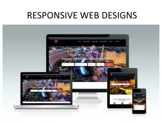
Responsive Web Designs Almost every entrepreneur wants to have mobile versions of their ecommerce websites or their respective ERP Solutions. The advantages are: The managers or the sales team or the store/despatch team would be able to cater to their different customer orders on-time and every time And this should be possible when they are on-the-move. The management and the teams would need to have different dashboards and real-time stock data, which will help them in managing different processes. We cannot undergo the consequences of losing visitors using one device or even take the advantage of gaining visitors from other web sites. It is very important and essential to have a different designs for iPad, another one for an iPhone and for BlackBerry or for the netbooks. All their screen resolutions must be compatible on the respective devices. In the field of Web designing and software development, it has come to a point where we are unable to keep up with the boundless new resolutions on various devices. And it is cumbersome and almost impossible to create separate website/software versions for each resolution of the new devices.
Responsive Web design is the approach that suggests that the design and development should respond to the user’s behaviour and environment based on screen size, platform and orientation. This practice or the method involves the use of a combination of flexible grids, images and layouts. Also there is an intelligent use of CSS media queries. As the user’s switches from laptop/desktop to their iPads, the website or the application should automatically switch to accommodate to the resolution of the devices. The images should automatically resize and should give different scripting abilities. In other words, the website should have the technology to automatically respond to the user’s preferences. This quick and effective solution would eliminate the need for a different design and development, for each new gadgets in the market. This 'Responsive Web design' is a design approach, aimed at having applications on the web using Responsive Web design (RWD) and asp.net MVC platform which helps in: Crafting sites to provide an optimal viewing experience. This makes panning and scrolling across a wide range of devices (from mobile phones to desktop computer monitors). Easy reading and navigation with a minimum of resizing A site which is designed by FactsRWD has the capability to be adaptive to the particular viewing environment. This is possible by using fluid / proportion based constructed grids with stretchable images & CSS3. This fluid grid concept calls for some page elements to change its dimensions to relative units like fractions. Instead of complete entities like points/pixels and this helps to avoid the display of the contents outside the covering border. The images are flexibly resized to relative/comparative units. This is specifically done so that the images do not get displayed outside their specific contained elements. We can take advantage of cloud data storage and hence eliminate the hardware costs.