Download
1 / 23
240 likes | 398 Vues
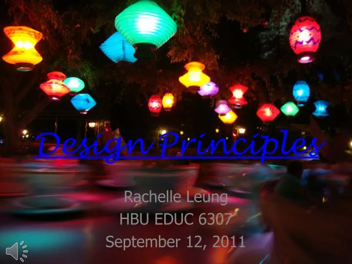
Design Principles. Rachelle Leung HBU EDUC 6307 September 12, 2011. The 5 Design Principles. Contrast Proximity Unity Repetition Balance. Contrast.

E N D
Design Principles Rachelle Leung HBU EDUC 6307 September 12, 2011
The 5 Design Principles ContrastProximity Unity RepetitionBalance
Contrast • The design principle of contrast is emphasizing of the differences between elements, usually done to highlight the more important elements. Contrast can be done through color, size, shape, font, and even links (underlined and a different color from the rest of the text). • This picture is a good example of contrast because it uses different colors to emphasis the text. • Other examples of good contrast are...Ex. 1Ex. 2Ex. 3
Contrast 1 • This is a good example contrast because of the different colors of the kittens, as well as their soft fur against the hard floor and wall and door. • Go to Example 2
Contrast 2 • This is a good example contrast because the pink and red color of the fan draws attention to the subject of the picture, while the rest of the objects are green or brown colored. • Go to Example 3
Contrast 3 • This is a good example contrast becausethe white cup has black designs, while the black cup has white designs. • Go back to the Design Principles Menu
Proximity • The design principle of proximity or closeness isusing the relative location of elements (how close together or far apart they are) to suggest a relationship (or lack of) between these elements. • This picture is a good example of proximity because the titles are close together and linked, while the small circles (which could represent details) are grouped together. • Other examples of good proximity are... Ex. 1Ex. 2Ex. 3
Proximity 1 • This is a good example proximity becausethe main dishes are grouped together in the center, while the appetizer fruits are on the edges. • Go to Example 2
Proximity 2 • This is a good example proximity becausethe trees are at the top, the people are clumped in the middle, and the road and fallen leaves are at the bottom. • Go to Example 3
Proximity 3 • This is a good example proximity because the stanzas of the poem are grouped together, instead of one line after another. • Go back to the Design Principles Menu
Unity • The design principle of unity is creating a bond between elements on a page by using a third element to connect distant parts. • The 1st picture is not a good example of unity, but by adding a road in the 2nd picture it now has unity between the two buildings. • Other examples of good unity are... Ex. 1Ex. 2Ex. 3
Unity 1 • This is a good example unity because the people form a line connecting the light green algae with the dark green trees. • Go to Example 2
Unity 2 • This is a good example unity because the rows of arches and columns connect the end of the hall with the person in the center of the photo. • Go to Example 3
Unity 3 • This is a good example unity becausethe bridge connects the river to the people walking in the corner of the picture. • Go back to the Design Principles Menu
Repetition • The design principle of repetition or consistency is repeating design elements and consistently using styles and locations to help visitors navigate your document or website. • This picture is a good example of repetition becauseboth titles are the same font, and the details are the same shape and location (along the sides). • Other examples of good repetition are... Ex. 1Ex. 2Ex. 3
Repetition 1 • This is a good example repetition because the zodiac animals all have the same circular shape symbol, and the year numbers have the same font. • Go to Example 2
Repetition 2 • This is a good example repetition becausethe consistent alternations of tall and short people make it easy to find the males and females in this picture. • Go to Example 3
Repetition 3 • This is a good example repetition becausethe multiple bicycles are gathered together on a left, similar to how a webpage could have a navigation menu consistently on the left. • Go back to the Design Principles Menu
Balance • The design principle of balance is arranging elements on the page so that no one section is heavier than the other. Conversely, elements may be intentionally out of balance to create tension. • This picture is a good example of balance becausethe text is weighted to the left but there are more circles on the right to balance it out. • Other examples of good balance are... Ex. 1Ex. 2Ex. 3
Balance 1 • This is a good example balance because the light in the sky is balanced by the light reflected in the river. Also, the brighter smaller top portion is balanced by the darker bigger bottom portion. • Go to Example 2
Balance 2 • This is a good example balance becausethe whale and the person are curving towards each other. Also, the large whale is balanced by the large sky, and the small person is balanced by the ground (which is small relative to the sky). • Go to Example 3
Balance 3 • This is a good example balance because the tree branches and light blue sky are balanced by the deep blue river below. • Go back to the Design Principles Menu
Resources: The definitions and all black-and-white (or grey-scale) images were taken from: • http://desktoppub.about.com/od/designprinciples/tp/Principles_of_Design.htm • http://webdesign.about.com/od/webdesignbasics/p/aacontrast.htm • http://www.johnlovett.com/test.htm All other images were photographed by Rachelle Leung and her friends and family