Download
1 / 19
190 likes | 336 Vues
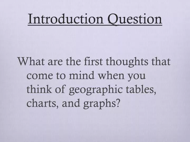
Introduction Question. What are the first thoughts that come to mind when you think of geographic tables, charts, and graphs?. Tables, Charts, and Graphs. Tables. Purpose of a table. Present data in an organized fashion

E N D
Introduction Question What are the first thoughts that come to mind when you think of geographic tables, charts, and graphs?
Tables • Purpose of a table • Present data in an organized fashion • Can display numerical data, or categorical data (ex. types of sports, or something being present or not present) Attendance for 10/13/13 Canada Provinces, Population, & Climate Zones
Tables • How to read a table. • What do you notice about this table? • There is a title, the data matches • What is the population of Ontario? • 13,505,000 million people • What are the climate zones of Nunavut • Tundra & Subarctic Canada Provinces, Population, & Climate Zones
Tables • How to create a table. • Determine the information needed and the number of columns for the data needed • Draw a table and label each of the rows and columns • Enter the data into the correct box • Title the table Canada Provinces Population & Climate Zones Quebec 8,054,800 Humid continental & Subarctic Ontario 13,505,900 Humid continental & Subarctic Nunavut 33,700 Tundra & Subarctic
Line Graphs • Purpose of this type of graph • Compare two variables, like population and time. • Show specific values and trends in data (example: increases and decreases) so you can make predictions • Display changes in direction or represent data over time (data measured in time intervals)
Line Graphs Ice Cream Cone Sales in Portland • How to read this type of graph • What does this graph say? • Displays the ice cream sales in Portland by thousands between June - December • 2 variables are the numbers of cones sold and the month • What do you notice about the graph? • There is a title, scale (the numbers), and key • Ice cream sales drop in December and are highest in August Number sold (Thousands)
Line Graphs • How to create this type of graph • Find data and decide two variables • Put variables on axis, label them, and determine the scale • Place points and connect the dots with a line • Title the graph USA Population Population (millions) Years
Pie Chart • Purpose of this type of chart • Compares how part of something relates to the whole • Often used with percentages (ex. Ethnicity of students)
Pie Chart • What do you notice? • There is a title, there is a key, it is discussing student ethnicity • The pie adds up to 100% • Which ethnicity is the largest? • Caucasian • Which ethnicity is the smallest? • Other • How to read this type of chart 65 + 20 + 12 + 3 = 100
Pie Chart • How to create this type of chart • Find data and decide the variables • Make a circle, and break up the pie based on the data • Label the “pieces of the pie” • Title the graph
Bar Graphs • Purpose of this type of graph • Bar graphs are used to present and compare data, and to make quick generalizations • Compare data in a simple format consisting of rectangular bars, differ in height based on value • Excellent way to show results that are one time, that aren't continuous (favorite after school activity or Ethnicity of a population)
Bar Graphs • How to read this type of graph • What do you see? • The title, a scale, a key • The graph is on music preferences by high school grade • Do you see any trends? • The most popular seems to be Hip Hop/Rap and Techno
Bar Graphs • How to create this type of graph • Find data and determine the variables • Put variables on axis, label them, determine scale and key • Make the bars • Title the graph US Female Ethnicity by Age, 2002 Percent of females
https://www.cia.gov/index.html Library- The World Factbook http://online.culturegrams.com -username: OregonCity (no spaces) -password: Pioneers
Exit Assignment (before you leave today!!!) • Please shut down your computers correctly and take out the answer to the Introduction Question. • Look back at your response to the Introduction Question. Now that you know how to create and read these types of tables, charts, and graphs, have your thoughts changed? Why, or why not? • Tell me how you read a pie graph. • Once you are done, hand in your computer and the sheet of paper.