Download
1 / 14
140 likes | 280 Vues
Displaying Data. Quantitative vs. Qualitative Data. Classifying Features. Qualitative. Quantitative. Qualitative Symbology. Different features get different symbols or colors, it is not dependent on a quantitative (numerical) value. Limit to 10 unique values (i.e. colors) generally.

E N D
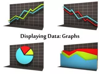
Displaying Data Quantitative vs. Qualitative Data
Classifying Features Qualitative Quantitative
Qualitative Symbology • Different features get different symbols or colors, it is not dependent on a quantitative (numerical) value. Limit to 10 unique values (i.e. colors) generally. Same symbol Unique symbol (value)
Quantitative Symbology Uses values, or quantities, contained in numeric attribute fields Graduated colors: The color varies with the numeric attribute value, Usually the darker the color the higher the value. Limit the number to 6 shades of one color.
Quantitative Symbology • Graduated Symbols The symbol size varies with the attribute value. Usually the larger the symbol the greater the value. This shows relative values, not absolute values.
Quantitative Symbology • Proportional symbols Symbols vary in size to show exact values.
Normalizing Data • Quantitative symbology can be normalized based upon the attributes of another field. Sales per state normalized by population Population normalized by area
Displaying multiple attributes • Symbolize features based on more than one attribute. • Street type and traffic volume. • Parcel land use and value. This is difficult to do effectively.
Quantitative Symbology • Dot Density Good for showing areas of low and high concentrations. Can only use for values associated with polygon features.
Classification places attribute values into groups • Natural breaks (default) – the gaps in the data are identified and the intervals are assigned accordingly. Shows clusters or concentrations of values. • Equal interval – range of values is equal within each class (61-70, 71-80, 81-90, etc.) Bands of temperature. • Quantile – the number of features with in each class are the same (top 25%)
Classification places attribute values into groups • Standard Deviation- the range of values with each class is based on the standard deviation of the data. Shows the amount the attribute value varies from the mean. (e.g. crops - which areas perform better than average? which perform worse than average?) • Manual – defined by the user.