Download
1 / 30
300 likes | 307 Vues
Statistics for Business Part 1. Collection, Processing and Presentation of Data Sources of data Data collection methods Processing of data Presentation of data: Graphs and Tables. Sources of data. Researching problems usually requires data .

E N D
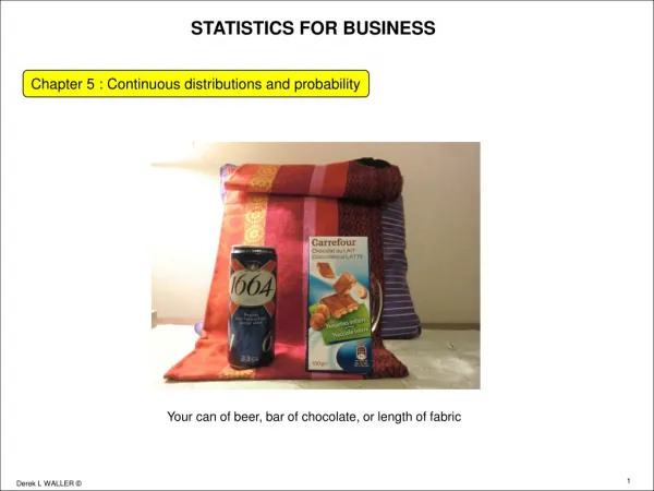
Statistics for Business Part 1
Collection, Processing and Presentation of Data • Sources of data • Data collection methods • Processing of data • Presentation of data: Graphs and Tables
Sources of data Researching problems usually requires data. • Data on these research problems may be found in published articles, journals, and magazines (Secondary data). • If published data is not available on a given subject. In such cases, information have to be collected (Primary data). • There are different methods of collecting data.
Sources of data (Cont….) Primary dataare originated by a researcher for the specific purpose of addressing the research problem at hand. It is expensive and time consuming. Secondary dataare data that have already been collected for purposes other than the research problem at hand. It is inexpensive and fast. Example: Price of rice in Dhaka city market. Researcher may collect data from the retailers directly the data obtained this way is primary data. He/She may use data published in different daily news papers, then it will be secondary data.
Data collection methods (Primary data) • Data collection instruments (Questionnaire/ Schedule): Questionnaire or Schedule is formalized set of questions for obtaining information from respondents: • Both Questionnaire and Schedule serve the same purpose, the only difference is that Questionnaires are filled by the respondent and the Schedules are filled by the interviewer. • Observation • Personal interview • Telephone Conversation • Mailing • Combination
Processing of data • Checking • Editing • Coding • Data entry • Cleaning • Ready for analysis
Data Presentation (Frequency Distribution) Frequency distribution: A grouping of data into categories showing the number of observations in each mutually exclusive category. Goal is to establish a table that will quickly reveal the underlying shape of the data
Data Presentation (Frequency Distribution) Example: Annual sell volume (in Lac TK.) of 50 companies are given following: 38.70, 42.93, 41.07, 45.66, 48.16, 15.27, 43.15, 54.88, 19.98, 33.64, 49.94, 55.45, 39.58, 47.58, 41.94, 34.39, 30.34, 36.81, 20.56, 47.33, 11.92, 14.95, 37.36, 17.67, 18.29, 12.24, 45.74, 19.39, 30.85, 23.45, 48.51, 12.45, 54.29, 57.61, 15.40, 44.10, 33.55, 32.56, 21.42, 22.12, 20.32, 45.38, 34.21, 44.84, 19.71, 15.04, 38.91, 21.59, 48.51, 28.09 (n=50) Present the data in a frequency distribution.
Example : Frequency Distribution Table: Frequency Distribution of yearly Sell volume Class Interval Tallies Frequency 10 to 20 |||| |||| 9 20 to 30 |||| |||| 10 30 to 40 |||| |||| | 11 40 to 50 |||| |||| |||| 15 50 to 60 |||| 5 Total 50 • Sell volume ranged from about Tk.10 lacs to TK. 60 lacs • Sell volume of about 30% companies are in the range 40 to 50 lacs • Only five companies sell more than 50 lacs in a year
Frequency Distribution • Disadvantages • We cannot pinpoint the exact sell volume • Minimum sell volume was TK. 11.92 lac • Maximum sell volume was TK. 57.61 lac • Advantage • Consider the data into a more understandable form
Frequency Distribution Class mark (midpoint): A point that divides a class into two equal parts. This is the average between the upper and lower class limits. Class Midpoint = (Lower Limit + Upper Limit)/2 Class interval: For a frequency distribution having classes of the same size, the class interval is the difference between upper and lower limits of a class. Class Interval = Upper Limit − Lower Limit
Construction of Frequency Distributions • The class interval used in the frequency distribution should be equal • Sometime unequal class intervals are necessary to avoid a large number of empty or almost empty classes • Too many classes or too few classes might not reveal the basic shape of the data • Use your professional judgment to select the number of classes
Construction of Frequency Distributions Expected number of classes can be calculated using the formula: k=1 + 3.322 × log10 n Calculation of Class Interval if number of classes is known The suggested class interval is: (highest value-lowest value)/number of classes. Hence the class interval is: (highest value-lowest value)/k. Consider a suitable rounded value as number of class and class interval
Construction of Frequency Distributions • Prepare a table with three column headings: class interval, Tally marks and Frequency. Class interval Tally Frequency • Write down the class intervals for the data set under class interval column • Read off the data values and put a tally under tally mark column in front of the appropriate class interval • Count the tally marks and put the figure under frequency column • Your frequency table is prepared
Construction of Frequency Distributions Exercise: The dean of the school of business wishes to know the time spent (hours in a week) by the business school students for study purpose. He collects the information from a random sample of 30 students: 15.0, 23.7, 19.7, 15.4, 18.3, 23.0, 14.2, 20.8, 13.5, 20.7, 17.4, 18.6, 12.9, 20.3, 13.7, 21.4, 18.3, 29.8, 17.1, 18.9, 10.3, 26.1, 15.7, 14.0, 17.8, 33.8, 23.2, 12.9, 27.1, 16.6. Present the data into a frequency distribution.
Construction of Frequency Distributions Relative frequency distribution Relative frequency of any class = (Frequency of that class/total number of observations) • Cumulative frequency Distribution Less than type Greater than type Cumulative frequency of a class = sum of frequency up to that class.
EXAMPLE: The director of the undergraduate program of a University has 16 applications for admission. The students scores in admission test are : 27, 27, 27, 28, 27, 25, 25, 28, 26, 28, 26, 28, 31, 30, 26, and 26 (a) How many classes would you recommend? (b) What class interval would you suggest? (c) What lower limit would you recommend for the first class? (d) Organize the scores into frequency distribution and determine the relative frequency distribution. (e) Determine cumulative frequency distribution (f) Comment on the shape of the distribution.
Stem-and-Leaf Displays • A statistical technique for displaying data • Each numerical value is divided into two parts: stem and leaf • Stem is the leading digit of the value • Leaf is the trailing digit of the value Number Stem Leaf 9 0 9 16 1 6 108 10 8 Note:An advantage of the stem-and-leaf display over a frequency distribution is: we do not lose the identity of each observation.
Stem-and-Leaf Displays EXAMPLE: Colin achieved the following scores on his twelve accounting quizzes this semester: 86, 79, 92, 84, 69, 88, 91, 83, 96, 78, 82, 85. Construct a stem-and-leaf chart for the data.
Stem-and-Leaf Displays Example: Represent the data in a stem and leaf display 96, 93, 88, 117, 127, 95, 108, 94, 148, 156, 139, 142, 94, 107, 125, 155, 155, 103, 112, 127, 117, 120, 112, 135, 132, 111, 125, 104, 106, 139, 134, 119, 97, and 89 Stem Leaf 8 89 9 344567 10 34678 11 122779 12 05577 13 24599 14 28 15 556
Graphic Presentation The commonly used graphic forms are Bar Diagram, Histograms, Frequency polygon, and a cumulative frequency curve (ogive). Histogram: A graph in which the classes are marked on the horizontal axis and the class frequencies on the vertical axis. The class frequencies are represented by the heights of the bars (equal class interval) and the bars are drawn adjacent to each other.
Graphical presentation Bar Chart:A graph in which the categories are marked on X-axis the frequencies on the Y-axis. The class frequencies are represented by the heights of the bars, usually there are gaps between two bars. A bar chart is usually preferable for representing nominal or ordinal i.e. to represent qualitative data. EXAMPLE: Construct a bar chart for the number of unemployed people per 100,000 population for selected six cities of USA in 1995.
Graphic Presentation • A frequency polygon consists of line segments connecting the points formed by plotting the midpoint and the class frequency for each class and than joined with X-axis at lower limit of first class and upper limit of last class. • A cumulative frequency curve (ogive) is a smooth curve obtained by joining the points formed by plotting upper limit (less than type) or lower limit (more than type) of and the cumulative frequency of each class. It is used to determine how many or what proportion of the data values are below or above a certain value.
Cumulative Frequency Curve (less than) Cumulative
Graphical Presentation (Pie Chart) • A pie chart is especially useful when there are many classes and class frequency is highly fluctuating. It displays a relative frequency distribution. A circle is divided proportionally to the relative frequency and portions of the circle are allocated for the different groups.
Graphical Presentation (Pie Chart) • EXAMPLE: A sample of 200 runners were asked to indicate their favorite type of running shoe. Draw a pie chart based on the information obtained.