Download
1 / 17
170 likes | 183 Vues
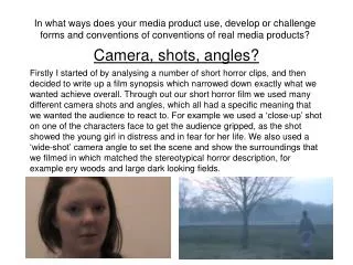
Camera Angles. In what ways does your media product use, develop or challenge forms and conventions of real media products?.

E N D
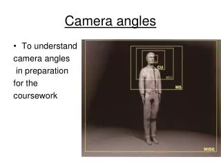
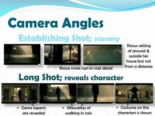
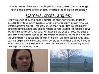
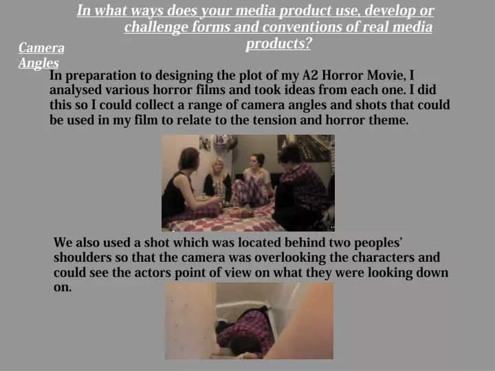
Camera Angles In what ways does your media product use, develop or challenge forms and conventions of real media products? In preparation to designing the plot of my A2 Horror Movie, I analysed various horror films and took ideas from each one. I did this so I could collect a range of camera angles and shots that could be used in my film to relate to the tension and horror theme. We also used a shot which was located behind two peoples’ shoulders so that the camera was overlooking the characters and could see the actors point of view on what they were looking down on.
Camera Angles, Shots Continued… To create a tense moment during the film we used a typical diegetic scream for help which was then followed by this shot of the girls eyes that quickly moved to focus on the door where the sound was coming from. This adds effect as you can see the worry and scare in her eyes. Other shots that were used in Back Stabber; Long shots, Extreme close-ups, Close-up side shots, Mid Close-up
Sound, Music and Editing When carrying out my research I looked into sound effects and music that are used in similar horror films. We decided to take the ring tone from the thriller ‘One Missed Called’ as we thought it related to our film as it was quite edgy and tense. We used it at the start of the film and over the end credits. We also had the killer introduce the film with a voice over, explaining previous events and her inside feelings of what has happened and her plans. We merged the One Missed Call music and the voice over together at the end of her speech and it went straight into the opening scene of the teenage girls. This gave the audience instant tension. The use of diegetic sound was used as in the opening scene we have music being played in the background but in the room as it creates the scene and makes it realistic. HYPERLINK OFONE MISSEDC CALL MUSIC OF YOUTUBE
Sound, Music and Editing Continued… In our film we included a prank call which was brought in to create tension and related to the teenagers as joking around. By including this we relied on the phones ring tone to grab attention as it was a simple repetitive ring which gets louder and louder. At one point in the film we included a sound effect from iMovie. We placed this after one of the characters screams as she turns around to notice the killer. The sound used was an eerie noise that brought effectiveness to it as the camera cuts to black and to silence, as it signifies that the girl gets killed.
Editing Continued… Throughout our film we used many forms of editing to create the effect of the horror genre. For example we used a few blurry effects that merge scenes together, however they did relate to each scene, for example the camera cuts from the two girls separating from each other to find help, to one of them walking off alone and vulnerable into a dark and misty field. The blurry effect going into this clip showed that she was deserted and being watched. Also the outdoor scenes where one of the characters is being chased and killed the lighting is grey and dull as something bad is about to happen, we used the lighting effect to dull it out. However, at the end when to remaining two girls find each other and appear to celebrate their friends death by the line ‘Its done, she’s gone!’ the lighting is brighter, this shows that they could be happy about it.
Mise-En-Scene One of the mise-en-scene that we used in Back Stabber that stood out was the signifier of a knife covered in blood. This shows that this is the weapon that has been used throughout to kill off each character. This is the same signifier used in the sequel of Scream. Other mise-en-scene that was important to use was the sweets, junk food and magazines that were used in the opening bedroom scene. These created the typical teenage girl sleepover setting.
Intertextuality When carrying out our research into other horror films, we specifically looked at the sequel of Scream, we took the main signifier from this film and used it in ours; the close up image of a knife covered in blood. This is an intertextual semiotic code. This was used in our film and on the cover of our poster as it is what relates to our film the most. Another film in which we took ideas from was Sorority Row. We used this as it contains a group of teenage girls who’s prank goes completely wrong. As we use a joke prank call in this and four teenage girls we thought this film was perfect to extract ideas from.
How effective is the combination of your main product and ancillary texts? This is my poster for my film Back Stabber. We decided to set the characters out in a line but with the two killers at the front with their backs slightly turned in as they are the secretive back stabbers towards the other girls. The remaining two characters are stood at each end with their backs turned in. The expressions on their faces show fear which relates to their feelings in the film. We used four colours to create colour cohesion as it makes it stand out; grey, red, white and black all work together and give of the horror image with the red relating to blood and gore. We used Photoshop to edit this photo into black and white but left the blood on the knives remain red to draw the audience in. We also edited the background out so that it is just the characters on the page and nothing else but the figures and bold writing. POSTER
I decided to have my double page spread article as in interview with T4 magazine and the four main characters on Back Stabber. I decided to ask questions which gave a deeper insight to the film. I made this on In Design and spread the text out in three columns. I also picked two colours to have the article text so that the audience can clearly read who is the interviewer and which actor is speaking. The colours I used were red and black. I included screen shots of different parts of the film to show the progression of betrayal throughout. The title of the article is ‘BACK STABBER’ which immediately draws the audience in and titles the page so people know it is about that film. ARTICLE
Text & Font In both the article and on the poster I used ‘times new roman’ font as I thought it was simple and professional. Also I decided to use two bold colours, red and black to create colour cohesion it also works well as With clear use of different colours to signify a question and answer format The two colours I picked relate to the film as it is a gory horror film so therefore the black relates to the darkness of the murder’s inside thoughts and the red can relate to the blood on the signifier knife. On the article I decided to have the title of Back Stabber in a bold and large font so it stands out from the whole page as that is what the topic on the interview is on; a new horror film.
What have you learned from your audience feedback? From the feedback we received for our film we found that there was a clear build up of tension and events, there is also an excellent use of disequilibrium. Some of the audience also said they liked the hand held camera work and over the shoulder/POV shots. From the feedback the reoccurring genre that people would says this film fits is ‘teen horror' which is exactly what we were trying to get across. After looking at our poster, our audience said that the knives that we are holding works especially well as a semiotic symbol of violence. Also many said that just from looking at the poster it would encourage them into watching the film as the relationships between the characters on the cover seems complex. The article also gave off relevant information, especially About the way the film has affected the lives of the cast.
How did you use media technologies in the construction and research, planning and evaluation stages? The media technologies that I used when constructing and carrying out research for my film were; • Wordpress • Google • Youtube • DVDs of similar films • iMovie • Photoshop • In Design
Wordpress.com http://sheldonschoolemilyroberts.wordpress.com/ I created a blog using Wordpress to post all of my A2 media work. I uploaded all of my work, from draft work, research I have carried out and my final pieces of production work. This has been extremely helpful throughout both AS and A2 as I have had a blog for both. I have been able to receive audience and teacher feedback which has encouraged me to change parts of my work to relate more towards my target audience for my film.
Google Google has become very useful throughout my production work as I have needed to carry out a lot of research; from film genres, similar films from our selected genre, front cover poster ideas and the selected music etc. Youtube We used Youtube to research trailers of films with similar story lines; ones where we took specific ideas from each; for example, the symbolic knife covered in blood was taken from Scream. Also the One Missed Call music that we used for the opening and ending credits was taken off Youtube. Also our finished film has been uploaded to Youtube, so therefore it is available to everyone in the world which gives us continuous audience feedback for if we were to create a film again. http://www.youtube.com/
iMovie We created our A2 horror film by using iMovie. This provided us with a range of tools in which we could use to create specific ideas and feelings. For example in one of the scenes outside where one character is getting chased, we specifically edited the lighting to make the sky and surrounding area of the fields and lane darker; this created more tension and edgy feelings for the audience as you could tell she was running towards something dangerous and forbidden.
Photoshop We used Photoshop to create our poster; By using this form of media technology we were able to edit out parts of the previous image to get our end result of this. We outlined the characters to get rid of the background of the picture and replaced it with a plain white background. This outlines the characters which shows the importance of them. We also changed the photo to black and white but decided to keep the blood on the knives in red which signifies the main weapon used throughout the film. By the red of the blood we decided to use only three specific colours for the font to create colour cohesion; red, white and grey. Without Photoshop we were unable to get specific ideas across.
InDesign When creating my double page spread article I used InDesign. With this programme I was able to get the specific layout that is used in magazines for article as I wanted to go for an interview with the characters of the film. By using the tools on here I decided to have three columns, as when I carried out my research on magazine articles they are always in separate columns, this is easier for the audience to read. Also with a certain tool I started the article off with a larger ‘W’ as it appears more realistic and professional.