Download
1 / 33
330 likes | 464 Vues
How to design and present a poster. Dr. Maha Al- Sulaimani. What are posters?. Posters are a special type of presentation. The purpose of scientific posters is to present work to an audience who is walking through a hallway or exhibit. . What makes an ideal poster?.

E N D
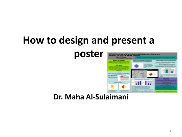
How to design and present a poster Dr. Maha Al-Sulaimani
What are posters? • Posters are a special type of presentation. • The purpose of scientific posters is to present work to an audience who is walking through a hallway or exhibit.
What makes an ideal poster? • The ideal poster is designed to • Attract attention (Use various strategies) • Provide a brief overview of your work • Concise and focused and it should explain your research using schematics, graphs, and other visual strategies, with a minimum of supporting text. • Initiate discussion: Use the poster to generate conversation between you and your visitors
The specific sections such as the results should be easy to locate on the poster. • For instance, many will read only the objectives (or goals) of the work, and then the final results. • Others, who have a deep interest in the topic, will try to read the poster from beginning to end. • Given these different approaches to reading posters, another characteristic of an effective poster is that specific sections are easy to locate.
How to Design a Great Poster…The BASICS • A Great Poster Is... • Readable • Well Organized
Posters tell stories: provide clear flow of information from introduction to conclusion. • Your poster tells viewers what you did, why you did it and what you found out from doing it. Focus on your major findings - a common fault is to try to cover too much. Few delegates are going to read everything on your poster, so get to the point.
General rules for poster • Artistry does not substitute for content • Follow the directions given (READ THE INSTRUCTIONSsupplied by the meeting organizers! ) • Space limitations • Length • Format • Proof read, • Check with all authors
Planning your Poster • Make your poster Readable • Do the ideas flow from one item to the next? • Does the text have grammar/spelling problems? • Avoid: • Complex sentence structures. • Unnecessary adjectives. • Long paragraphs.
Planning your Poster • Make your poster legible • Use larger fronts (Title: 65-108 pts; Subheadings: 36-54 pts; Body text: 18-27 pts) • Major points should be readable from 6 feet away (This size is needed to ensure people can read your poster from a distance). • Even minor points should be obvious at a glance. • Double-space all text, unless font size is large enough to read comfortably single
Planning your Poster • Make your poster legible • Use larger fronts (Title: 65-108 pts; Subheadings: 36-54 pts; Body text: 18-27 pts) • Major points should be readable from 6 feet away (This size is needed to ensure people can read your poster from a distance). • Even minor points should be obvious at a glance. • Double-space all text, unless font size is large enough to read comfortably single
Planning your Poster • Make your poster legible • AVOID USING ALL CAPS (has the effect of yelling) • Use large pictures. • Use eye catching titles. • Use color wisely • The flow of your poster should be downward in columns, starting at the TOP LEFT and ending at the BOTTOM RIGHT.
example of poster Title of Poster Author's name, Author's name, Author's name Name of Division, Department, Institution, City, State Introduction Results continued Figures Lorem ipsum dolor sit amet, consectetuer adipiscing elit. Praesent eu est ut orci sagittis fringilla. In hac habitasse platea dictumst. Ut magna odio, vestibulum sit amet, ullamcorper nec, convallis eget, enim. Cras a libero. Duis eros risus, vehicula a, feugiat sit amet, venenatis aliquet, Abstract Lorem ipsum dolor sit amet, consectetuer adipiscing elit. Praesent eu est ut orci sagittis a) b) Results Conclusion Loremipsum dolor sit amet, consectetueradipiscingelit. Praesenteuestutorcisagittisfringilla. Lorem ipsum dolor sit amet, consectetuer adipiscing elit. Praesent eu est ut orci sagittis fringilla. Method Loremipsum dolor sit amet, consectetueradipiscingelit. Praesenteuestutorcisagittisfringilla. References Author, article, journal, page, date Author, article, journal, page, date Author, article, journal, page, date
The Title • Use a brief title • The title needs to accurately reflect the content of the poster. • The title of your poster should appear at the TOP about 25 mm high. • Large font • ~60 point • The title banner should be readable from 5-7 m away • Authors and Institution • ~44-48 point • Logos • KSU, Science College, biochemistry Department
The title • A TITLE ALL IN CAPITAL CASE IS DIFFICULT TO READ.
Compulsory content: • Author's name/s • Author's organisation/s • Organisation's logo/s • Contact details (website, email, phone, postal address.
Introduction/Summary Use a minimum of background information. This section should be composed mostly of your research questions/hypotheses.
Methods May shorten this section by using references for less critical techniques. Flow diagrams work well here.
Results Biggest section of the poster, with lots of graphs, figures, etc. Arrange in a logical order so conclusions naturally follow.
Discussion/ Conclusion Usually more of a conclusion than a discussion. May use bulleted lists. Link the results to the hypotheses.
Acknowledgements Have an acknowledgements section, in smaller size type (14-18 point), where you acknowledge contributors and funding organizations.
References Keep to a minimum Only cite critical references to your project.
Graphics Posters are a visual medium and should include graphics. Graphics convey your message quickly Should catch and hold audience attention. Should increase understanding of complex subjects. Should increase efficiency in sending a message. Should be visible easily from a minimum distance of 2 m. Restrained use of 2-3 colors, avoid overuse.
Image Resolution • Make sure your graphics will be clear when printed out. • Stay within 150-300 dpi resolution. • Use light backgrounds with dark photos and vice versa. • Neutral/gray backgrounds enhance color photos while white backgrounds reduce their impact. • 10cmx12.5cm photos are a good minimum size. • Beware of Web Graphics • Graphics optimized for fast download often don’t print well.
Text • Should be able to read anything from 4’- 6’ away. • Establish a hierarchy of importance using the font size: • Title: 65-108 pts • Subheadings: 36-54 pts • Body text: 18-27 pts • AVOID USING ALL CAPS (has the effect of yelling) • Double-space all text, unless font size is large enough to read comfortably single-spaced. • Use shorter sentences than you might otherwise use.
Things to Do Wear a name tag. Greet viewers and offer to answer questions. Stand to the side of your poster, give viewers space. Speak to the viewers, not the poster. Point to areas on the poster while speaking. Walk viewers through the figures. Leave a note if you must leave during your session. Thank viewers for visiting.
Do NOTS! Do not simply reprint your paper in poster format!!!!!!!!!!!!!!!!!!!!!! Do not cover every space with text and pictures Do not make the poster text heavy DO NOT WAIT UNTIL THE LAST MINUTE
Typical Evaluation Criteria • Appearance: • Does the poster attract attention? • Can it be read at a distance? • Is it clearly organized? Easy to follow? • Does it use enough visual aids? Does it use them effectively? • Is there unnecessary clutter?
Typical Evaluation Criteria • Content • Does the poster cover the underlying methodology well enough to understand the results? • Does the content stand on its own? (Without a presenter)
A great poster catches your eye, and is: • Clear and simple • Easy to read • Organized with a logical flow • Relevant to viewers in its content • Taking advantage of the visual medium • Providing viewers with 1 or 2 main messages
Sources Pechenik, JA. 2007. A short guide to writing about biology, 6th ed. Pearson, Longman, NY. NCHC Poster Guidelines. www.ucs.iastate.edu/mnet/ _repositroy/nchc/html/poster.htm. August 26, 2008. Poster Preparation. www.kumc.edu/SAH/OTEd/ jradel/Poster_Presentations/120.html. August 26, 2008. Abstracts, The Writing Center at Rensselaer Polytechnic Institute. www.rpi.edu/web/writingcenter/abstracts.html. August 26, 2008. How to make a research poster using PowerPoint. Undergraduate Research, University of Missouri-Columbia. Undergradresearch.missouri.edu/resources/powerpoint-video.php. August 26, 2008.