Download
1 / 42
420 likes | 497 Vues
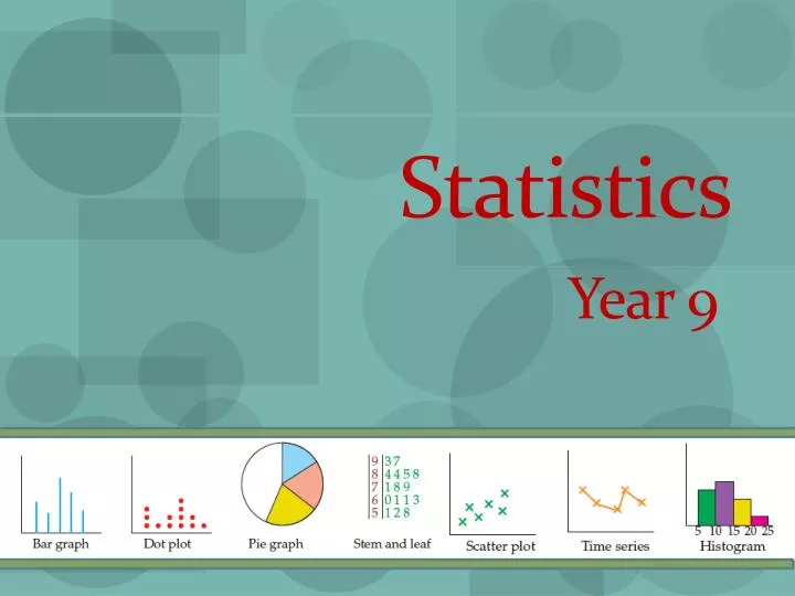
Statistics. Year 9. Note 1 : Statistical Displays. Note 1 : Statistical Displays. Note 1 : Statistical Displays. 3. Oliver. IWB Ex 31.01 Pg 859. Sally and Mark (with 4 each).

E N D
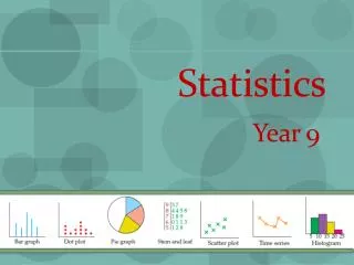
Statistics Year 9
Note 1: Statistical Displays 3 Oliver IWB Ex31.01 Pg 859 Sally and Mark (with 4 each)
Kowhai are small, woody legume trees. Kowhaiwhai patterns are special Maori patterns that are used for decorations and beautiful paintings. The koru and pit au are the most famous sort of designs for kowhaiwhai patterns. At the end of stalks there is normally a circle that resembles a silver fern. Red, black and white is the most common colours in a kowhaiwhai pattern. There are also kowhai trees that are very cool. They have flower like leaves that are a very bright yellow.At the end of stalks there is normally a circle that resembles a silver fern. Note 1: Statistical Displays
Note 2: Dot Plots A dot plot uses a marked scale Each time an item is counted it is marked by a dot
Dot Plots - Symmetry A symmetric distribution can be divided at the centre so that each half is a mirror image of the other.
Dot Plots - Outliers A data point that diverges greatly from the overall pattern of data is called an outlier.
Dot Plots e.g. This graph shows the number of passengers on a school mini bus for all the journeys in one week. IWB Ex31.02 Pg 863 19 How many journeys were made altogether? What was the most common number of passengers? 6
Note 3: Pie Graphs Pie Graphs are used to show comparisons ‘Slices of the Pie’ are called sectors Skills required: working with percentages & angles e.g. 20 students in 9Ath come to school by the following means: 10 walk 5 Bus 3 Bike 2 Car Represent this information on a pie graph.
Note 3: Pie Graphs e.g. 20 students in 9Ath come to school by the following means: 10 walk 5 Bus 3 Bike 2 Car = 10 × 18° = 180° = 90° = 5 × 18° = 54° = 3 × 18° = 36° = 2 × 18° All 20 Students represent all 360°of a pie graph How many degrees does each student represent? = 18°
Note 3: Pie Graphs IWB Ex31.03 Pg 870 We can also use percentages and fractions to calculate the angles e.g. 500 students at JMC were surveyed regarding their TV provider at home. 180 had Skyview, 300 had Freeview and 20 had neither. Represent this in a pie chart. × 360° = 129.6° × 360° = 216° × 360° = 14.4°
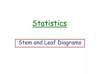
Note 4: Stem & Leaf Graphs Daily absences from JMC for a six week period in Term 3 are as follows:
Note 4: Stem & Leaf Graphs Daily absences from JMC for a six week period in Term 3 are as follows: These figures can be summarized in a stem and leaf graph
Note 4: Stem & Leaf Graphs IWB Ex31.04 Pg 875
Note 5: Scatter Plot Scatter Plots show the relationship between two sets of data. IWB Ex31.05 Pg 879
Note 6: Time Series Graph This ‘line graph’ shows what happens to data as time changes Time is always on the x-axis Data values are read from the y axis What are some of the features of this graph? # of advertisements Time
Note 6: Time Series Graph Each week, roughly the same amount of advertisements are sold The most popular days to advertise are: Wednesday & Saturday The least popular days to advertise are: Monday & Tuesday What are some of the features of this graph? IWB Ex31.06 Pg 884
Calculating Statistics - averages • Mean (average) – The mean can be affected by extreme values • Median – middle number, when all data is placed in order. Not affected by extreme values • Mode – the most common value/s
Note 7: Mean • Mean (average) – The mean can be affected by extreme values x =
Note 7: Median • Median – middle number, when all the number are placed in order. Not affected by extreme values
Note 7: Mode • Median – middle number, when all the number are placed in order. Not affected by extreme values
Note 7: Median • Mode – is the most common value, one that occurs most frequently e.g. Find the mode of the following
Note 7: Calculating Averages • In statistics, there are 3 types of averages: • mean • median • mode Mode Median Mean - x The middle value when all values are placed in order The most common value(s) Affected by extreme values Not Affected by extreme values IWB Ex31.07 Pg 892 Ex31.08 Pg 896 Ex31.09 Pg 901
Calculating Statistics • Range – a measure of how spread out the data is. The difference between the highest and lowest values. • Lower Quartile (LQ) – halfway between the lowest value and the median • Upper Quartile (UQ) – halfway between the highest value and the median • Interquartile Range (IRQ) – the difference between the LQ and the UQ. This is a measure of the spread of the middle 50% of the data.
Note 8: Box & Whisker Plot Comparing data Male Female x median minimum maximum Upper quartile extreme value Lower quartile IQR
Note 8: Frequency Tables A frequency table shows how much there are of each item. It saves us having to list each one individually. 8 2 4 56, # of houses
Note 8: Frequency Tables How would you display this information in a graph?
Note 8: Frequency Tables Tables are efficient in organising large amounts of data. If data is counted, you can enter directly into the table using tally marks e.g 33 students in 10JI were asked how many times they bought lunch at the canteen. Below is the tally of individual results. 0 4 0 3 5 0 5 5 0 2 1 0 5 2 3 0 0 5 5 1 2 5 5 3 0 0 1 5 0 5 1 3 0 The data can be summarised in a frequency table
Note 8: Frequency Tables IWB Ex31.11 Pg 910 Calculate the mean = = = = 2.3 Why is this mean misleading? Most students either do not buy their lunch at the canteen or buy it there every day. Total 33
Note 9: Histograms When a frequency diagram has grouped data we use a histogram to display it - measured data (e.g. Height, weight) Each student will fit into one of these groups of data Total 15
Note 9: Histograms When a frequency diagram has grouped data we use a histogram to display it
Note 9: Histograms IWB Ex31.12 Pg916 When a frequency diagram has grouped data we use a histogram to display it
Summary: Data Display Line Graphs – identify patterns & trends over time Interpolation - Reading in between tabulated values Extrapolation - Estimating values outside of the range Looking at patterns and trends 0 1 2 3 4 5 6 7 8 9 10 11
Summary: Data Display Pie Graph – show proportion Multiply each percentage of the pie by 360° 60% - 0.6 × 360° = 216° Scatter Graph – show relationship between 2 sets of data Plot a number of coordinates for the 2 variables Draw a line of best fit - trend Reveal possible outliers (extreme values)
Summary: Data Display Histogram– display grouped continuous data – area represents the frequency frequency Bar Graphs– display discrete data Distance (cm) – counted data – draw bars (lines) with the same width – height is important factor
Summary: Data Display Stem & Leaf – Similar to a bar graph but it has the individual numerical data values as part of the display – the data is ordered, this makes it easy to locate median, UQ, LQ 3 3 4 8 5 10 9 8 8 3 11 2 3 6 7 8 Back to Back Stem & Leaf – useful to compare spread & shape of two data sets 4 2 0 12 1 9 9 3 3 13 0 2 2 14 5 Key: 10 3 means 10.3