Download
1 / 9
90 likes | 391 Vues
You can organize data by:. Using Line PlotsDescribing Data (mean, median,mode, and range)Making Charts or Graphs (bar graphs,circle graphs,pictographs,line graphs, histographs, etc.). Sometimes, it is easier to understand data if it is organized and displayed.. Charts:. Line Plots. Line plots are diagrams that organize data on a number lineIf your data is numerical, one way to show it would be with a line plot.

E N D
1. Displaying Data: Graphs
2. You can organize data by: Using Line Plots
Describing Data (mean, median,mode, and range)
Making Charts or Graphs (bar graphs,circle graphs,pictographs,line graphs, histographs, etc.)
3. Charts:
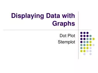
4. Line Plots Line plots are diagrams that organize data on a number line
If your data is numerical, one way to show it would be with a line plot
5. Bar Graphs Bar graphs are another way to show data.
Double bar graphs help you to compare data.
6. Line graphs Line graphs are good for showing changes in data over time when working with dates.
Double line graphs can help you show even more data and compare data.
7. Circle graphs/Pie Charts Circle or pie charts are another way to show data, and compare data to percentages or fractions of a whole.
8. Pictographs Pictographs are often used to show data in newspapers and magazines because they get your attention.
Each picture represents a specific number of data.
9. Stem and Leaf Plot
10. In conclusion Organizing data makes it easier to read and understand.
Using graphs and charts helps to get the attention of your audience
Charts, line plots and graphs are ways to organize data so it is useful to you.
Comparing data is easier when it is clear and specific.