Download
1 / 33
330 likes | 441 Vues
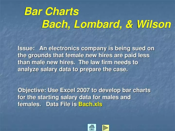
Bar Charts Bach, Lombard, & Wilson. Issue: An electronics company is being sued on the grounds that female new hires are paid less than male new hires. The law firm needs to analyze salary data to prepare the case.

E N D
Bar Charts Bach, Lombard, & Wilson Issue: An electronics company is being sued on the grounds that female new hires are paid less than male new hires. The law firm needs to analyze salary data to prepare the case. Objective: Use Excel 2007 to develop bar charts for the starting salary data for males and females. Data File is Bach.xls
Bar Charts-Bach, Lombard & Wilson Open the Excel file called Bach.xls
Bar Charts-Bach, Lombard & Wilson • Select data in columns B and C • Select Insert • Select Column
Bar Charts-Bach, Lombard & Wilson Select 2-D paired columns
Bar Charts-Bach, Lombard & Wilson Which brings up…
Bar Charts-Bach, Lombard & Wilson • To change the horizontal axis labels to Years: • Select Data • Select Edit
Bar Charts-Bach, Lombard & Wilson Select cells A2 through A8 to display years in the label
Bar Charts-Bach, Lombard, & Wilson (continued) Issue: An electronics company is being sued on the grounds that female new hires are paid less than male new hires. The law firm needs to analyze salary data to prepare the case. Objective: Use Excel 2007 to develop bar charts for the percent of males and females hired with MBA’s. Data File is Bach.xls
Bar Charts-Bach, Lombard & Wilson • Select the Graph • Select “Select Data”
Bar Charts-Bach, Lombard & Wilson Select Edit Select the data in Column A
Bar Charts-Bach, Lombard, & Wilson (continued) Issue: An electronics company is being sued on the grounds that female new hires are paid less than male new hires. The law firm needs to analyze salary data to prepare the case. Objective: Use Excel 2007 to develop a bar chart for the average starting salary of males and females hired with and without MBA’s. Data File is Bach.xls
Bar Charts-Bach, Lombard & Wilson • Select Columns G1 – J2 • Select Insert • Select Column
Bar Charts-Bach, Lombard & Wilson • To add data labels to the top of the bars: • Select Layout Tab • Select Data Labels • Select Outside End • Delete the legend Series1
Line Charts- McGregor Vineyards Issue: Analyze the sales and profits data over time. Objective: Use Excel 2007 to develop line charts for weekly sales and profits. Data File is McGregor.xls
Line Charts-McGregor Vineyards Open the Excel file called McGregor.xls The file contains 20 weeks of historic data. The last row is 21
Line Charts-McGregor Vineyards • Select The data in Column B • Select Insert • Select Line • Select the 2-D Line with Markers sample line chart
Line Charts-McGregor Vineyards • Need to: • Change the title (Click title and replace with Sales Trend) • Delete the legend Sales (dollars)(click the legend and press Delete) • Add x-axis and y-axis titles • Remove the gridlines
Line Charts-McGregor Vineyards • To add Axis Titles: • Select Layout Tab • Select Axis Titles • First Select Horizontal Axis Title and then Click Title Below Axis – Replace with Week • Go through same steps above and click Primary Vertical Axis Title and then click Rotated Title – Replace with Sales • To Change Gridlines: • Click Gridlines • Point to Primary Horizontal Gridlines • Click None • Resize to fit in the range D1 through L11.
Line Charts-McGregor Vineyards Repeat the process for Profit, changing titles as shown
Line Charts-McGregor Vineyards Rebuild the line chart using both Sales and Profit, changing titles as shown and using Move Chart to move to another page.
Line Charts-McGregor Vineyards • To improve the scaling need a 2-axis chart • Click the Profit line on the chart • On the Format tab, select Format Selection • Select Secondary Axis option button
Scatter Diagrams- Personal Computers Issue: Analyze the relationship between PC sales price and the processing speed of the PC Objective: Use Excel 2007 to develop a scatter diagram for PC price and speed. Data File is Personal Computers.xls
Scatter Diagrams- Personal Computers Open the Excel file called Personal Computers.xls The file contains data for 14 PC’s
Scatter Diagrams- Personal Computers • Select columns to be graphed (C and G) • Select Insert • Select Scatter • Select Scatter with only Markers
Scatter Diagrams- Personal Computers • Use Design tab to move to a new sheet • Use Layout tab to add titles and remove grid lines