Download
1 / 23
230 likes | 283 Vues
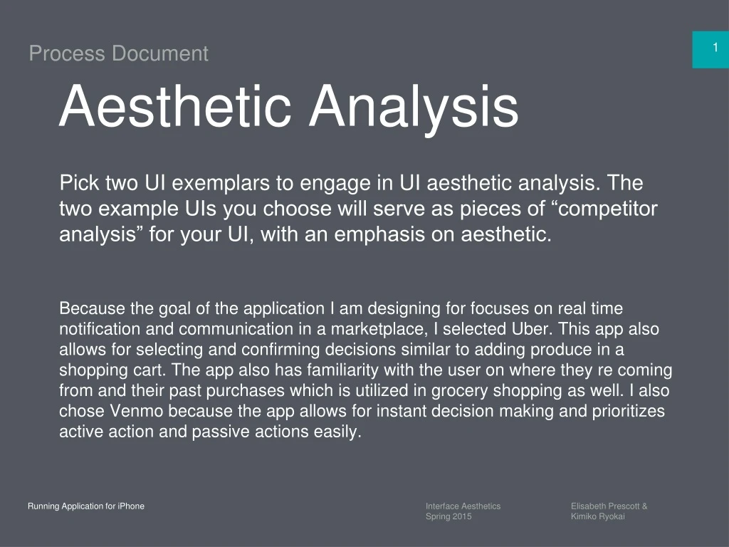
Aesthetic Analysis. Pick two UI exemplars to engage in UI aesthetic analysis. The two example UIs you choose will serve as pieces of “competitor analysis” for your UI, with an emphasis on aesthetic.

E N D
Aesthetic Analysis • Pick two UI exemplars to engage in UI aesthetic analysis. The two example UIs you choose will serve as pieces of “competitor analysis” for your UI, with an emphasis on aesthetic. • Because the goal of the application I am designing for focuses on real time notification and communication in a marketplace, I selected Uber. This app also allows for selecting and confirming decisions similar to adding produce in a shopping cart. The app also has familiarity with the user on where they re coming from and their past purchases which is utilized in grocery shopping as well. I also chose Venmo because the app allows for instant decision making and prioritizes active action and passive actions easily.
Analysis 1 • Analysis 1 • Uber • Set 1 • Here the app focuses on usability to address a narrow goal of requesting rides. To do so, the aesthetics comes into play to provide a visual on the environment and help the customer navigate as if they were navigating a map to select a location. It reinfocres the environment through a map metaphor and includes maps to help the user understand where they are . • It is successful in achieving this goal of navigation by providing real time data when the user selects a location and pinpoints where they are. The technology allows for this to occur by providing the mapping update immediately. Also, the overall appearance provides a sleek and chic feel in that it is simple in it color choices of mostly using black and white to represent the company’s colors and uses familiarity of the types of maps individuals use such as Google Maps for the mapping visual. This allows for the user to trust the map data because of this recognition.
Analysis 1 • Examples • 01 - Label • Home page of what the Uber customer sees. They can see the availability of cars near them and different services offered. • 02- Label –Uber Ride Confirmation • 02 - Label • 01- Label –Uber Homepage • Customer selects ride and confirm s ride has been selected for indicated location. • 03 - Label • Uber Drives is en route where the customer can see how far they are from the destination and type of car they are driving. • 03- Label –Uber Ride en route.
Analysis 1 • Analysis 1 • Uber • Objectives • Objectives • 1. Select Trip • 2. Use Map and Input field to select destination • 3. Provide options of different type of ride services • What do you think their objectives were? • I believe Uber’s goals are for passengers to find the rides they need when they need it by seeing where the pick-up are relative to where they are. This helps with customers to decide where to be picked up and also see options of different ways to be picked up depending on the wait time and cost of each option. • What was the need for this UI? • This UI allows for assurance for the rider to know where their driver is. Rather than cause the rider to wonder how close their ride is, the map allows for them to follow their driver on a real-time basis. As a result, both parties can communicate back and forth with each other on what is the most efficient way to meet. Furthermore, the rider has freedom to pick different ways of traveling in terms of carpooling or taking luxury services. Thus, they also have an idea of the type of car picking them up to reduce the ambiguity of their selected drivers.
Analysis 1 • Analysis 1 • Uber • Users • Individuals who need to make trips from one destination to another use it. Those that mainly use it live in urban cities or cities close to the urban hubs. It changes behavior in that users make decisions quickly about selecting a ride and do not have to think about payment options because this was taken care of in the early stages of the sign up process. This is used all throughout the day and available 24 hours.
Analysis 1 • Name of UI Example 1 • Color Palette • Color Palette • 01–C0C0C8 • 03–5DBCD2 • 01–C0C0C8 • 02–2E2EC3 • 03–5DBCD2 • 01 - Label • R - 192 • G - 192 • B -200 • R - 93 • G - 188 • B - 210 • 02 –2E2EC3 • R - 46 • G - 46 • B - 60 • Label • Uber emphasizes the use of 2 colors and uses various gradients of them which they call Uber Grey (C0C0C8) and UberBlack(2E2EC3). This is what the branding is based on and how the two service lines are identified as such as Uber Black.
Style Guide • Uber • Color • The colors are strictly aligned with the brand and services it offers. For example, the main service line the company was founded off was Uber Black and their main color for logos, branding, and application design is Uber Black. They also have Uber Grey to keep the simplicity. They do this so the customers reach their goal and not allow for color to be a distraction. By using these ‘everyday’ type of colors, Uber is advocating or promoting its service as an everyday go to service as well. • As for notifications and alerts, they use one color and this refers to pricing such as surge pricing or availabilities of desired services. This is done so with the color: 5DBCD2 (teal-like color).
Analysis 1 • Uber • Typography • Type Inventory: • How many fonts are there? • 4 • In order of priority:1. Museo • 2. Clan Pro (Weight Book) • 3. Helvetica Neue (Regular) • 4. Standard Helvetica • How many sizes are there within those fonts? • Each font has 1 size. • What do those variations represent? (body copy, headline, time, indicators, etc.) • The variations allow for distinction between when a request is made, call to action, and user input fields. This occurs so the user can know where they need to be active and receive confirmation that their input has been taken. • Is this consistent across the UI? (If not why is it broken?) • Consistency is maintained.
Analysis 1 • Uber • Typography • The designer chose these type faces to demonstrate areas that need user attention which are in 2 ways: one for call to action and one for notification after a call to action has been made. The typefaces are similar so this does not distract the user from attaining their objective of selecting a ride.
Analysis 1 • Uber • Assets
Analysis 1 • Uber • Imagery
Style Guide • Uber • Imagery • The imagery is to show the user the outcome of every action that they do and how it is reflected on the map. Once they select the ride, they are able to see the ride is en route via a confirmation message and the route they are travelling to get to the user. As Uber’s slogan is “Everyone’s Private Driver,” customers are able to see who their selected driver is with the name of the driver and the car and make they are coming with.
Analysis 1 • Analysis 2 • Venmo • Set 2 • Although the app has to deal with payment transactions, the look and feel is that of a social network by incorporating a newsfeed like feature. The designer achieves usability with the goal of being able to pay and request for money and makes clear that this is so by having is placed at the top of the application with greatest weight dedicated to it. It feels that outcome is dependent on how these 2 functions are carried out.The user is also able to see their transactions carried out after the action is done by viewing updates to the newsfeed. The app does not scream beautiful, but shouts usable. Given the idea that making a payment electronically is difficult, Venmo makes it feel as if you are sending a quick status update.
Analysis 2 • Examples • 01 - Label • Homepage of what the user can see about their community memebers and types of payements made. • 02 - Label • User is able to make and receive payments. • 01- Label –Venmo Homepage • 02- Label –Send/Request Payment • 03 - Label • Menu items displaying how user can set up accounts and find friends or invite them. • 03- Label –Venmo Menu Items
Analysis 1 • Analysis 2 • Venmo • Objectives • Make and receive payments. • See transactions completed in real-time with balance confirmations. • See status updates of community members through transactions • What was the need for this UI? • This type of UI was needed to bring awareness that simple processes do exist for payment systems and a social aspect can bring light and ease of use to it.
Analysis 1 • Analysis 2 • Venmo • Users • This app is used by anyone who is on the go and has a debit/credit card system on file. By having the newsfeed aspect, the user is able to learn about how payments are made and because the app is quick with transactions through a mobile first perspective, it assures that payments are made through updates. This can be used at any time of the day to send and receive money. The app allows for individuals to not have to go through the logistical work of doing bank transfers and matching bank accounts because this is already streamlined.
Analysis 2 • Venmo • Color Palette • Color Palette • 06– 080000 • 05– FF0000 • 01–3D95CE • 01–3D95CE • 02- EZEBEE • 03–6E7878F • 04 -283036 • 04–283036 • R - 061 • G - 149 • B -206 • R - 112 • G - 124 • B - 124 • 05–FF0000 • 02 –E7EBEE • R - 255 • G - 0 • B - 0 • R - 231 • G - 235 • B - 238 • 06–08000 • 03–6e7878F • R - 0 • G - 128 • B - 0 • R - 112 • G - 124 • B - 124 • Label • Venmo uses colors that users are familiar with social networks such as Twitter and Facebook for the newsfeed feature. For the financial payments it focuses on red and green to indicates if money has been received or given.
Style Guide • Venmo • Color • Venmo used these colors to appeal to familiairty of users with social media networks such as Twitter and Facebook which have blue tones to their newsfeed feature. As for payments, Venmo used red for money taken out and green for money being received which has also become a standard.
Analysis 2 • Venmo • Typography • Type Inventory: • How many fonts are there? • 4 • Helvetica Neue Light • Helvetica NeueMedium • Helvetica Neue Large • Helvetica Neue Bold • How many sizes are there within those fonts? • 4 • What do those variations represent? • Given the fonts are coming from the same family, they differ based on urging user action or looking at information that requires no action. For confirmations and headlines, Bold is used. For newsfeed information, Medium is used. To input pircing, Light is used. • Is this consistent across the UI? • Consistency is maintained.
Analysis 2 • Venmo • Typography • Why do you think the designers chose this typeface(s)? Is this successful or unsuccessful? Are they functional or aesthetic decisions? What would you do differently? • I think the designers chose these typefaces to demonstrate the intersection between payment systems and social media related aspects such as the newsfeed. However, I feel that payments could be reinforced with a completely different font so that the user is aware they are making a payment and not a status updates, especially because of the financial implications.
Analysis 2 • Venmo • Assets
Analysis 2 • Venmo • Imagery
Style Guide • Venmo • Imagery • This imagery makes the experience of going through payment transactions lightweight. This was done as a functional choice to make it easier to send and receive money. The look and feel also makes the user feel like they are part of another social network and make it a social activity to share their payment processes.