Download
1 / 19
200 likes | 356 Vues
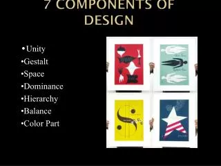
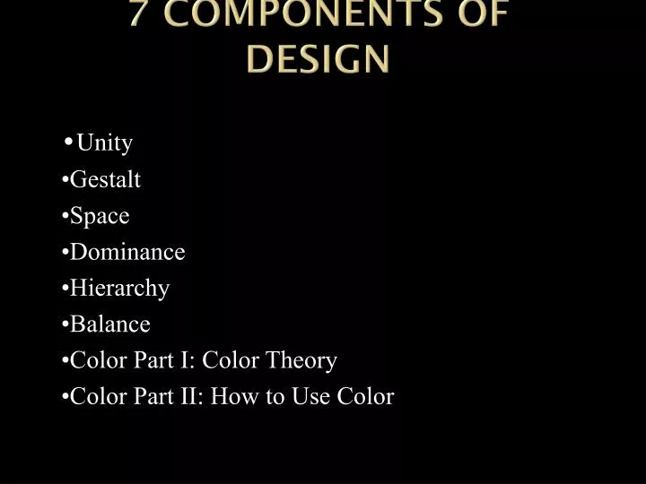
7 Components of Design. • Unity •Gestalt •Space •Dominance •Hierarchy •Balance •Color Part I: Color Theory •Color Part II: How to Use Color. Dominance. dominant ( adj ) – commanding, controlling, or prevailing over all others

E N D
7 Components of Design •Unity •Gestalt •Space •Dominance •Hierarchy •Balance •Color Part I: Color Theory •Color Part II: How to Use Color
Dominance dominant (adj) – commanding, controlling, or prevailing over all others dominance (n) – the fact or state of being dominant
Dominance Is • Dominance can be thought of as Visual Weight • Objects with more visual weight have a gravity which attracts the viewer’s eye- pulling their attention to the dominant object before other objects on the page
Why is dominance important • Dominance creates a visual hierarchy in your design. • A lack of dominance between elements leads to competition between them. • A hierarchy is by default a series of different levels of dominance.
Stages of Dominance • Dominant • Subdominant • Tertiary Dominance
Visual Weight = more dominance • Visual Weight can be added by the following •Size – As you would expect larger elements carry more weight •Color – It’s not fully understood why, but some colors are perceived as weighing more than others. Red seems to be heaviest while yellow seems to be lightest. •Density – Packing more elements into a given space, gives more weight to that space. •Value – A darker object will have more weight than a lighter object. •Whitespace – Positive space weighs more than negative space or whitespace.
Dominance by Size Which objects carries the most visual weight?
Color Notice how the eye is pulled to certain colors in the example at right. Red carries the most visual weight of all colors and will draw the eye. Yellow carries the least visual weight
Density Density – Packing more elements into a given space, gives more weight to that space. The stars are smaller than the square but they are many and packed together their gravity combines to outdraw the square for dominance.
Value If two objects are the same size, the darker of the two objects will have more visual weight.
Whitespace • An object surrounded by whitespace dominates it’s immediate environment even though other objects may be larger.
Dominance • Keep in mind that visual weight is a combination of all of the above. • Your biggest element on the page may also have the lightest color and value and still recede into the background.
Dominance • Be careful with overdoing dominance. • While you want to create an element that dominates your design to serve as the focal point you still want the rest of your design to be seen. • Be careful not to make an element so dominant that everything else in the design gets lost. You want your design to be balanced overall.
Emphasis • You can create dominance in elements that don’t have the most visual weight. • Objects placed in the center are often seen as a focal point as long as their is enough emphasis given to them. • When many other elements all lead your eye to one particular element, that element can become the dominant focal point.
Example dominance in web design • The image in the upper left of the WebDesigner.ro site is clearly the dominant element on the page. • It pulls you into the design and from there your eye moves right to the navigation and the content
Example 2 • The dominant element on the Ribbons for Red home page is the emblem in the upper left. • Notice how red is used to create sub-dominant elements to pull you through the page. • Notice too what those sub-dominant elements are and think about what the goals for this page might be.
Denise Chandler’s site uses dominance to create a focal point around the welcome message on the page. • Dominance is created through the large black font. It’s inviting to read and immediately leads you into the navigation, which repeats the black as a background color. • The black background is used throughout the page behind other elements to pull your eye to them and blue is used to provide contrast and help other items on the page stand out. • The page does a great job of both pulling you into the design and then pulling you through the design.
Area 17′s site also uses heavy black text to pull you into the design. In this case the dominant element is the A / again in the upper left. • Notice how the welcome message in the header also uses black text which pulls you to it and then to short bio about the company to the right. • You then encounter a light red diagonal (easier to see on the live site than in this image) which guides your eye down and to the left to selected projects from the company’s portfolio.