Download
1 / 39
520 likes | 1.36k Vues
Chapter 2: Frequency Distributions. Frequency Distributions. After collecting data, the first task for a researcher is to organize and simplify the data so that it is possible to get a general overview of the results. This is the goal of descriptive statistical techniques.

E N D
Frequency Distributions • After collecting data, the first task for a researcher is to organize and simplify the data so that it is possible to get a general overview of the results. • This is the goal of descriptive statistical techniques. • One method for simplifying and organizing data is to construct a frequency distribution.
Frequency Distributions (cont'd.) • A frequency distribution is an organized tabulation showing exactly how many individuals are located in each category on the scale of measurement. A frequency distribution presents an organized picture of the entire set of scores, and it shows where each individual is located relative to others in the distribution.
Frequency Distribution Tables • A frequency distribution table consists of at least two columns - one listing categories on the scale of measurement (X) and another for frequency (f). • In the X column, values are listed from the highest to lowest, without skipping any. • For the frequency column, tallies are determined for each value (how often each X value occurs in the data set). These tallies are the frequencies for each X value. • The sum of the frequencies should equal N.
Frequency Distribution Tables (cont'd.) • A third column can be used for the proportion (p) for each category: p = f/N. The sum of the p column should equal 1.00. • A fourth column can display the percentage of the distribution corresponding to each X value. The percentage is found by multiplying p by 100. The sum of the percentage column is 100%. • e.g. Example 2.3 (p. 41)
Regular Frequency Distribution • When a frequency distribution table lists all of the individual categories (X values) it is called a regular frequency distribution.
Grouped Frequency Distribution • Sometimes, however, a set of scores covers a wide range of values. In these situations, a list of all the X values would be quite long - too long to be a “simple” presentation of the data. • To remedy this situation, a grouped frequency distribution table is used.
Grouped Frequency Distribution (cont'd.) • In a grouped table, the X column lists groups of scores, called class intervals, rather than individual values. e.g. n intervals • These intervals all have the same width, usually a simple number such as 2, 5, 10, and so on. • Eachinterval begins with a value that is a multiple of the interval width. The interval width is selected so that the table will have approximately ten intervals. n = 10 • If the width is 10, lower bound for each class could be 10, 20, 30, 40 .....
Grouped Frequency Distribution (cont'd.) • Guidelines: • # of classes (n) = 10 in most cases • class width (k) should be in 5s or 10s • lower bound for each class should be a multiple of the width, e.g. i x k, i = 1,2,3,4,.... • all interval should be the same width
Example 2.4 (p.43) • 25 exam scores range = highest score – lowest score = 94-53 = 41 original width = 1 42 rows ( too many) Goal: width in 5s, 10s, about 10 classes/intervals Range ≤ (class width) ∙ (# of classes) • width = 5, n = 9 1st class: 50-54 (includes the min score 53)... 9th class: 90-94 (includes the max score 94) Table 2.2 (p. 44)
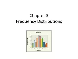
Frequency Distribution Graphs • In a frequency distribution graph, the score categories (X values) are listed on the X axis and the frequencies are listed on the Y axis. • When the score categories consist of numerical scores from an interval or ratio scale, the graph should be either a histogram or a polygon.
Histograms • In a histogram, a bar is centered above each score (or class interval) so that the height of the bar corresponds to the frequency and the width extends to the real limits, so that adjacent bars touch.
p.47: a stack of blocks Figure 2.4 one block for each individual (one frequency) • not a substitute for a histogram • but very easy to see and understand • no Y-axis is needed
Polygons • In a polygon, a dot is centered above each score so that the height of the dot corresponds to the frequency. The dots are then connected by straight lines. An additional line is drawn at each end to bring the graph back to a zero frequency.
polygons for grouped distribution • 1st find midpoint = (upper bound+lower bound)/2 • put the dot on the midpoint position • connect the dots • close the graph by extending the line on both end, e.g. pre-1st interval:2-3 midpoint=2.5, after-last interval:14-15 midpoint=14.5 • see p. 48 Fig 2.6 • Can use the histogram to draw the polygon
Bar Graphs • When the score categories (X values) are measurements from a nominal or an ordinal scale, the graph should be a bar graph. • A bar graph is just like a histogram except that gaps or spaces are left between adjacent bars.
Relative Frequency • Many populations are so large that it is impossible to know the exact number of individuals (frequency) for any specific category. • In these situations, population distributions can be shown using relative frequency instead of the absolute number of individuals for each category.
Smooth Curve • If the scores in the population are measured on an interval or ratio scale, it is customary to present the distribution as a smooth curve rather than a jagged histogram or polygon. • The smooth curve emphasizes the fact that the distribution is not showing the exact frequency for each category.
Frequency Distribution Graphs • Frequency distribution graphs are useful because they show the entire set of scores. • At a glance, you can determine the highest score, the lowest score, and where the scores are centered. range and mean • The graph also shows whether the scores are clustered together or scattered over a wide range. variability measure: variance
Shape • A graph shows the shape of the distribution. • A distribution is symmetrical if the left side of the graph is (roughly) a mirror image of the right side. • One example of a symmetrical distribution is the bell-shaped normal distribution. • On the other hand, distributions are skewed when scores pile up on one side of the distribution, leaving a "tail" of a few extreme values on the other side.
Positively and Negatively Skewed Distributions • In a positively skewed distribution, the scores tend to pile up on the left side of the distribution with the tail tapering off to the right. can have extremely large values • In a negatively skewed distribution, the scores tend to pile up on the right side and the tail points to the left. can have extremely small values
Percentiles, Percentile Ranks, and Interpolation • The relative location of individual scores within a distribution can be described by percentiles and percentile ranks. • The percentile rank for a particular X value is the percentage of individuals with scores equal to or less than that X value. • When an X value is described by its rank, it is called a percentile.
Percentiles, Percentile Ranks, and Interpolation (cont'd.) • To find percentiles and percentile ranks, two new columns are placed in the frequency distribution table: One is for cumulative frequency (cf) and the other is for cumulative percentage (c%). • Each cumulative percentage identifies the percentile rank for the upper real limit of the corresponding score or class interval.
Example 2.5-2.6 (p. 54-55) • cf: cumulative frequency by adding up the frequencies in and below that category. • c%: cumulative percentage = (cf/N)100% • each c% is associated with the upper real limit of its interval (class) for a continuous variable • e.g. a cumulative percentage of 30% is reached at 2.5 (not 2)
Interpolation • When scores or percentages do not correspond to upper real limits or cumulative percentages, you must use interpolation to determine the corresponding ranks and percentiles. • Interpolation is a mathematical process based on the assumption that the scores and the percentages change in a regular, linear fashion as you move through an interval from one end to the other.
Example: interpolation • to estimate the intermediate values • assume a linear relationship between two real limits • e.g. it took Bob 40 minutes to walk 2 miles • assume: Bob walks at a steady pace • Q: How far Bob has walked after 20 minutes? • he took 20 minutes to walk 1 mile (linear relationship between time and distance) Q: How much time does it take for Bob to walk 1.5 miles?
interpolation process • find the width for time (40 minutes) and distance (2 miles) • calculate the fraction of the intermediate value fraction = 1.5/2 = 0.75 • use this fraction to determine the corresponding time • time = 0.75*40 = 30 • it took Bob 30 minutes to walk 1.5 miles.
Ex. 2.7 (p.57-58) • Q: percentile rank for X = 7.0 • Note: it is not 44%!!!! • Actually, X=6.5 (20%) and X=7.5 (44%) • X=7.0 is the intermediate value we want to locate! Remember: the starting/base % is 20% • fraction=(7.0-6.5)/(7.5-6.5) = 0.5 • location = 0.5*(44%-20%)=12% • X=7.0 is positioned at 20%+12% = 32% percentile
Ex 2.8 (p.58-59) • Q: find the 50th percentile: X=0-4, c%=10%, X=5-9, c%=60% so the 50th percentile is positioned between the upper real limit of 4 (i.e. 4.5) and 9 (i.e. 9.5) Remember: the starting/base point is X=4.5 • the fraction = (50-10)/(60-10) = 0.8 • the location = 0.8*(9.5-4.5) = 4 • the 50th percentile = 4.5 + 4 = 8.5
Stem-and-Leaf Displays • A stem-and-leaf display provides an efficient method for obtaining and displaying a frequency distribution with the same table. • Each score is divided into a stem consisting of the first digit or digits, and a leafconsisting of the final digit. • stem is like rows / categories • leaf is like frequency / block (i.e. Fig 2.4 in p. 47) • Then, go through the list of scores, one at a time, and write the leaf for each score beside its stem.
Stem-and-Leaf Displays (cont’d.) • The resulting display provides an organized picture of the entire distribution. The number of leaves beside each stem corresponds to the frequency, and the individual leaves identify the individual scores.