Download
1 / 10
100 likes | 363 Vues
Website Design Toronto: iMediadesigns provide cost effective and innovative responsive web design solutions and offer custom web development services in Toronto

E N D
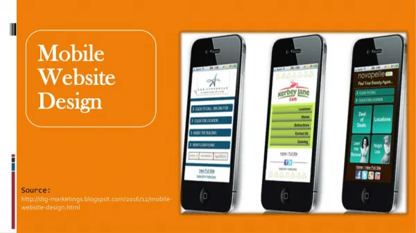
Best Examples of Effective Mobile Website Design Now a days, it is essential for every business to make a website that look good, work and perform better on your small screen devices. The success of any functional website depends on its degree of responsiveness that is ability to adapt to the screen in which it is being viewed. Research has shown that 91% of traffic comes from mobile devices, therefore it is an opportunity for every business owner to make a positive impression on its visitors. The responsive website is the best way to stand out and to execute the mobile design. Since Google is giving priority to mobile –friendly websites, developers and designers are considering the mobile functionality to create the best user – experience when browsing on mobile. A responsive Web Design helps you keep your customers or users coming back to your website for more business. To create a responsive website keep these principles in mind: Consistency: Provide visitors with the same tools and features for browsing and filtering across all devices.
Use space intuitively:Focus the visitor’s attention on the most important elements Make your site clean and give a clear CTA (call to action –for example, “buy!”). Put the viewer in control: Provide device specific user interactions and give the viewer the ability to choose what kind of user experience they want. Here is a list of some beautiful websites which really nailed it on mobile web experience. 1) Shutterfly 2) Google Maps
3) Typeform 4) Adrian Zumbrunnen
9) Zappos Hopefully these responsive design inspirations help you create an engaging and user friendly website with required functionality and information. Website Design Toronto: iMediadesigns provide cost effective, innovative responsive web design solutionsand offer custom web development services in Toronto