Download
1 / 29
290 likes | 391 Vues
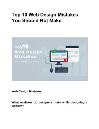
Mistakes in Web Design. Top 10 Mistakes in Web Design. 10. Long download times 9. Outdated info 8. Link colors & consistency 7. Lack of navigation support 6. Long pages 5. Orphan pages 4. Complex URLs 3. Animations 2. Gratuitous use of bleeding edge technology 1. Frames.

E N D
Top 10 Mistakes in Web Design 10. Long download times 9. Outdated info 8. Link colors & consistency 7. Lack of navigation support 6. Long pages 5. Orphan pages 4. Complex URLs 3. Animations 2. Gratuitous use of bleeding edge technology 1. Frames
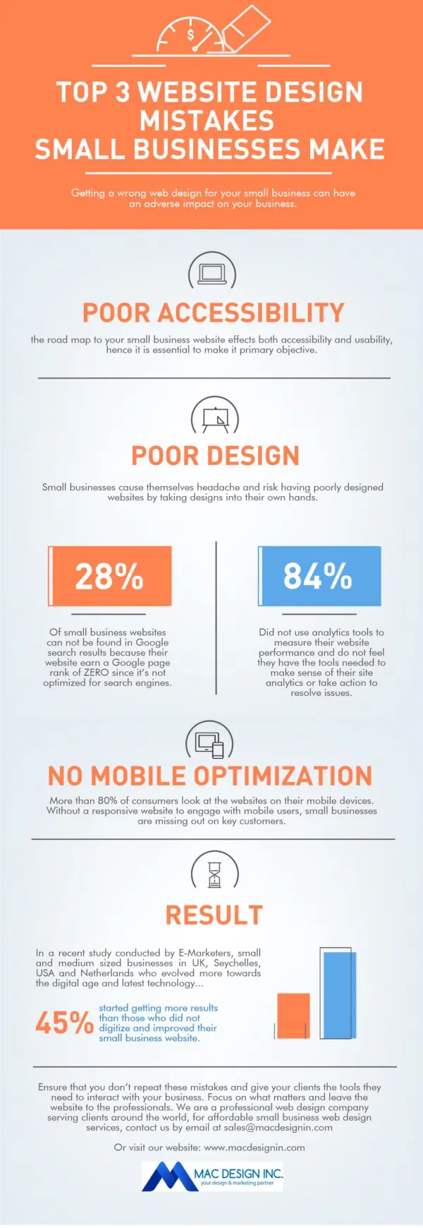
10. Overly Long Download Times • 10 second rule • amount of wait time before users lose interest • traditional human factors studies back this up • 15 seconds may be acceptable on web • people are getting trained to endure • but only for a few key pages
9. Outdated Information • Most people rather create content than do maintenance • Cheap way of enhancing content • still relevant link to new pages • otherwise remove them • Outdated content also leads to a lack of trust (important for e-commerce)
8. Non-standard Link Colors • Links to • pages that haven’t been seen are blue • previously seen pages are purple/red • Don't mess with these colors • one of the few standard navigational aides • consistency is important for learning • don’t underline other objects with blue/red! • this is a Web Design Pattern (talk more about this later)
Bad! Side Note: Consistency Don’t make things that look like buttons unless they act like buttons (or opposite)
7. Lack of Navigation Support • Users don’t know much about your site • they always have difficulty finding information • give a strong sense of structure and place • Communicate site structure • provide a site map • so users know where they are & where they can go • provide a good search feature • the best navigation support will never be enough • People now expect these • site logo in upper left linked to home page • outline structure showing where you are currently at
6. Long Scrolling Pages • Many users do not scroll beyond visible section when page comes up • All critical content & navigation should be on the top part of the page • Leaf nodes can be longer • people who have that interest will be reading it • still good to be brief • Becoming less of an issue • top items will STILL dominate • should be careful not to go past 3 screens max.
5. Orphan Pages • All pages should have a clear indication of what web site they belong to • users may not come in through your home page • Every page should have • a link up to your home page • some indication of where they fit within the structure of your information space
3. Constantly Running Animations • Don’t have elements that move incessantly • moving images have an overpowering effect on the human peripheral vision • no animations, scrolling text, marquees • Users tune them out • so nothing important there! • Give your user some peace and quiet to actually read the text!
2. Gratuitous use of Bleeding Edge Technology • Don’t try to attract people using it • you’ll get the nerd crowd, but mainstream users care about content and service • If their system crashes • they will never come back • E.g., use VRML if your info maps to 3d • architectural design or surgery planning • Caveat: appropriate if selling those products
1. Using Frames • Lose predictability of user actions • what information appears where when you click? • can’t bookmark the current page & return to it • fixed in Explorer 5 • URLs stop working • can’t share with others (lose social filtering) • emailing links still doesn’t work...
Frames (cont.) • Search engines have problems w/ frames • what part of frames do you include in indexes? • Early surveys found most users preferred frame-less sites • recent surveys back this up ~70-90%
References • Nielsen’s top 10 list (required reading) • http://www.useit.com/alertbox/9605.html • Web pages that suck • http://www.webpagesthatsuck.com/ • Net tips for designers • http://www.dsiegel.com/tips/ • User Interface Engineering • http:///www.uie.com
Other Hints for Web Usability • Page titles • Text size and color • Better thumbnails • Assumptions • Writing for the web • Feedback • Image tags
Page Titles • Pages should have <TITLE> in header • Important for navigation • bookmark lists, history lists, search engines • Enough info to stand on its own • often taken out of context (search engines) • Long titles slow users down (trade-off) • optimize for quick scanning with keywords first • “My Company - Home page” vs. “Welcome to My ...” • Different pages -> different titles
Text Size and Color • Don’t use blue/red colored text • Don’t use red combined with blue • hard on the eyes • Designers often think the default font is wrong • acceptable to change a small amount of text • not recommended to change all text on a page • the user set that size for a reason! • reading comfort for that person on their monitor
Better Thumbnails • Thumbnails • represent images that are too big to be downloaded w/o user command • Smaller • scaling or cropping don’t work well
Relevance-EnhancedImage Reduction • First crop and then scale • e.g., to get a thumbnail that is 10% of original • crop by 32% • then scale by 32% • .32 * .32 = .1 of the original • Balance between detail & context
Don’t Make Assumptions • Browser • people use many different browsers • Netscape, Explorer, Lynx, etc. • Window size • not everyone uses the default window size
Writing for the Web • Be succinct • 25% slower to read from a computer screen • write 50% less (people don’t scroll) • Write for scannability • people scan -- they don’t read • structure with 2 or 3 levels of headlines • use meaningful headings and emphasis
Writing for the Web (cont.) • Use hypertext to split-up information • split info into chunks of coherent topics • user inverse pyramid style (conclusions first)
Animation • Higher click-thru rates, but • Annoyed users • Could be useful in conveying information
FRAME • not so bad, but • make sure large frame changes are obvious as a result of clicks in small (TOC) frame
Links • Users had trouble with short links • “If you click on Disneyland, will you get a map of the park? Ticket Information, etc?” • Longer links clearly set expectations • “How to Read the Pricing and Rating Listings” • “Pricing (How to Read Pricing & Rating Listings) • Links embedded in paragraphs are bad • hard to find information • can’t skim - must now read
References • Nielsen’s top 10 list • http://www.useit.com/alertbox/9605.html • Web pages that suck • http://www.webpagesthatsuck.com/ • Net tips for designers • http://www.dsiegel.com/tips/ • User Interface Engineering • http:///www.uie.com
Summary • Make sure to • use page <title> tags • watch assumptions • user’s text size, browser type, & window size • make better thumbnails & use image tags • write for the web • give better feedback about links