Download
1 / 32
390 likes | 682 Vues
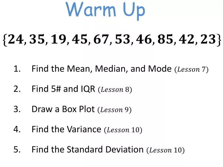
Warm Up. Find the Mean, Median, and Mode Find 5# and IQR Draw a Box Plot Find the Variance Find the Standard Deviation . Activity 2.3—Who buys iMacs?. Turn to page 82 in your textbooks. As a group work through Activity 2.3. Be prepared to share your results with the class.

E N D
Warm Up Find the Mean, Median, and Mode Find 5# and IQR Draw a Box Plot Find the Variance Find the Standard Deviation
Activity 2.3—Who buys iMacs? Turn to page 82 in your textbooks. As a group work through Activity 2.3. Be prepared to share your results with the class.
Activity 2.3—Who buys iMacs? Although the heights of the pictures are accurate, our eyes respond to the area of the pictures. This pictograph makes it seem like the percent of iMac buyers who are former Mac owners is at least ten times higher than either of the other two categories, which isn’t the case. The bar graph on the right is misleading. By starting the vertical scale at 10 instead of 0, it looks like the percent of iMac buyers who previously owned a PC is less than half the percent who were first time computer buyers. We get a distorted impression of the relative percents in the three categories. Only 60/500 or 12% of iMac buyers were former PC users.
Line Graph—Time Series Graph Many quantitative variables are measured at intervals over time. The key is change over time. To display change over time, always make a line graph. A line graph plots each data point against the time at which it was measured. Always put time on the horizontal scale of your plot and the variable you are measuring on the vertical scale.
Example The number of vehicles, both passenger and commercial, that used the Pennsylvania Turnpike for the years 1999 through 2003.
Steps to Draw a Line Graph Draw and label the x- and y-axes. Plot points according to the table. Draw line segments to connect adjacent points.
Check 4 3 2 Number of Record High Temperatures 1 0 March April May June July August Months
Line Graph Patterns If you are looking for a pattern, first look for an overall pattern. A trend is a long term upward or downward movement over time. Next, look for striking deviations of the overall pattern.
Line Graphs The number of unmarried couples living together has increased in recent years. The line graphs below present the number of unmarried-couple households in the US. The graph on the left suggests a steady but moderate increase. The right-hand graph says that cohabitation is rapidly increasing.
Watch those scales! Both graphs plot the same data, but the effect of changing the scales makes the right-hand graph appear to increase much more rapidly.
How much is a pound worth? The figure below shows a graph that appeared in the Lexington (Kentucky) Herald-Leader of October 5, 1975.
Pictogram A pictogram is a bar graph in which pictures replace the bars. This variation of a bar graph is attractive but misleading. The numbers above the pens show that advertising spending in Time is 1.64 times as great as in Newsweek. Why does the graph suggest that Time is much farther ahead?
Misleading Pictograms All 900 students in an elementary school responded to the following survey question: “What is your favorite animal to have as a pet?” The following is a pictogram representation of the results. Do you see how this graph is misleading?
Are the numbers consistent? News reports of snowstorms say things like “A winter storm spread snow across the area, causing 28 minor traffic accidents.” Eric Meyer decided to ask the sheriff how many minor accidents are typical in good weather: about 48, said the sheriff. Perhaps the news should say, “Today’s winter storm prevented 20 minor traffic accidents.”
Summertime is burglary time An advertisement for a home security system says, “When you go on vacation, burglars go to work. According to FBI statistics, over 26% of home burglaries take place between Memorial Day and Labor Day.” This is supposed to convince us that burglars are more active in the summer vacation period. Look at your calendar. There are 14 weeks between Memorial Day and Labor Day. As a percent of the 52 weeks in the year, this would be…
Drunk driving A newspaper article on drunk driving cited data on traffic deaths in Rhode Island: “42% of all fatalities occurred on Friday, Saturday, and Sunday, apparently because of increased drinking on the weekends.” What percent of the week do Friday, Saturday, and Sunday make up?
Don’t dare to drive? A university sends a monthly newsletter on health to its employees. A recent issue included a column called “What Is the Chance?” that said: “Chance that you’ll die in a car accident this year: 1 in 75.” There are about 305 million people in the United States. About 40,000 people die each year from motor vehicle accidents. What is the chance a typical person will die in a motor vehicle accident this year?
Misleading Percents! An ad for a new electronic toothbrush says that it "reduces the amount of plaque on teeth by 300 percent." What does this even mean?
Misleading Graphs About how many times taller does the July 1990 bar appear to be than the July 1991 bar? Read the graph. How many jobs were there in July 1990? In July 1991? How many more jobs were there in July 1990 than in July 1991? Compare your answers to Exercises 1-3. Could the bar graph be misleading? If so, how would you correct the graph?
Misleading Graphs The number of endangered bird species in Hawaii appears to be how many times greater than the number of endangered bird species in Texas? Texas has how many endangered bird species? Hawaii has how many endangered bird species? Could the bar graph be misleading? If so, how would you correct the graph?
Misleading Graphs Can you see what is wrong with this graph?
Misleading Graphs Can you see what is wrong with this graph?
Misleading Graphs Can you see what is wrong with this graph?
Misleading Graphs Can you see what is wrong with this graph?
Misleading Graphs Can you see what is wrong with this graph?
Misleading Graphs Can you see what is wrong with this graph?
Make GOOD Graphs! Principles for making good graphs: Make sure labels and legends tell what variables are plotted, what their units are, and the source of the data
Make GOOD Graphs! Principles for making good graphs: Make the data stand out. Be sure that the actual data, not labels, grids, or background art, catch the viewer’s attention.
Make GOOD Graphs! Principles for making good graphs: Pay attention to what the eye sees. Be careful choosing scales. Avoid pictograms. Avoid 3D effects.
Homework Line Graph & Misuse Worksheet Due Monday