Download
1 / 40
410 likes | 525 Vues
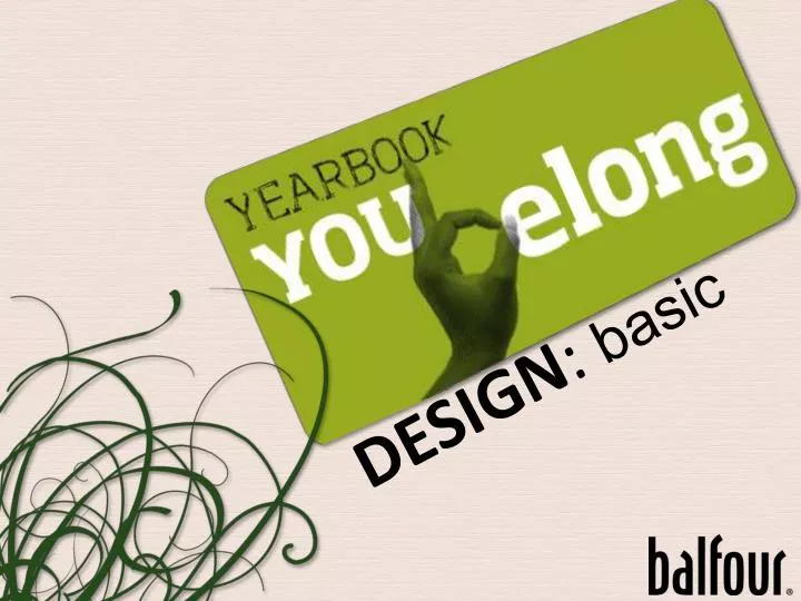
DESIGN : basic. Basic Design. [Organized arrangement] of images & words to tell a story. Elements of Design. ■ Photos. ►captions. ■ Copy. ►headline & story. ■ White space. Don’t underestimate the importance and impact white space has on your spreads!. Placement of elements.

E N D
Basic Design [Organized arrangement] of images & words to tell a story
Elements of Design ■ Photos ►captions ■ Copy ►headline & story ■ White space Don’t underestimate the importance and impact white space has on your spreads!
Placement ofelements White space Words Photos Verbal and visual elements create a bull’s-eye effect
Design steps #1 layout into columns of equal sizes. Determine foundational structure by dividing
DesignCAUTION All elements must begin and end on a column. 2 columns 3 columns 2 ½ 1 col. 3 ¾ 1 ¼ All elements begin and end on a column
Design steps #2 Establish the external margins The amount of white space that surrounds the spread.
Design steps Note the gutter and the internal spacing #3 (The 1 pica of white space between columns.)
Design steps #4 Place an eyeline.
DesignCAUTION Placement of the eyeline (Place in upper or lower third, never in the middle) But not here… Here…
Design steps Place a vertical axis that meets your eyeline #5 at what is called the axis point.
Design steps #6 Select and place dominant photo at axis pt.
Design steps Place headline/copy area near dominant #7 photo to reinforce message.
Design steps #8 Place next largest photo at axis point.
Design steps Continuing to work from the axis point, place your next photo. #9
Design CAUTION Pause and consider caption placement. (Avoid temptation to fill in the corners.)
Design IMPERATIVE Vary the shapes and sizes of rectangular photos.
Design steps Working from the eyeline, place the remaining photos. #10
Design imperative Photos should rest on or hang down from the eyeline
Design CAUTION Pictures that bleed run completely off the page. Avoid running pictures into the outside margins, unless they bleed.
Design steps #11 Place a caption for each photo. (Captions may differ in length, but must be the same width.)
Design steps #12 Begin design check.
2Design CHECK Does a photo or copy element touch each margin? ■ Consistent external margin
2Design CHECK ■ Consistent internal spacing Is there 1 pica separation between each element?
2Design CHECK ■ Eyeline Do the photo edges create a line of white space that spans across two facing pages?
Design CAUTION Avoid placing pictures on the spread that are the exact size & shape unless the content is related. X X X X X X
2Design CHECK Do the layout of elements flow from the inside out, from black to gray to white? ■ Bull’s-eye effect
2Design CHECK ■ Captioning Do you have a caption block for every photo?
2Design CHECK Do you have white spaced trapped on the inside? Example of trapped copy ■ White space to outside
2Design CHECK ■ Photo cropping and placement Aim for a variety of content & balanced coverage
2Design CHECK ■ Photo cropping and placement Numbers: 1 person, 2 people, small group, large group Boys vs Girls: Do you have a balance?
2Design CHECK Replace photos or redesign as needed. Primary headline
Design MAXIMIZATION #14 ■ Use your layout to create others
Design MODIFICATIONS Original Design > ■ Mirror
Design MODIFICATIONS Original Design > ■ Flip
Design MODIFICATIONS Original Design > ■ Mirror-Flip
Design MODIFICATIONS ■ Mirror ■ Original ■ Mirror-Flip ■ Flip
Design MODIFICATIONS ■ You can remove a photo and add a secondary package
Your turn ■ Design a layout using an eight-column format ■ Place your eyeline ■ Use 7-9 photos, varying size ■ Create a headline with a secondary headline & place over the copy area ■ Make sure every picture has a caption placed logically near the photo it identifies ■ Check your layout before turning it in
This PowerPoint presentation was created by Balfour Yearbooks, Dallas, Texas, for educational purposes only. It is unlawful to remove or alter the Balfour logo without the permission of Balfour Yearbooks’ Marketing Department. For more information, contact Judi Coolidge, Education Specialist at judi.coolidge@balfour.com.