Download
1 / 116
1.31k likes | 1.64k Vues
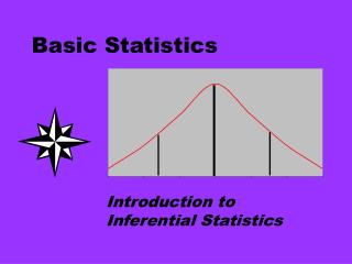
Basic Statistics. Content. Data Types Descriptive Statistics Graphical Summaries Distributions Sampling and Estimation Confidence Intervals Hypothesis Testing (Statistical tests) Errors in Hypothesis Testing Sample Size. Data Types. Motivation.

E N D
Content • Data Types • Descriptive Statistics • Graphical Summaries • Distributions • Sampling and Estimation • Confidence Intervals • Hypothesis Testing (Statistical tests) • Errors in Hypothesis Testing • Sample Size
Motivation Defining your data type is always a sensible first consideration You then know what you can ‘do’ with it
Variables • Quantitative Variable • A variable that is counted or measured on a numerical scale • Can be continuous or discrete (always a whole number). • Qualitative Variable • A non-numerical variable that can be classified into categories, but can’t be measured on a numerical scale. • Can be nominal or ordinal
Continuous Data • Continuous data is measured on a scale. • The data can have almost any numeric value and can be recorded at many different points. • For example: • Temperature (39.25oC) • Time (2.468 seconds) • Height (1.25m) • Weight (66.34kg)
Discrete Data • Discrete data is based on counts, for example: • The number of cars parked in a car park • The number of patients seen by a dentist each day. • Only a finite number of values are possible e.g. a dentist could see 10, 11, 12 people but not 12.3 people
Nominal Data • A Nominal scale is the most basic level of measurement. The variable is divided into categories and objects are ‘measured’ by assigning them to a category. • For example, • Colours of objects (red, yellow, blue, green) • Types of transport (plane, car, boat) • There is no order of magnitude to the categories i.e. blue is no more or less of a colour than red.
Ordinal Data • Ordinal data is categorical data, where the categories can be placed in a logical order of ascendance e.g.; • 1 – 5 scoring scale, where 1 = poor and 5 = excellent • Strength of a curry (mild, medium, hot) • There is some measure of magnitude, a score of ‘5 – excellent’ is better than a score of ‘4 – good’. • But this says nothing about the degree of difference between the categories i.e. we cannot assume a customer who thinks a service is excellent is twice as happy as one who thinks the same service is good.
Motivation • Why important? • extremely useful for summarising data in a meaningful way • ‘gain a feel’ for what constitutes a representative value and how the observations are scattered around that value • statistical measures such as the mean and standard deviation are used in statistical hypothesis testing
Session Content • Measures of Location • Measures of Dispersion
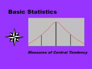
Measures of Location • Measures of location • Mean • Median • Mode • The average is a general term for a measure of location; it describes a typical measurement
Mean • The mean (arithmetic mean) is commonly called the average • In formulas the mean is usually represented by read as ‘x-bar’ • The formula for calculating the mean from ‘n’ individual data-points is; x-bar equals the sum of the data divided by the number of data-points
Median • Median means middle • The median is the middle of a set of data that has been put into rank order • Specifically, it is the value that divides a set of data into two halves, with one half of the observations being larger than the median value, and one half smaller Half the data < 29 Half the data > 29 18 24 29 30 32
Mode • The mode represents the most commonly occurring value within a dataset • Rarely used as a summary statistic • Find the mode by creating a frequency distribution and tallying how often each value occurs • If we find that every value occurs only once, the distribution has no mode. • If we find that two or more values are tied as the most common, the distribution has more than one mode
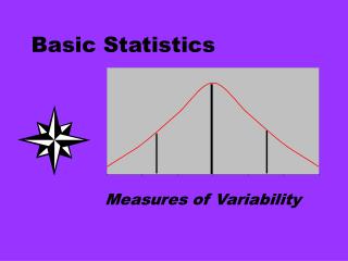
Measures of Dispersion • Range • Interquartile range • Variance • Standard deviation
2 4 6 8 10 12 14 16 2 4 6 8 10 12 Length of stay in hospital (days) Measures of spread • The spread/dispersion in a set of data is the variation among the set of data values • They measure whether values are close together, or more scattered Length of stay in hospital (days)
Days 4 16 Range Range • Difference between the largest and smallest value in a data set • The actual max and min values may be stated rather than the difference • The range of a list is 0 if all the data-points in the list are equal
Interquartile Range Days 12 4 9 20 Q1 Q3 Interquartile range • Measures of spread not influenced by outliers can be obtained by excluding the extreme values in the data set and determining the range of the remaining values • Interquartile range = Upper quartile – Lower quartile
Variance • Spread can be measured by determining the extent to which each observation deviates from the arithmetic mean • The larger the deviations, the larger the variability • Cannot use the mean of the deviations otherwise the positive differences cancel out the negative differences • Overcome the problem by squaring each deviation and finding the mean of the squared deviations = Variance • Units are the square of the units of the original observations e.g. kg2
Standard Deviation • The square root of the variance • It can be regarded as a form of average of the deviations of the observations from the mean • Stated in the same units as the raw data
Mean 1 SD 1 SD Mean 1 SD 1 SD 8 10 12 4 6 8 10 12 14 16 Standard Deviation (SD) Smaller SD = values clustered closer to the mean Larger SD = values are more scattered Days
Variance & Standard Deviation • The following formulae define these measures Population Sample
Variation within-subjects • If repeated measures of a variable are taken on an individual then some variation will be observed • Within-subject variation may occur because: • the individual does not always respond in the same way (e.g. blood pressure) • of measurement error • E.g. readings of systolic blood pressure on a man may range between 135-145 mm Hg when repeated 10 times • Usually less variation than between-subjects
Variation between-subjects • Variation obtained when a single measurement is taken on every individual in a group • Between-subject variation • E.g. single measurements of systolic blood pressure on 10 men may range between 125-175 mm Hg • Much greater variation than the 10 readings on one man • Usually more variation than within-subject variation
Session Summary • Measures of Location • Measures of Dispersion
Motivation • Why important? • extremely useful for providing simple summary pictures, ‘getting a feel’ for the data and presenting results to others • used to identify outliers
Session Content • Bar Chart • Pie Chart • Box Plot • Histogram • Scatter Plot
Displaying frequency distributions • Qualitative or Discrete numerical data can be displayed visually in a: • Bar Chart • Pie Chart • Continuous numerical data can be displayed visually in a: • Box Plot • Histogram
Bar Chart • Horizontal or vertical bar drawn for each category • Length proportional to frequency • Bars are separated by small gaps to indicate that the data is qualitative or discrete
Pie Chart • A circular ‘pie’ that is split into sections • Each section represents a category • The area of each section is proportional to the frequency in the category
Example: Pie Chart What could improve this chart?
Box Plot • Sometimes called a ‘Box and Whisker Plot’ • A vertical or horizontal rectangle • Ends of the rectangle correspond to the upper and lower quartiles of the data values • A line drawn in the rectangle corresponds to the median value • Whiskers indicate minimum and maximum values but sometimes relate to percentiles (e.g. the 5th and 95th percentile) • Outliers are often marked with an asterix
Histogram • Similar to a bar chart, but no gaps between the bars (the data is continuous) • The width of each bar relates to a range of values for the variable • Area of the bar proportional to the frequency in that range • Usually between 5-20 groups are chosen
‘Shape’ of the frequency distribution • The choice of the most appropriate statistical method is often dependent on the shape of the distribution • Shape can be: • Unimodal – single peak • Bimodal – Two peaks • Uniform – no peaks, each value equally likely
Unimodal data • When the distribution is unimodal it’s important to assess where the majority of the data values lie • Is the data: • Symmetrical (centred around some mid-point) • Skewed to the right (positively skewed) – long tail to the right • Skewed to the left (negatively skewed) – long tail to the left
Displaying two variables • If one variable is categorical, separate diagrams showing the distribution of the second variable can be drawn for each of the categories • Clustered or segmented bar charts are also an option • If variables are numerical or ordinal then a scatter plot can be used to display the relationship between the two
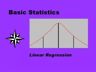
Fitting the Line • If the scatter plot of y versus x looks approximately linear, how do we decide where to put the line of best fit? • By eye? • A standard procedure for placing the line of best fit is necessary, otherwise the line fitted to the data would change depending on who was examining the data
Regression • The least-squares regression method is used to achieve this • This method minimises the sum of the squared vertical differences between the observed y values and the line i.e. the least-squares regression line minimises the error between the predicted values of y and the actual y values • The total prediction error is less for the least-squares regression line than for any other possible prediction line
Example: Scatter Plot with Regression Line Weight Loss = 1.69 + 3.47 Time on Diet
Session Summary • Bar Chart • Pie Chart • Box Plot • Histogram • Scatter Plot
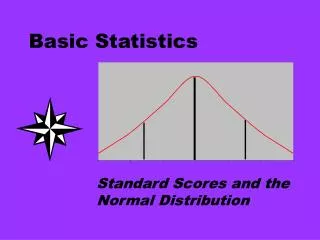
Motivation • Why important? • if the empirical data approximates to a particular probability distribution, theoretical knowledge can be used to answer questions about the data • Note: Empirical distribution is the observed distribution (observed data) of a variable • the properties of distributions provide the underlying theory in some statistical tests (parametric tests) • the Normal Distribution is extremely important
Important point • It is not necessary to completely understand the theory behind probability distributions! • It is important to know when and how to use the distributions • Concentrate on familiarity with the basic ideas, terminology and perhaps how to use statistical tables (although statistical software packages have made the latter point less essential)