Download
1 / 12
120 likes | 202 Vues
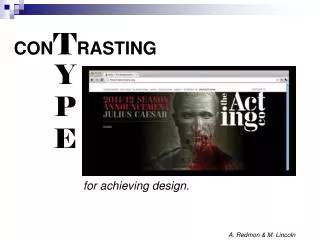
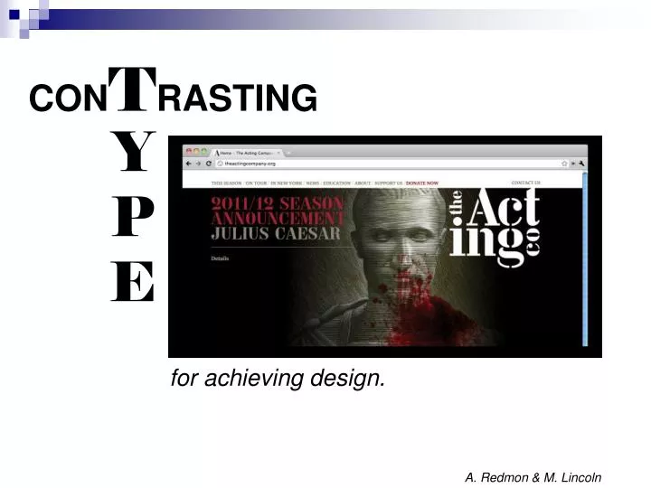
CON T RASTING. Y P E. for achieving design. A. Redmon & M. Lincoln. Using type for Design:. A process of grouping two typographical elements and using different methods to create contrast. 6 Ways to Contrast Type. Size vary the size of the words Weight vary the thickness of strokes

E N D
CONTRASTING Y P E for achieving design. A. Redmon & M. Lincoln
Using typefor Design: A process of grouping two typographical elements and using different methods to createcontrast.
6 Ways to Contrast Type • Size • vary the size of the words • Weight • vary the thickness of strokes • Structure • use two fonts from different categories that look very different
6 Ways to Contrast Type • Form • vary the shapes of the words – - italics vs. normal, - lowercase vs. Upper And Lowercase 5. D i r e c t i o n • combine horizontal and vertical type or blocks of text Color
1. Size: • The eye is immediately drawn to the "super sized" G. • The word "Jiong" is the first thing you pay attention to on the page because of the G. • The key point here is that the font used for the lettering is the same.
3. Structure:Use two fonts from different categories that look very different.
4. Form:Vary the shapes of the words - italics versus normal - lowercase versus upper and lowercase arial narrow meetsArial Black
5. Direction:Combine horizontal and vertical type or blocks of text.
6. Color: Notice how the most important word in the title is ‘FIRST” and how it contrasts rather nicely with the rest of the text.
Hmmm, how can you use to create if you are only printing in black and white ? color contrast
Sources: 3st: The Acting Company. Web Page. 20 September 2011. <http://happenings.3st.com/>. Van Loon, T. & Valicenti, R. Loeb Fellowship Poster. 20 September 2011. <http://happenings.3st.com/>. Jiong. Image Six. 20 September 2011. <http://www.tomontheweb2.ca/CMX/D4FBD/>. Dair, C. Image Nine. 20 September 2011. <http://www.tomontheweb2.ca/CMX/D4FBD/>. Vorzie. Typography/Structure. 20 September 2011. http://www.vorzie.com/html/typography.html. Tomontheweb2. Image Ten. 20 September 2011. <http://www.tomontheweb2.ca/CMX/D4FBD/>. 3st: The Acting Company. The Acting company Logo. 20 September 2011. http://3st.com/#/clients/cultural_leaders/the_acting_company. Istuff. 50FirstDates. 20 September 2011. <http://istuff21.blogspot.com/2011/09/various-artists-50-first-dates-love.html>.