Download
1 / 15
160 likes | 222 Vues
T03-02 Calculate Descriptive Statistics With Histogram.

E N D
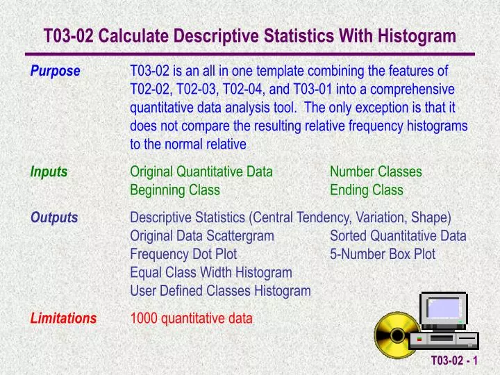
T03-02 Calculate Descriptive Statistics With Histogram Purpose T03-02 is an all in one template combining the features of T02-02, T02-03, T02-04, and T03-01 into a comprehensive quantitative data analysis tool. The only exception is that it does not compare the resulting relative frequency histograms to the normal relative Inputs Original Quantitative Data Number Classes Beginning Class Ending Class Outputs Descriptive Statistics (Central Tendency, Variation, Shape) Original Data Scattergram Sorted Quantitative Data Frequency Dot Plot 5-Number Box Plot Equal Class Width Histogram User Defined Classes Histogram Limitations 1000 quantitative data
An Example A college professor has the test results shown here. He is interested in the producing SummaryDescriptiveStatistics for CentralTendencyVariationShape He is also interested in calculating the 93rd percentile. Also, he would like to produce an EqualClassWidthHistogram (10 classifications) and GradeDistributionHistogram (ABCDF on a 10 point scale) of the data.
Data can either be entered directly into the OriginalData cells or copy/paste special/values into the cells.
Cell A1 allows you to set the decimal point accuracy for the Descriptive Statistics Calculations.
Once the data is entered Sample Descriptive Statistics are automatically calculated. Scrolling through the sheet will show all the calculations.
Scrolling down to row 17 in the spread sheet you will find the Percentile Input Cell. For the 93rd percentile, we enter .93 and the 93rd percentile is calculated automatically.
The SortMacro can be run to sort the OriginalData into the SortedData cells. This also automatically calculates the necessary information for the DotPlot.
Scrolling down to row 39 in the spread sheet you will find the EqualWidthClassHistogramInput/Output information. The Histogram by # Classes Macro is run to calculate the FrequencyCounts by classification.
Scrolling down to row 60 in the spread sheet you will find the User Selected Classes HistogramInput/Output information. The Histogram by Fixed Classes Macro is run to calculate the FrequencyCounts by classification.
WorksheetTabs can be selected to view the Original Data Scattergram, Frequency Dot Plot & 5 Number Box Plot, Histogram - # Classes, and Histogram – User Defined Classes
The Scattergram displays a plot of the observations in the sequence they were entered.
The 5 Number Box Plot (Min, Q1, Median, Q3, Max) is shown here.
The Equal Class Width Histogram displays a graphical plot of the information on the Data Sheet Histogram Output.
The User Defined Classes Histogram displays a graphical plot of the information on the Data Sheet Histogram Output.