Download
1 / 52
520 likes | 805 Vues
Responsive Design. In Class Today. Review Course Project Review Homework Assignment Responsive Design Presentation In Class Assignment. Overview. What is Responsive Design? Media Queries Variable Width design Trending Development Frameworks In class assignment.

E N D
In Class Today • Review Course Project • Review Homework Assignment • Responsive Design Presentation • In Class Assignment
Overview • What is Responsive Design? • Media Queries • Variable Width design • Trending Development Frameworks • In class assignment
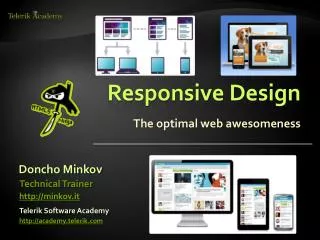
Responsive Design 101 • Pretty basic • Write CSS for different browser sizes, device capabilities and aspect ratios using ‘Media Queries’ • Media Queries will query the media you are using and use the appropriate CSS (respond) in real-time (without reloading the page)
Viewport • Meta tag • Used to control the viewport's size and scale • Accepts either a positive integer or keyword
Viewport • Chapter 2 – Examining the mobile viewport & Controlling viewports
Media Queries = Expression • A media query is a logical expression that is either true or false • The CSS associated with the media query expression is only applied to the device if the expression is true.
Media Queries • Allow web developers to change our layouts to suit the exact need of different devices - without changing the content. • a CSS3 extension to media types that gives us more control over rendering across different devices
Initializing Media Queries • @media rule • @import rule • Separate style sheet
Logical Operators • Help build powerful expressions • Three different logical operators: • And • Not • Only • Syntax link rel=“stylesheet” href=“style.css” media=“[AND| NOT] screen[ONLY] (expression)”
AND Operator • Allows an extra condition to be added • Comma separated, acting as an unspoken or operator • Example:
NOT Operator • Negates the query, specifying any query but the one identified. • Example:
ONLY Operator • Hides style sheets from older or non-conforming user agents • Ignored by conforming user agents
Browser Support • Internet Explorer: 9.0+ • Firefox: 3.5+ • Chrome: 4.0+ • Safari: 3.1+ (a bit buggy until 4.0, however) • Opera: 9.5+ • iOS: 3.2+ • Android: 2.1+ • Windows Phone: 7.5+ (Mango) • Blackberry: 4.7.1+
Height & Width Media Features • One of the most common media features • Used with: height, width, device-height, and device-width • Height and width media features base off the height and width of the viewport rendering area
Media Query Breakpoints • 320px - Mobile portrait • 480px - Mobile landscape • 600px - Small tablet • 768px - Tablet portrait • 1024px - Tablet landscape/Netbook • 1280px & greater - Desktop
Media Queries • Chapter 2 – Understanding Media Queries and Creating breakpoints with media queries
Mobile First • Popular technique with using media queries • Saves user from having to load styles for desktop version
Fluid/Flexible Layout • A layout based on proportions rather than absolute • Built using relative length units, most commonly percentages or emunits • Relative lengths are used to declare common grid property values such as width, margin, or padding
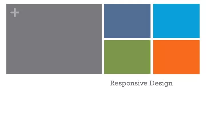
Fixed vsFluid/Flexible Fixed Fluid/Flexible
Using Fluid Grids • Chapter 2 - Using Fluid Grids
Advantages of using Grids • Great for content-rich sites • Device-friendly • Enhanced stability • Better engagement • Unmatched flexibility
Disadvantages of Using Grids • Restricted creativity • Lack of dynamic appeal • Steep learning curve • Not fit for all sites
What is a Responsive Framework? • A standardized set of concepts, practices and criteria for dealing with a common type of problem, which can be used as a reference to help us approach and resolve new problems of a similar nature. • Package of files and folders of standardized code (HTML, CSS, JS documents etc.) which can be used to support the development of websites
Trending Grid Frameworks • 960 Grid System (960.gs) • Unsemantic– (unsemantic.com) • Skeleton (www.getskeleton.com) • Skeleton for Wordpress(themes.simplethemes.com/skeleton) • Bootstrap (getbootstrap.com) • Compare (responsive.vermilion.com/compare.php)
Choosing the Right Framework • Speed of installation • Ease of understanding • Options • Integration with other systems • Best long-term support
Advantages of Frameworks • Speeds up the mock-up process • Clean and tidy code • Solutions to common CSS problems • Browser compatibility • Learn good practices • Having a single procedure to resolve common problems makes maintaining various projects more straightforward. • Helpful in collaborative work
Disadvantages of Frameworks • Mixes content and presentation • Unused code leftover • Slower learning curve • You don’t learn to do it yourself
Flexible Images • Chapter 2 – Making Images Responsive & Examining the future of responsive images
RWD vsOther Options • Native Apps • A native application (native app) is an application program that has been developed for use on a particular platform or device. • Mobile-Specific Website • A scaled down version of your site with any unnecessary content removed to improve its functionality and load speed on mobile devices.
Native Apps Pros Cons • Can provide a slick user experience • Can more easily access device features (camera, GPS, etc.) • Available for offline use • Very expensive • Hard to do well • Which platforms do you support? • Your users (probably) don't want a native app • You still need a website
Mobile-Specific Websites Pros Cons • Easier to optimize for speed • More freedom to create a unique mobile experience • Can more easily target less advanced devices, like feature phones • Have to deal intelligently with redirects • Ignores tablets for the most part • Tends to offer an incomplete experience
Responsive Design Pros Cons • Only have to maintain a single website • Don't need to deal with mobile-specific URLs • Addresses a wide multitude of devices: phones, tablets, desktops, etc. • More difficult to optimize properly for specific devices (for example, phones might get desktop-sized images) • Testing, testing, and more testing
Advantages of Responsive Design • Save Money • Save Time • Improved SEO • Better Performance • Wide Browser Support