Download
1 / 22
260 likes | 780 Vues
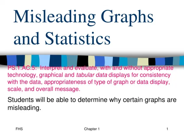
Misleading Graphs and Statistics. “Lies, damned lies, and statistics”. Statistics are commonly used to make a point or back-up one’s position 82.5% of all statistics are made up on the spot. The “Average” Person…. Be wary when politicians use the word “average” when making a point.

E N D
“Lies, damned lies, and statistics” • Statistics are commonly used to make a point or back-up one’s position • 82.5% of all statistics are made up on the spot.
The “Average” Person… • Be wary when politicians use the word “average” when making a point. • When the data are likely to be skewed, you should ask: • What kind of average did you use?
U.S. Income Distribution Source: http://visualizingeconomics.com/2006/11/05/2005-us-income-distribution/ 11/8/2007 3:07 PM
Manipulating Information • By adjusting the type and scale of graphical displays, they can be used to highlight desirable information or (hide undesirable information). • While this is not always bad, it should make you aware of the danger of taking graphical displays at face value. • You should also be wary of the results of surveys, especially when you do not know how the survey was collected / administered / worded.
Sampling Issues • Those being polled are not always honest! • (Imagine a cop surveying teens on drug use) • E.g. “The Bradley Effect” -- an issue related to race discrimination; getting a lot of airtime lately re: the election. • (There’s a “Reverse Bradley Effect” too!) • Is the sample biased (intentionally or not)? • (Political polls of likely voters under-represent cell-phone users)
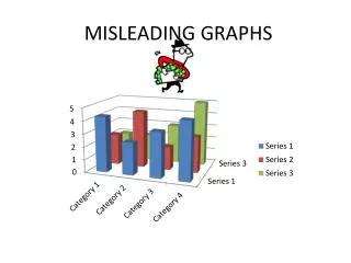
Ways to Manipulate Graphs • Scale and Axis Manipulation (Line, Bar Graphs) • Cropping to focus on desirable information (Esp. w/ Line Graphs) • Three dimensional effects (e.g., perspective & “volume”) • Pictorial Embellishments (e.g., “cartoon” effects, leading the readers’ eye)
Starting Point • Mayor Marcus is running for a second term against a challenger. Which graph should he send to the local journalist who is reporting on crime rates?
What’s wrong with this sample? • A uniformed police officer surveys teens at a local high school athletics competition about drug activity in the school. • Compare the following survey questions: • “Should the university use trees harvested during construction to build furniture in the new chemistry building?” • “Should the university cut down trees in the construction zone to use as furniture in the new chemistry building?”
What’s wrong with this sample? • Third grade students are asked, “How nutritious are your evening meals?” • Literary Digest magazine asked its subscribers to RSVP saying whether they would vote for Landon or for Roosevelt in the 1936 presidential election.