Download
1 / 28
280 likes | 569 Vues
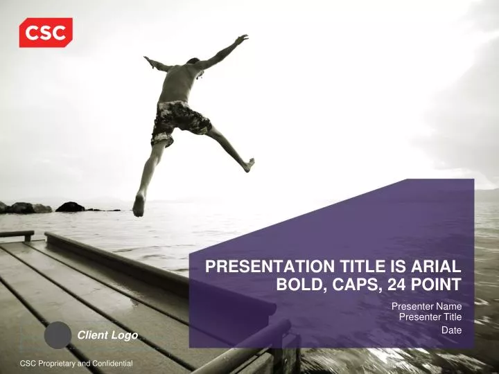
Client Logo. PRESENTATION TITLE IS ARIAL BOLD, CAPS, 24 POINT. Presenter Name Presenter Title Date. Agenda. Client Logo. Section Title Is Arial Bold, Title Case, 24 Point. Presenter Name Presenter Title. Slide Title Is Arial Bold, 22 Point Subtitle Is Arial, 20 Point.

E N D
Client Logo PRESENTATION TITLE IS ARIAL BOLD, CAPS, 24 POINT Presenter NamePresenter Title Date
Client Logo Section Title Is Arial Bold, Title Case, 24 Point Presenter NamePresenter Title
Slide Title Is Arial Bold, 22 PointSubtitle Is Arial, 20 Point • First-level bullet text is Arial 20 point • Second-level bullet text is 18 point • Third- and fourth-level bullet text is 16 point • Bullets should use sentence-style capitalization • Preferred line spacing is “.9 line spacing, and .4 before paragraph,” which can be accessed by selecting Format/Line Spacing • When using slide transitions, be careful not to use too many or distract from your information with unnecessary multimedia effects Takeaway text is white, 14 point Arial Bold within a charcoal box. Text is centered, has .9 line spacing, and uses sentence-style capitalization
We Have Preformatted Your Text Slides • Try this — select Insert/New Slide from the menu above • Then select this icon from the list • The new slide will provide you a place to begin typingyour title and text • This line is formatted for first-level text • Use a carriage return (Enter) for second-level text • Click one of these arrows on the toolbar to change levels • Do not insert a text box • The slide has already been formatted for your text • Text boxes create unnecessary work for you • Text boxes also create consistency problems Takeaway text is white, 14 point Arial Bold within a charcoal box. Text is centered, has .9 line spacing, and uses sentence-style capitalization
Client Logo Logo Positions • The CSC logo is set in the lower left-hand corner of the slide template • For more information on CSC logo usage, reference http://www.csc.com/styleguide/ds/21509-brand_elements_logo • When you place a client or partner logo into a presentation template, set it in the lower-right position as shown below (recommended, but not required) • Client logos should be sized to have weight equal to the CSC logo Takeaway text is white, 14 point Arial Bold within a charcoal box. Text is centered, has .9 line spacing, and uses sentence-style capitalization
Color Scheme • Consistent use of color presents a unified corporate image • Some palette colors are built into the PowerPoint “slide color scheme” • Most selections are based on Web-safe matches • RGB values for the approved color palette are listed below • Colors below can be selected from the Custom Colors area in the fill menu • Choose the standard brand colors first • Select colors with good value contrast (put darker next to lighter) for best prints • For reliable projection, use white or black text as shown here Ok for use STANDARD BRAND COLORS are embedded in the _FMT color palettes Don’t use Asparagus 136186 065 CSC Red 238037037 Dark Charcoal 099100102 CSCMidnight 000088130 White 255255 255037 CSCPlum 133000087 R:G:B: Ok for use Don’t use Sunset 255207001 CSC Charcoal 147149152 LightMidnight 088139163 DeepMidnight 000063096 Black 000 000 000 DarkPlum 056038088 R:G:B:
These Are Preformatted Text Boxes — Ready to Use The boxes below are theSTANDARD BRAND COLORS The boxes below are 75% opacityfor use in projection boxes over images Your New Text Here Your New Text Here Your New Text Here Your New Text Here Your New Text Here Your New Text Here Your New Text Here Your New Text Here Your New Text Here Your New Text Here Your New Text Here Your New Text Here Your New Text Here Your New Text Here Your New Text Here Your New Text Here Your New Text Here Your New Text Here Your New Text Here Your New Text Here Your New Text Here Your New Text Here Your New Text Here
Alignment Tips — PowerPoint 2007 • PowerPoint tools make it easier to align content consistently • Select Grid Settings to turn on PowerPoint guides • Align live guides with those shown on next page
3.38 H 3.25 H Guide Structure 2.2 H • Consistent placement and alignment of elements helps conveya clean and professional look • Try to align your content with the established guide lines Content placed outside these guide lines may not show when projected 0.00 V 3.45 V 4.11 V 4.62 V 3.45 V 4.11 V 4.62 V 2.45 H 3.00 H
Text, Typography, and Style Guidelines Lead lines, if required by the author, should be Arial Regular, 14 point • Body text and bullets should be flush left beginning at the top point on the slide • Bullets should use sentence-style capitalization with no periods at the end of each entry. If there is more than one sentence per bullet, the last sentence does not have a period • Tabular information and labels on charts and diagrams generally use title-style capitalization • Spell out “and” unless the ampersand is part of a proper name • “Cont’d” is the standard abbreviation for “continued” and should be placed in parentheses
Text, Typography, and Style Guidelines (Cont’d) • Always insert a space before an ellipsis (…) • Use em-dashes (—) and hyphens (-) appropriately • En-dashes (–) should not be substituted for em-dashes • Correct punctuation errors before finalizing • Do not double-space after periods — use a single space • Maintain consistency in number treatments, abbreviations, acronyms, etc.
Sample Organization Chart Legend • Tabular information and labels on charts and diagrams are generally title case and Arial Bold John Doe TitleOrganization Staff Cross-Functional P&L John Doe TitleOrganization John Doe TitleOrganization John Doe TitleOrganization John Doe TitleOrganization John Doe TitleOrganization John Doe TitleOrganization John Doe TitleOrganization John Doe TitleOrganization John Doe TitleOrganization John Doe TitleOrganization John Doe TitleOrganization • Linework is 1.5 point and 119 gray
Sample Bar Chart Sample Label
Sample Pie Chart Chart Title Data Label #8 Data Label #1 12.5% 12.5% Data Label #7 Data Label #2 12.5% 12.5% 12.5% 12.5% Data Label #6 Data Label #3 12.5% 12.5% Data Label #5 Data Label #4
Section Header When Required Arial, Charcoal Gray, 14 Pt, Title Case, 1.5 Pt Gray Rule, Left Indent = .5 A CSC Chart • Conveys concise, orderly messaging • Uses standard presentation color palette • Uses clean imagery to enhance meaning • Uses standardized icons where possible Connection Broker Microsoft Active Directory Centralized Virtual PCs Virtual Infrastructure(Servers, Storage, and Networks) VM Management
Basics of Charts, Diagrams, and Graphics no • Copy the sample table from the _FMT you are using • Use “Distribute Rows and Columns Evenly” when feasible • Copy the sample org or box array from the _FMT, using preset text in boxes and alignment tools • Copy the sample bar and pie charts from the _FMT,using preset styles and real data to create line, bar, and pie charts • Always use two-dimensional bar charts, etc. — three-dimensional charts skew data relationships • Do not place text over images 27% 43% 22% 8% yes no yes 27% 43% Collaboration 22% Collaboration 8%
Gradients • Avoid gradients unless they are necessary for understanding • If you must show depth, use a solid color • If you must use a gradient, do not angle it — if the end user’s printer driver does not support it, the angled gradient will explode • It is best to avoid the transparency function — many printer drivers do not support it To This Point Use a gradient to show movement when an arrow is not appropriate From Here * Use 3D only when essential to the meaning of the graphic no yes no yes*
Drop Shadows • Avoid drop shadows; they add visual clutter • Use drop shadows only when needed to enhance meaning • Check “high quality” in Print dialog box no no yes Acceptable PPT 2007 Shadow
Buttons and Bevels • Do not use bevels in chart designs; they add visual clutter • Use bevels and rounded shapes only when needed to enhance meaning • When the shape represents an actual interactive button, such as a Web icon • When the impression of depth is central to the meaning of the graphic • Check “high quality” in Print dialog box Process no yes • Use only a slight, elegant bevel, and maintain a consistent depth when resizing shapes • Or use a beveled shape from Photoshop (120 ppi, save for Web, 80% .jpg) • Or use a PPT 2007 bevel (Top, Height: 4, Width: 4, Material: Matte,Lighting: Neutral)
Separation of Like Objects Add white lines around objects to separate, when needed no yes no yes
A second box may emerge from the first Projecting from the notch of the logo Projecting from the short side of the logo Using a Projection Box as a Graphic • Projection boxes always carry the “voice of CSC” • Should not be used as a generic shape (e.g., not for flowcharts) • Do not always have to emerge from the CSC logo • Always five-sided • Fit type to square area of box • Add a notch to the projection box • It now has six sides
Slide Title Is Arial Bold, 22 Point, Title CaseSubtitle Is Arial, 20 Point, Title Case • First-level bullet text is 20 point • Second-level bullet text is 18 point • Third- and fourth-level bullet text is16 point • Bullets should use sentence-style capitalization • PowerPoint 2007 preferred paragraph spacing for 20 point type is 9.6 point before paragraph, and line spacing is multiple at 0.9, which can be accessed by selecting Home/Paragraph/Line Spacing Options • When using slide transitions, be careful not to use too many or distract from your information with unnecessary multimedia effects
Engagement Phases with Descriptions Phase I Phase Il Phase Ill Phase IV • First-level text should be Arial Bold, 14 point, with round bullets in CSC Red • Second-level text should be Arial Regular 14 point with an en-dash bullet • Third-level is Arial Regular 14 point with a round bullet set at 80% • First-level text should be Arial Bold, 14 point, with round bullets in CSC Red • Second-level text should be Arial Regular 14 point with an en-dash bullet • Third-level is Arial Regular 14 point with a round bullet set at 80% • First-level text should be Arial Bold, 14 point, with round bullets in CSC Red • Second-level text should be Arial Regular 14 point with an en-dash bullet • Third-level is Arial Regular 14 point with a round bullet set at 80% • First-level text should be Arial Bold, 14 point, with round bullets in CSC Red • Second-level text should be Arial Regular 14 point with an en-dash bullet • Third-level is Arial Regular 14 point with a round bullet set at 80% • *Footnote: 10 point Arial Regular • Note: 10 point Arial Regular • Source: 10 point Arial Regular
Client Logo Thank You