Download
1 / 3
30 likes | 123 Vues
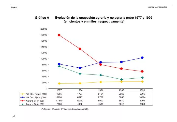
Gráfico A Evolución de la ocupación agraria y no agraria entre 1977 y 1999 (en cientos y en miles, respectivamente). (*) Fuente: EPAs del II Trimestre de cada año (INE). Gráfico B OFERTA Y DEMANDA DE TRABAJO EN LA AGRICULTURA (trabajo familiar, en miles).

E N D
Gráfico A Evolución de la ocupación agraria y no agraria entre 1977 y 1999 (en cientos y en miles, respectivamente) (*) Fuente: EPAs del II Trimestre de cada año (INE).
Gráfico B OFERTA Y DEMANDA DE TRABAJO EN LA AGRICULTURA (trabajo familiar, en miles) (*) Fuente: elaboración propia a partir de las EPAs del II Trimestre y de las Encuestas de Estructura de las Explotaciones Agrarias de cada año (INE).
Gráfico C OFERTA Y DEMANDA DE TRABAJO EN LA AGRICULTURA (trabajo no familiar, en miles) (*) Fuente: elaboración propia a partir de las EPAs del II Trimestre y de las Encuestas de Estructura de las Explotaciones Agrarias de cada año (INE).