Download
1 / 16
160 likes | 180 Vues
Learn how to analyze the correlation between fertilizer usage and grain production through scatterplots. Understand form, direction, and strength of association. Calculate correlation coefficient to interpret the relationship. Homework exercises included.

E N D
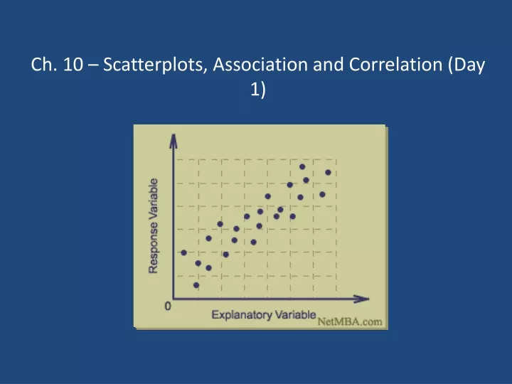
Scatterplots • So far, all of our analysis has looked at one variable at a time • In this chapter, we will look at the relationship between two variables • If the variables are quantitative, we can do this by starting with a graph called a scatterplot
Scatterplots • Ex Use the following data to examine the relationship between the amount of fertilizer (lbs per acre) used on plots of land in a particular farming region and the number of bushels per acre of grain produced.
THINK: How will we draw the graph? • To decide which variable will go on which axis, think about what you are trying to learn • Do the variables have an explanatory/response relationship? • In this case, we are wondering how the amount of fertilizer used affects the amount of grain produced • Fertilizer is the explanatory variable • Bushels produced is the response variable • In a scatterplot, the explanatory variable goes on the x-axis and the response variable goes on the y-axis • If we aren’t looking at this type of relationship for the variables, you can use either axis
SHOW: Draw the scatterplot • Don’t forget about labels and scale! 60 55 50 45 40 Bushels 30 40 50 60 70 80 Lbs of Fertilizer
TELL: What does a scatterplot show us? • In most of our previous graphs, we were looking for center, shape, and spread of a single quantitative variable • This time we are looking at the relationship between two quantitative variables • If the two variables seem related, this is referred to as an association • Specifically, we are looking at the form, direction and strength of the association
Form: Is it linear? • Our eventual goal is to create a model for the data • In order to decide which calculations to use, we need to first look at the form (shape) the pattern follows • A scatterplot has a linear form if a straight line could be used to describe it reasonably well • For now, we will simply describe form as linear or nonlinear Linear Nonlinear
Direction: Positive, Negative or No Association? • Once we decide that the form is linear, we now turn to direction • If y increases as x increases, this is a positive association • If y decreases as x increases, this is a negative association Positive association Negative association No association
Strength: Strong, Moderate, Weak? • The last thing we should address is the strength of the relationship • The conclusions we draw about strength are highly subjective, especially if they are based strictly on looking at the scatterplot Strong association Moderate association Weak association
Correlation Coefficient • r = correlation coefficient for linear relationships • Measures the strength and direction of a linear relationship between two quantitative variables
Calculating r 60 55 50 45 40 Bushels r = .9782 30 40 50 60 70 80 Lbs of Fertilizer
What does r tell us? • Close to +1 = strong, positive linear association • Close to -1 = strong, negative linear association • Close to 0 = weak or no linear association • r = 1 or r = -1 means a perfect linear correlation
Properties of r • r is a number between -1 and 1 • Since r is based on z-scores, it is not affected by shifting or re-scaling, and it has no units • The correlation of x with y is the same as the correlation of y with x (it doesn’t matter which variable is used as x or y – the correlation stays the same) • Remember that r only works for linear associations of quantitative variables • r is very sensitive to outliers – be careful! • Even though we have this numerical calculation, strength is still subjective – a value such as 0.68 that is considered strong for one set of data might be considered weak for another
Outliers • A scatterplot can also show us outliers • In this context, an outlier is a point which doesn’t seem to fit within the pattern formed by the rest of the data
Homework Pg. 542 # 12, 14, 16 Directions: Make a scatterplot of the data. Calculate the correlation coefficient and interpret what this means.