Download
1 / 48
570 likes | 991 Vues
Designing Great Visualizations. Jock D. Mackinlay Director, Visual Analysis, Tableau Software. Outline. Examples from the history of visualization Computer-based visualization has deep roots Human perception is a fundamental skill Lessons for designing great visualizations

E N D
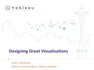
Designing Great Visualizations Jock D. Mackinlay Director, Visual Analysis, Tableau Software
Outline • Examples from the history of visualization • Computer-based visualization has deep roots • Human perception is a fundamental skill • Lessons for designing great visualizations • Human perception is powerful • Human perception has limits • Use composition and interactivity to extend beyond these limits • Finally, great designs tell stories with data • Image sources: • www.math.yorku.ca/SCS/Gallery • www.henry-davis.com/MAPS
Visual Representations are Ancient • 6200 BC: Wall image found in Catal Hyük, Turkey • Painting or map?
Two Common Visual Representations of Data Presentations: Using vision to communicate • Two roles: presenter & audience • Experience: persuasive Visualizations: Using vision to think • Single role: question answering • Experience: active 1999: Morgan Kaufmann
Maps as Presentation • 1500 BC: Clay tablet from Nippur, Babylonia • Evidence suggests it is to scale • Perhaps plan to repair city defenses
Maps as Visualization • 1569: Mercator projection • Straight line shows direction
William Playfair: Abstract Data Presentation • 1786:The Commercial and Political Atlas (Book) • 1801: Pie chart
Dr. John Snow: Statistical Map Visualization • 1855: London Cholera Epidemic • It is also a presentation Broad StreetPump
Charles Minard: Napoleon’s March • 1869: Perhaps the most famous data presentation
Darrell Huff: Trust • 1955: How to Lie With Statistics (Book) • Trust is a central design issue • Savvy people will always question data views • Does a data view include the origin? • Is the aspect ratio appropriate?
x x x x x x x x x x x x x x x x Jacques Bertin: Semiology of Graphics (Book) • 1967: Graphical vocabulary • Marks Points Lines Areas • Position • Statistical mapping • Retinal Color Size Shape Gray Orientation Texture
Jacques Bertin (continued) • Visual analysis by sorting visual tables • Technology
Jock Mackinlay: Automatic Presentation • 1986: PhD Dissertation, Stanford • Extended and automated Bertin’s semiology • APT: A Presentation Tool
Scientific Visualization • 1986: NSF panel and congressional support Wilhelmson et al
Richard Becker & William Cleveland • 1987: Interactive brushing Related marks Selection
Information Visualization • 1989: Stuart Card, George Robertson, Jock Mackinlay • Abstract data • 2D & 3D interactive graphics • 1991: Perspective Wall & Cone Tree
Task Book: Readings in Information Visualization • 1999: Over a decade of research • Card, Mackinlay, Shneiderman • An established process of visual analysis • Involves both data and view • Interactive and exploratory Data View DataTables Views RawData VisualStructures Data Transformations Visual Mappings View Transformations Human Interaction (controls)
Chris Stolte • 2003: PhD Dissertation, Stanford • Extended the semiology from Bertin & Mackinlay • VizQL connected visualizations to databases • Accessible drag-and-drop interface VizQL View Query Data Interpreter Visual Interpreter
Visual Analysis for Everyone • 2008: Tableau Customer Conference
Human Perception is Powerful • How many 9s?
Human Perception is Powerful • Preattentive perception:
Traditional Use: Negative Values • However, mental math is slow
Cleveland & McGill: Quantitative Perception More accurate Position Length Angle Slope Area Volume Color Density Less accurate
Bertin’s Three Levels of Reading • Elementary: single value • Intermediate: relationships between values • Global: relationships of the whole
Global Reading: Scatter View • Bertin image:A relationship you can see during an instant of perception
Effectiveness Depends on the Data Type • Data type • Nominal: Eagle, Jay, Hawk • Ordinal: Monday, Tuesday, Wednesday, … • Quantitative: 2.4, 5.98, 10.1, … • Area • Nominal: Conveys ordering • Ordinal: • Quantitative: • Color • Nominal: • Ordinal: • Quantitative:
Ranking of Tableau Encodings by Data Type Quantitative Position Length Angle Area Gray ramp Color ramp Color hue Shape Ordinal Position Gray ramp Color ramp Color hue Length Angle Area Shape Nominal Position Shape Color hue Gray ramp Color ramp Length Angle Area
Human Perception is Limited • Bertin’s synoptic of data views • 1, 2, 3, n data dimensions • The axes of data views: ≠ Reorderable O Ordered T Topographic • Network views • Impassible barrier • Below are Bertin’s images • Above requires • Composition • Interactivity • First a comment about 3D
3D Graphics Does Not Break the Barrier • Only adds a single dimension • Creates occlusions • Adds orientation complexities • Easy to get lost • Suggests a physical metaphor
Composition: Minard’s March • Two images:
Telling Stories With Data • What are the good school districts in the Seattle area? • Detailed reading • One school or school district at a time
Telling Stories With Data (continued) • I needed a statistical map
Telling Stories With Data (continued) • Positive trend views online • Easy to see that the district is stronger than the state • Harder to see that reading is stronger than math • Found the source data, which is a good thing about public agencies
Telling Stories With Data (continued) • Reading is clearly better than math
Telling stories with data (continued) • Moral: Always Question Data
Telling Effective Stories • Trust: a key design issue • Expressive: convey the data accurately • Effective: exploit human perception • Use the graphical vocabulary appropriately • Utilize white space • Avoid extraneous material • Context: Titles, captions, units, annotations, …
Stories Involve More Than Data • Aesthetics: What is effective is often affective • Style: Include information about who you are • Playful: Allow people to interact with the data views • Vivid: Make data views memorable
Summary • Visualization & presentation • Human perception is powerful & limited • Coping with Bertin’s barrier • Composition • Interactivity • Sorting • Filtering • Aggregation • Brushing • Linking • Telling stories with data • Trust is a key design issue • Always question data
Resources • My email: jmackinlay@tableausoftware.com • Edward Tufte (www.edwardtufte.com) • The Visual Display of Quantitative Information • Beautiful Evidence • Jacques Bertin • Semiology of Graphics, University of Wisconsin Press • Graphics and Graphic Information Processing, deGruyter • Colin Ware on human perception & visualization • Information Visualization, Morgan Kaufmann • William S Cleveland • The Elements of Graphic Data, Hobart Press