Download

1 / 57
570 likes | 706 Vues
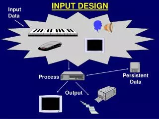
data Capture and user Input Design. Data Capture. Taxonomy for Computer Inputs (continued). Taxonomy for Computer Inputs (concluded). Input Design Guidelines. Capture data as close to its source as possible Capture only variable data. Not data that can be looked up.

E N D
Input Design Guidelines • Capture data as close to its source as possible • Capture only variable data. • Not data that can be looked up. • Do not capture data that can calculated or stored in computer programs as constants. • Extended Price, Federal Withholding, etc. • Use codes for appropriate attributes.
Source Document / Form Design Guidelines • Include instructions for completing the form. • Minimize the amount of handwriting. • Data to be entered (keyed) should be sequenced top-to-bottom and left-to-right. • When possible use designs based on known metaphors.
Internal Controls for Inputs • The number of inputs should be monitored (to minimize risk of lost transactions). • For batch processing • Use batch control slips • Use one-for-one checks against post-processing detail reports • For on-line systems • Log each transaction as it occurs to a separate audit file • Validate all data • Existence checks • Data-type checks • Domain checks • Combination checks • Self-checking digits • Format checks
The user interface • System users often judge a system by its interface rather than its functionality • A poorly designed interface can cause a user to make catastrophic errors • Poor user interface design is the reason why so many software systems are never used • Software engineers generally must do interface design
Importance of User Interface • “Most important part of any computer system” • “Interface is the system for most users” • Increasingly important • GUIs a big improvement over previous approaches • Platforms (e.g. Mac/ Microsoft) have style guides • 50% of code devoted to interface • Interface should “disappear” – users can focus on their task, not the interface • Biggest enemy of good interface design is time Galitz
Benefits of Good Design • Small improvements can be worth big $$$ • If users work 1 sec slower on each of 4.8 million screens per year, need almost an extra person • Redesigns have improved productivity 20%, 25%, 40%, 50% … • IBM - $1 invested in usability returns $10-$100 • Interface problems are treated as bugs • Pressman - $1 fix during design, $10 fix during development, $100 fix after release • Big Improvements can establish new products, companies, markets … • the browser was a UI idea – before it, search using gopher etc was tedious. • AOL was successful because it was more user friendly than early leader CompuServe. Galitz
System User Classifications Distinguish between different types of computer users and design considerations for each. Expert User – an experienced computer user • Spends considerable time using specific application programs. • Use of a computer is usually considered non-discretionary. • In the mainframe computing era, this was called a dedicated user. Novice User – a less experienced computer user • Uses computer on a less frequent, or even occasional, basis. • Use of a computer may be viewed as discretionary (although this is becoming less and less true). • Sometimes called a casual user.
Galitz’sWWW Heuristics • Speak the user’s language • Be consistent • Minimize the user’s memory load • Build flexible and efficient systems • Design aesthetic and minimalist systems • Use chunking • Provide progressive levels of detail • Give navigational feedback • Eliminate erroneous or misleading links. Do not refer to missing information Galitz
Interface Problems According to Galitz, the following problems result in confusion, panic, frustration, boredom, misuse, abandonment, and other undesirable consequences. • Excessive use of computer jargon and acronyms • Nonobvious or less-than-intuitive design • Inability to distinguish between alternative actions (“what do I do next?”) • Inconsistent problem-solving approaches • Design inconsistency
Commandments of User Interface Design • Understand your users and their tasks. • Involve the user in interface design. • Test the system on actual users. • Practice iterative design.
Human Engineering Guidelines • The user should always be aware of what to do next • Tell user what the system expects right now. • Tell user that data has been entered correctly. • Tell user that data has not been entered correctly. • Explain reason for a delay in processing. • Tell user a task was completed or not completed. • Format screen so instructions and messages always appear in same general display area. • Display messages and instructions long enough so user can read them.
Human Engineering Guidelines (continued) • Use display attributes sparingly. • Default values should be specified. • Anticipate errors users might make. • Users should not be allowed to proceed without correcting an error. • If user does something that could be catastrophic, the keyboard should be locked to prevent any further input, and an instruction to call the analyst or technical support should be displayed.
Guidelines for dialogue Tone and Terminology Dialogue – the overall flow of screens and messages for an application • Don’t use computer jargon. • Avoid most abbreviations. • Use simple terms. • Be consistent in your use of terminology. • Carefully phrase instructions—use appropriate action verbs.
Graphical User Interfaces Styles and Considerations • Windows and frames • Menu-driven interfaces • Pull-down and cascading menus • Tear-off and pop-up menus • Toolbar and iconic menus • Hypertext and hyperlink menus • Instruction-driven interfaces • Language-based syntax • Mnemonic syntax • Natural language syntax • Question-answer dialogue
Pull-Down and Cascading Menus • For frequently used application actions that take place in a wide variety of different windows menu bar Cascading menu Ellipses indicates dialogue box To simplify a higher-level menu Pull-down menu
Pop-Up Menus • For frequent users and frequently used contextual commands • Tear-Off menu: For items sometimes frequently or infrequently selected
Tool Bars • To identify and provide access to common and frequently used actions
Iconic Menus • To designate applications available and special functions within an application
Special Considerations for User Interface Design • Internal Controls – Authentication and Authorization • User ID and Password • Privileges assigned to roles • Web certificates • Online Help • Growing use of HTML for help systems • Help authoring packages • Tool tips • Help wizards • Agents – reusable software object that can operate across different applications and networks.
Error messages • Error message design is critically important. Poor error messages can mean that a user rejects rather than accepts a system • Messages should be polite, concise, consistent and constructive • The background and experience of users should be the determining factor in message design
System and user-oriented error messages System-oriented error message ? Err or #27 In v alid patient id entered OK Cancel
user-oriented error messages User-oriented error message P atient J . Bates is not registered Clic k on P atients f or a list of registered patients Clic k on Retr y to re-input a patient name Clic k on Help f or more inf or mation P atients Help Retr y Cancel
Help system design • Help? means ‘help I want information” • Help! means “HELP. I'm in trouble” • Both of these requirements have to be taken into account in help system design • Different facilities in the help system may be required
Help information • Should not simply be an on-line manual • Screens or windows don't map well onto paper pages. • People are not as good at reading screen as they are paper text. • Content should be prepared with help of application specialists • Content should not be too large – don’t overwhelm user
Help system use • Multiple entry points should be provided so that the user can get into the help system from different places. • Some indication of where the user is positioned in the help system is valuable. • Facilities should be provided to allow the user to navigate and traverse the help system. • Index, TOC, and Search should be provided
Help on WWW • Easy to implement • Easy for users to use • Difficult to link to applications themselves • users may need to make extra effort to get to help • Help doesn’t know context where you needed help – cannot provide context sensitive help
The User Interface Design Process • Chart the user interface dialogue. State Transition Diagram– a tool used to depict the sequence and variation of screens that can occur during a user session. • Prototype the dialogue and user interface. • Often STD is precursor to a use case • Obtain user feedback. • Exercising (or testing) the user interface • If necessary return to step 1 or 2
State Transition Diagrams A state transition diagram is a model that depicts a system’s states and the events that cause the system to change states. A state is any observable mode of behavior for the system. The state transition diagram also shows what actions are taken as a consequence of an event Such models are often called finite state machine models 48
State Transition Diagrams – An Example Following is a very simple state transition diagram for software controlling a printer. In this simplified model, we’ve identified five distinct states: idle, ready, printing, jammed, out_of_paper. The arrows represent transitions from one state to another. Along each arrow we note the event triggering the state change (above the horizontal rule) and the action taken in response to the event (below the horizontal rule). 49
State Transition Example (cont’d) idle trigger action print request ready new job job complete stop printing new job initiate print ready resume job initiate print paper loaded ready resume job printing out_of_paper no paper display paper msg jam corrected ready resume job jammed display jam msg jammed 50
Activity Consider the software that controls the functions of a cruise control device on an automobile. Work with your team to create a state transition diagram for this system. The particular device we’re working has the usual cruise control functions, plus the following enhanced ones: 1) if your vehicle pulls within 50 feet of a vehicle in front of you, an active cruise control device will turn itself off if it is set for more than 45 mph; 2) when you tap the brake once, the cruise control speed is suspended, but may be reinstated by pressing the resume button; 3) if you tap the brake more than once or if you hold the brake down for more than 2 seconds, the cruise control device will turn itself off in which case the speed setting is cancelled and will have to be reset when you re-engage the device. 51
Dialog Maps User interfaces can often be regarded as a finite state machine model Thus, state transition diagrams can be used to model these Such state transition diagrams are referred to as dialog maps (also sometimes called site maps when used with Web development) 52
Dialog Maps as Finite State Machines Each dialog element (menu, screen, dialog box, etc.) can be viewed as a state The user can then navigate to another dialog element (i.e. change states) The possible elements and the navigation paths between them can be modeled as a state transition diagram 53