Download
1 / 19
190 likes | 376 Vues
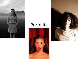
Portraits. Don't feel bad if you've made some of these common portrait art mistakes. They are very common errors - a lot of people make them!

E N D
Don't feel bad if you've made some of these common portrait art mistakes. They are very common errors - a lot of people make them! DON'T draw an eye like this! So many things are wrong with it. Notice that the eyebrow is kind of close to the eye itself. Should it really be this way? Often, the eyebrow is higher up. Look at your model closely, and make sure that you get the eyebrow placed in the proper place. The eye is too much like a fat almond shape here. The eye should have more of an angular, asymmetrical almond shape. There is no tear duct. People will notice its absence, if only subconsciously. The thickness on the bottom lid is drawn badly. This area should be drawn with a delicate touch - if not, the eye will look uncomfortable. The hard line that goes all across the bottom lid is not flattering. The line underneath it (where the eyelashes are) just makes the whole bottom lid look ugly. The eyelashes look too spikey, and are starting to resemble spider's legs. Creepy-looking. The iris is not round. It has to be round! ROUND, I tell you! The pupil also is not round, and is not concentric with the iris. Too much of the iris is showing. Usually (unless the person has had waaay too much caffiene) there is a lot more of the iris concealed underneath the top eyelid. Also, what are those wheel-spoke lines coming out from the pupil? That's just wrong. Wrong, I tell you! There is no shading on the eye, eyelid, or anywhere. It makes the eye look flat.
DON'T draw the nose like this! The lines are too dark and harsh on both sides of the nose. Put less shadow (if any) on the side of the face that is facing the light source. The shading is too dark and harsh, period. The nostrils are not shaded at all - and there should be some shading on the nostirl that is in more shadow.
DON'T draw the mouth like this! It's horrid. Notice how the lines are too harsh all around the mouth. The lines at the corners of the mouth, the chin, and underneath the nose. Too harsh, not necessary. There should be delicate and subtle rendering around the mouth, to show the structure and expression of the mouth. • The center line (that divides the top lip from the bottom lip) is too straight - this line is usually curved in at the middle. • The shading is simplistic and does not accurately represent the structure of the mouth and lips.