Download
1 / 12
120 likes | 292 Vues
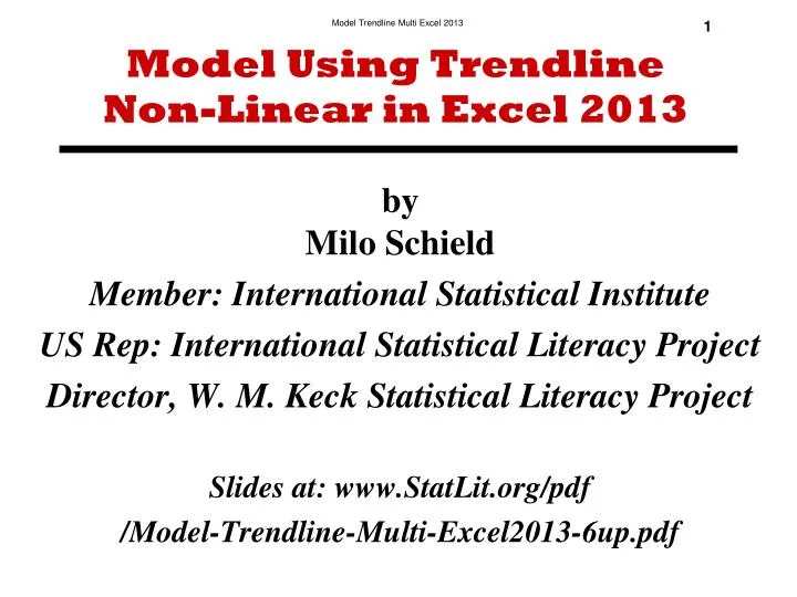
Model Using Trendline Non-Linear in Excel 2013. by Milo Schield Member: International Statistical Institute US Rep: International Statistical Literacy Project Director, W. M. Keck Statistical Literacy Project Slides at: www.StatLit.org/pdf /Model-Trendline-Multi-Excel2013-6up.pdf.

E N D
Model Using Trendline Non-Linear in Excel 2013 by Milo Schield Member: International Statistical Institute US Rep: International Statistical Literacy Project Director, W. M. Keck Statistical Literacy Project Slides at: www.StatLit.org/pdf /Model-Trendline-Multi-Excel2013-6up.pdf
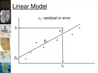
Goal: Summarize association between two variables Generate seven charts showing association between two quantitative variables (slides 5-11). Use seven different models: linear with forecast, linear with intercept = 0, polynomial, logarithmic, power, exponential and moving average. For each chart (except moving average), show trend-line, regression equation and R2. Show title and axis for all Review comparison of model R-squared on slide 12. No description of association (trend) is necessary. For details on using Trendline to build a model, see > www.StatLit.org/pdf/Model-Trendline-Linear-Excel2013-6up.pdf 2
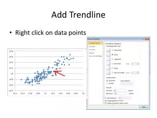
Using Chart TrendlineCreate Graph. Look for + Sign . 3 Select Chart Elements. Check Trendline box. Select More Options. Select Algebraic modelCheck Display Equation. Check Display R-squared.
Algebraic Models 1) Linear: Y=a+bx. Straight line, simplest 2) Polynomial: Y= a+bx+cx2. Multiple curves 3) Logarithmic: Y=aLn(x)+b. Ratio scale. Equal ratios have equal differences Log10(1) = 0; Log10(10) = 1; Log10(100) = 2 4) Power model: Y=axb [Between log & exp.] 5) Exponential: Y=aex/b. Constant rate of change 6) Moving average: For time series 4
Comparison of R-squared Percentage of Weight “explained by” Height 61.6% Linear model 40.6% Linear (intercept = 0) << Worst fit 62.1% Polynomial model 61.2% Logarithmic model 63.1% Power model 63.3% Exponential model << Best fit! Moving average model is not applicable here. 12