Download
1 / 9

E N D
By Andy Brown AS Media Studies Evaluation
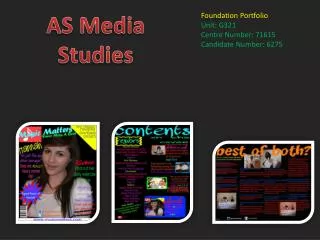
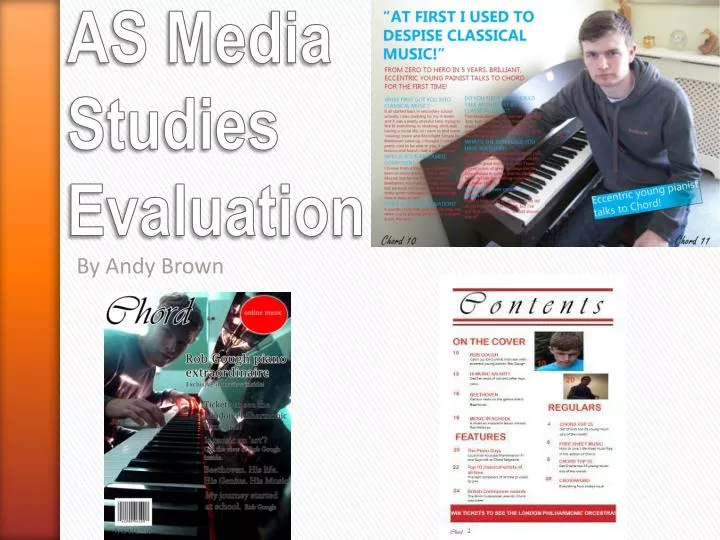
This is the masthead for my magazine. As you can see it follows the basic conventions of other magazines as it positioned in the top corner. This used in nearly every magazine as you can clearly see it. This is probably one of the most important factors for a new magazine as you want it to be recognised. There is an outer glow surrounding the masthead, this makes the letters stand out more and provides a contrast with the background image. This is good as it makes the masthead easier to read. The magazine is named with direct links with the genre. This conforms with other media products such as ‘Kerrang’ which is very onomatopoeic, it sounds like genre of the magazine - very rocky and slightly dangerous. I feel that the masthead of magazines has two meanings. The first being to inform the reader of what they are reading and the second to increase the aesthetics of the cover. In what ways does your media product use, develop or challenge forms and conventions of real media products?
The models expression is a key feature of this. It is a big contrast with genre of the magazine. Classical music is often associated with being very “ordinary” and i think that because of this it is often avoided by the younger generation. This is a good example of how my front cover challenges forms and conventions from other classical magazines such as ‘Classical Music’ and ‘Classic FM’. The contrast is not so much that you cant tell the genre of the magazine. This is crucial as you don’t want to confuse the reader. You can clearly tell that the genre of the magazine is classical because the model is playing a piano and the name of the magazine is Chord , which is a common term associated with classical music. This follows conventions of other music magazines as instruments are often used as props and the name of the magazine usually links in with the genre. In what ways does your media product use, develop or challenge forms and conventions of real media products?
You can clearly see this bubble in the top right of the page. This is red because it is very eye catching. This follows the forms and conventions of real media products as it is very common to see certain sell lines that the magazine want to be emphasised in bubble. This is the barcode. I have located it at the bottom left hand corner of the cover, this also follows forms and conventions as barcodes are on every magazine but they are often tucked away in the corners so they don’t get in the way of the image on the cover. I have also located the date and price beneath the barcode this is seen on all magazines but typically I've seen this on NME. So adding this uses forms and conventions needed for real media products. In what ways does your media product use, develop or challenge forms and conventions of real media products?
A good example of how people are shown in my magazine is on the contents page. There is certain stereotype put on people who listen and perform classical music, that being, people from wealthy background, fairly elderly people are often associated with being into classical music and my magazine, i feel, breaks this. You can see the two models on this page are young, this develops conventions of classical music magazines in particular, as the people on magazines such as ‘Classic FM’ are often the stereotype and i think that having younger people is a change or the better . In what ways does your media product use, develop or challenge forms and conventions of real media products?
As for the use of clothes, props and location of the photo shoot i have chosen my double page spread. The outfit of the model is typical of what an average teenager/young adult would wear. This was done deliberately as it challenges costumes worn on professional photo shoots for real media products. For example you would stereotypically assume that people who play classical music to wear fairly formal clothes such as i have seen in ‘Classic FM’. As for the use of props, there is only one, the piano. As you can see it only a standard upright piano, this challenges the conventions used on real media products such as ‘Classical Music’ where they often use big Grand Pianos, which simply are not accessible to everyone. The simple fact that there is an instrument featured in the double page spread follows the very basic conventions of music magazines. In what ways does your media product use, develop or challenge forms and conventions of real media products?
When it come to use of fonts and text style i think that the front cover is the best example. The masthead uses, challenges and i feel, in some cases develops conventions used by music magazines. Firstly the font i have chosen to use is ‘Vivaldi’, as obviously Vivaldi is famous composer of classical music, but also it gives a nice, classic handwriting effect, which, i believe, fits in with the genre very well. Secondly it challenges conventions of magazines as its not all in capital letters. This was done deliberately because the font looks like handwriting and people tend not to write in all capitals. And finally i believe that this develops the conventions of magazines as big block capitals is not always needed for an effective masthead. As for the sell lines i have chosen a font that is a lot easier to read, as the soul purpose of the sell lines is to inform the reader of what they are going to see in the magazine. Therefore this follows the forms and conventions seen on real magazines. In what ways does your media product use, develop or challenge forms and conventions of real media products?
In what ways does your media product use, develop or challenge forms and conventions of real media products? In terms of the written content I have chosen to use the left hand side of the double page spread as an example as it has the vast majority of writing on it. This pretty much challenges and develops the classic forms and conventions of magazines. First of all i have chosen to do a ‘Q&A’ rather than the standard article. I chose to do this because, personally speaking i tend to see actual articles to be like a ‘wall of text’ and for this reason i often don’t read them through. Having a Q&A I feel breaks up the text and makes it easier to read. Also i tend to find Q&A’s more interesting. Another way in which my double page spread challenges conventions is the colour of the font. I feel that having the text the standard black is dull and boring, so i chose blue and red. Also as a lot of the background image dark grey, having the font black is impractical as the reader can not read it easily. As the main purpose of a double page spread is to inform, it should be easy to read.
In what ways does your media product use, develop or challenge forms and conventions of real media products? The layout of all three pieces very much conforms with real media products. It is actually quite hard to develop conventions as each magazine is unique and there are so many variations of style and layout. A few examples of how my magazine follows the conventions is that on the double page spread the writing is on the left, this makes it easier to read as we read from left to right. The contents page has a very basic layout however, it easy to read and understand as the only real purpose of a contents page is to inform, so the easier to read the better. Finally the front cover’s layout is also fairly basic. The masthead is positioned so you can read it easily, the sell lines are down the right hand side which means they do not get in the way of the main image.