Download
1 / 11
110 likes | 230 Vues
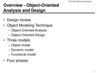
Bell ringer. How much longer does it take for object B to travel 40 yards than it takes for object A? How much further has object A traveled in 10 seconds than object B? At what time and distance are object A and object B at the same point?. Scatter plots. Like a line graph. Has x and y axis

E N D
Bell ringer • How much longer does it take for object B to travel 40 yards than it takes for object A? • How much further has object A traveled in 10 seconds than object B? • At what time and distance are object A and object B at the same point?
Like a line graph • Has x and y axis • Plot individual points
Different from a line graph • Don’t connect the points • Sometimes isn’t clear which IV and which DV
Scatter plots can show: • A positive correlation (relationship) between variables As x increases y increases. Example: As armspan increases, height increases.
The correlation can be strong or weak Weak: points further apart Strong: points close together
Scatter plots can show: • A negative correlation As x increases, y decreases Example: As GPA increases, the hours spent watching TV decrease.
Scatter plots can show: • No correlation There is no relationship between x and y. Example: The number of hot dogs eaten in a week is not related to the amount of rainfall.
Line of best fit • Shows the trend of the data • Can be used to interpolate (find a new point within the data) or extrapolate (find a new point outside the data) • Has a specific mathematical formula but roughly the middle of the plotted points • Does not have to include 0 • May ignore outliers
Assignment Make a scatter plot of math scores vs. science scores.