Download
1 / 18
180 likes | 874 Vues
Maps. They really can be so much fun!. The United States of Food. Differences among these maps?. Map B. Map A. Map C. Imagine for a moment…. …a globe made of glass …a bright light in its center casting land shaped shadows in all directions.

E N D
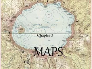
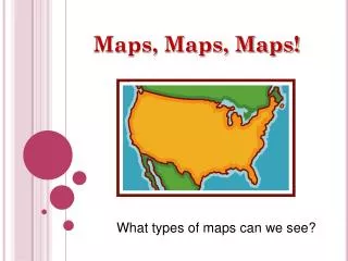
Maps They really can be so much fun!
Differences among these maps? Map B Map A Map C
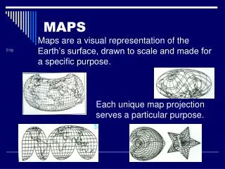
Imagine for a moment… • …a globe made of glass • …a bright light in its center casting land shaped shadows in all directions. The cartographer’s job is to gather those shadows and transform them into a reasonable portrait of the planet…this is the art of PROJECTION
Planar Projections • Project the Earth onto a plane that touches—or, technically, is tangent to—the globe at a single point, and you get a planar projection. Because this projection, also known as an azimuthal projection, is most accurate at its center, it is often used for maps focusing on one of the Poles.
Conic Projections • Cap the globe with a cone to achieve a conic projection. Cut open the cone, and the basis of a map emerges. The map will be least distorted along the line where the cone touches the sphere. Conic projections are handy for portraying the United States, which fits nicely within the resulting smile-shaped map.
Cylindrical Projections • Swaddle the globe and project its surface onto a cylinder. Slit the cylinder and flatten it into a map. This projection is most accurate near the Equator and greatly distorted near the Poles. The most famous cylindrical map is the Mercator projection, perfect for navigation but poor for teaching geography.
Preserving Area • To compare geographical data on a level playing field, pick a projection that maintains the correct proportions among the sizes of Earth’s landmasses. Such a map, often called an equal-area projection, would be useful to demographers. The price of getting the sizes right, however, is distortion in the shapes of the continents.
Preserving Shape • Preserving the shape of a landmass—an important concern for those wanting to see what Earth “really” looks like—gets harder as the area covered gets larger. A world map can only preserve the continents’ shapes by distorting their sizes. Maps that stress shape are called conformal.
Preserving Distance • Geometry students the world over learn that the shortest distance between two points is a line. Not on most maps. If distance is the focus of your map, choose a projection centered on a key point. Lines radiating from the middle will be equidistant. Shapes and sizes will be distorted, however, especially at the outer edges.
Preserving Direction • Many navigational charts rely on projections focused on direction. Such maps, usually centered on one place, allow mariners to plot a journey they can actually sail without constant course corrections. That ability matters far more at sea than shapes and sizes, which can get distorted.
Best for a WORLD MAP? • 1922, National Geographic adopted the Van derGrinten projection, which encloses the world in a circle. • 1988, switched to the Robinson projection, on which the high latitudes are less distorted in size (but more so in shape). • 1999, began using the WinkelTripel projection, which provides a better balance between size and shape.
ChoroplethMaps • Features: • Progressive shading of regions to indicate degrees of a topic
Cartogram Maps • Features: • A map which adjusts the sizes of countries so as to show the relevance of a topic
Image Credits • US of Food: http://www.foodiggity.com/wp-content/uploads/2011/01/food-by-state2.jpg • US of Soda: http://www.foodiggity.com/wp-content/uploads/2011/01/united_states_of_soda.jpg • Coke-Soda-Pop: http://quittingsoda.com/wp-content/uploads/2008/09/popvssodamap.gif • Black/Yellow Map Projections: http://www.nationalgeographic.com/xpeditions/hall/1/x1/xpedition1.html • Quote image & various projections: http://www.nationalgeographic.com/features/2000/exploration/projections/ • Cloropleth: Rubenstein, James M. The Cultural Landscape: An Introduction to Human Geography. 9th Ed. Upper Saddle River, NJ: Pearson/Prentice Hall, 2008. CD-ROM. • Cartogram: http://www.worldmapper.org/display.php?selected=219