Download
1 / 9
90 likes | 227 Vues
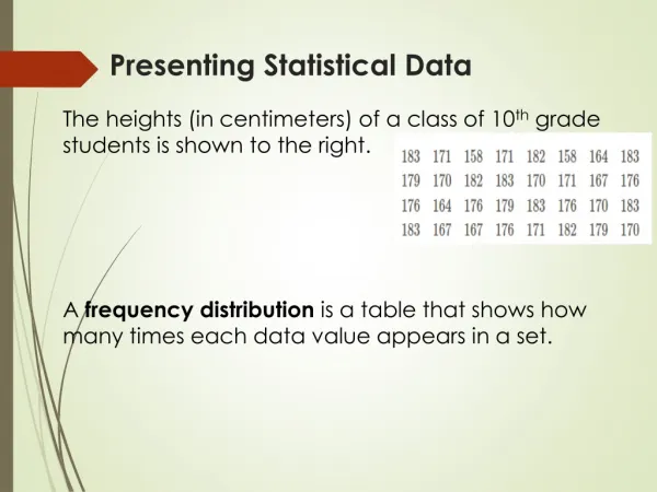
Analyzing Data Presenting Data. Tables and graphs organize and display. Data Tables. Independent variable – rows Data are ordered Dependent variable – columns Title should make reference to the variables in the experiment. Just by looking at the title, you can determine the IDV and DV.

E N D
Analyzing DataPresenting Data Tables and graphs organize and display
Data Tables • Independent variable – rows • Data are ordered • Dependent variable – columns • Title should make reference to the variables in the experiment Just by looking at the title, you can determine the IDV and DV
Line Graphs Changes in variable over time. Used when variables are continuous (versus discrete). Useful for representing trends (negative, positive, none)
Line Graph *Data table *Correlation?
Bar Graphs Continuous or discrete data More difficult to extrapolate data
Bar Graphs Identify: Independent variable Dependent variable Units
Circle Graphs • Parts of a whole • Represents the frequency of each category’s occurrence • There are 35 humans in room 142. Twelve have blonde hair, sixteen have brown hair, six have black hair, and one has red hair. The red-haired human is awesome. What percent of the class has blonde, brown, black and red hair? • 34.29% - blonde • 45.71% - brown • 17.14% - black • 2.86% - red
We will go to the computer lab to practice graphing using Excel. Although 3-D graphs may look pretty, avoid them unless a Z-axis is required. Otherwise, the graphics distract from the purpose of the graph, which is to convey information in a way that is easily interpreted.