Download
1 / 36
430 likes | 605 Vues
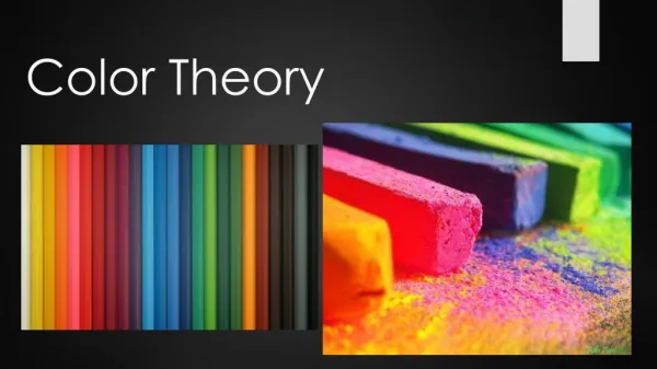
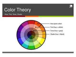
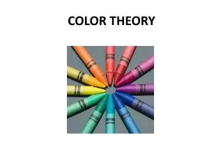
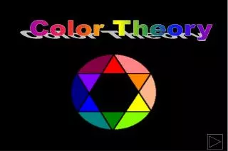
Color Theory. The 3 “Parts” of Color. 1 – HUE 2 – VALUE 3 - INTENSITY. HUE.

E N D
The 3 “Parts” of Color • 1 – HUE • 2 – VALUE • 3 - INTENSITY
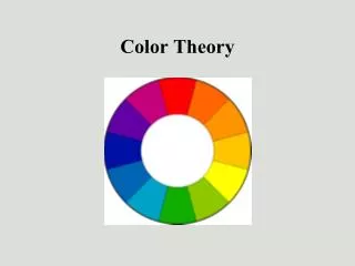
HUE • HUE - This is what we usually mean when we ask "what color is that?" The property of color that we are actually asking about is "hue". For example, when we talk about colors that are red, yellow, green, and blue, we are talking about the ‘hues’. • A hue is a color at its FULL INTENSITY; basically, it’s place on the full color wheel
VALUE(color has value too!) • The lightness or darkness of the hue • SHADE – a color to which BLACK has been added
INTENSITY * SATURATION • the BRIGHTNESS or DULLNESS (strength or weakness) of a color. • Ex. Pure blue is very intense…when you add a lighter or darker color to blue it makes the blue less intense
Mixing a color with its complimentary color reduces the intensity and brings the hue towards gray:
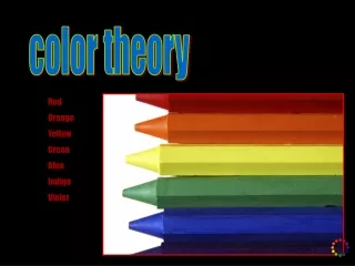
Primary colors are….. Red Blue Yellow
Secondary colors are…. Orange Green Violet
Tertiary colors Achieved by mixing a PRIMARY color and a SECONDARY color You name these with the PRIMARY color first…..red-orange, yellow-orange, yellow-green
Complementary Colors are….. ACROSS from each other on the color wheel
Analogous Colors are… Side by side on the color wheel, (3-5 colors) Pick a color, and the analogous colors are the ones to each side of it.
Monochromatic means… A ONE-colored color scheme. Pick ONE color – add white and black to it (tints and shades).
More complex relationships… SPLIT COMPLEMENT
WARM Colors • Red, orange, yellow • They appear on one side of the color wheel, and opposite the cool colors. • Optically, warm colors generally appear to advance, coming toward the viewer
COOL Colors • Green, blue, violet • Opposite the warm colors on the color wheel • Tend to recede, or go back, into space
Mood and Atmosphere • Warm colors are often associated with fire and the sun. They appear on one side of the color wheel, and opposite the cool colors. • Psychologically, these colors evoke emotions ranging from feelings of warmth and comfort to feelings of anger and hostility - they are said to be stimulating and passionate. • Do you feel anxious in a yellow room? What other emotions are associated with WARM COLORS?
Cool colors are often associated with ice, water, and coldness. They appear on one side of the color wheel, and opposite the warm colors. • Psychologically, cool colors are often described as calming or soothing, but can also call to mind feelings of sadness or indifference. • Does the color blue make you feel calm and relaxed? What other emotions are associated with COOL COLORS?
Feelings about color can also be deeply personal and are often rooted in your own experience or culture. • For example, while the color white is used in many Western countries to represent purity and innocence, it is seen as a symbol of mourning in many Eastern countries.
Hints • When mixing…start with LIGHTER color and add small amounts of the darker color • Make sure your colors are in the CORRECT order on your color wheel – check to see that when you squint you see a progression and that no two colors are too ‘close’ in hue to each other • You should ONLY be using the primary colors of paint and MIXING all others!!
I’d like you to…. • CONSERVE PAINT – only pour out small amounts at a time! • Use good CRAFTSMANSHIP!!!!!! • CLEAN!!!!!!!!!!!!!!!!!!!!!!!!!!!!!!!!!!