Download
1 / 19
200 likes | 536 Vues
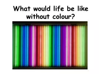
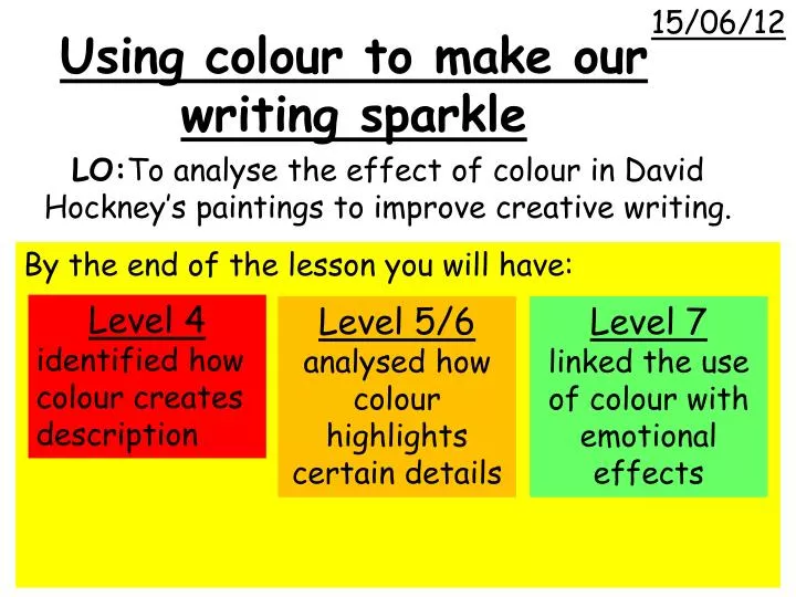
15/06/12. Using colour to make our writing sparkle. By the end of the lesson you will have:. Level 4 i dentified how colour creates description. Level 5/6 analysed how colour highlights certain details. Level 7 l inked the use of colour with emotional effects.

E N D
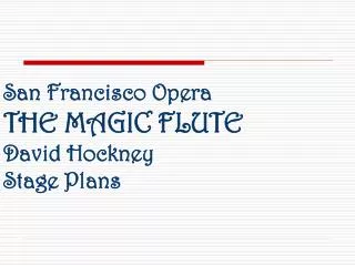
15/06/12 Using colour to make our writing sparkle By the end of the lesson you will have: Level 4 identified how colour creates description Level 5/6 analysed how colour highlights certain details Level 7 linked the use of colour with emotional effects LO:Toanalyse the effect of colour in David Hockney’s paintings to improve creative writing.
TASK ONE Stick your picture in the middle of your page and pick out using labels and notes… • What colours have been used • How they make the reader feel • What they tell us about the setting • Give your picture a title
WAGOLL cobalt blue, ultramarine blue the climate is sunny- suggested by color and light. Blue cloudless sky. Palm trees. splash = lighter blue + fine white lines against turquoise Title: ‘A Bigger Splash’ yellow diving board stands out against turquoise water
WABOLL Blue sky There are loads of green trees Swimming pool is pink I would give this picture the title, ‘A Swimming Pool’ because it’s got a swimming pool on it
TASK TWO • Complete a PEE paragraph about your picture using these sentence starters • The writer uses colour in this picture to… • Some example of colours used are… • There is also a …. that shows… • These are there to make the reader think that… • They tell the reader that …
WAGOLL WABOLL It’s quite a good picture of a swimming pool and a sky. Both the swimming pool and the sky are blue. The diving board is yellow and the trees are brown and green and tall.
WAGOLL WAGOLL A yellow diving board juts out of the margin into the paintings’ foreground and stands out dramatically against the turquoise water of the pool. The splash is represented by areas of lighter blue combined with fine white lines on the monotone turquoise which creates the sense of movement. I would give this picture the title, ‘A Bigger Splash’ because although it is absent of any person it seems to capture that liberating moment of jumping into a swimming pool.