Download
1 / 22
220 likes | 329 Vues
Textual Analysis. Nicole Keighrey. My Chosen Magazines. DJ Mag. DJ Mag are a successful worldwide magazine with a circulation of 19,479.

E N D
Textual Analysis Nicole Keighrey
DJ Mag • DJ Mag are a successful worldwide magazine with a circulation of 19,479. • Their mission statement is “living and breathing dance music, to represent the electronic music scene with the passion, professionalism and intelligence it deserves’. • DJMag’s reader profile is “An average 25 year old male who is employed so has a high disposable income and is often single. DJ mag has a youthful audience with 41% going clubbing at least once a week in the top 5 clubs including Fabric, Ministry of Sound, Egg, Pacha and Turn mills”.
Thrust Publishing Ltd. • DJ Mag is published by Thrust Publishing Ltd, 6-8 Standard Place, Rivington Street, London EC2A 3BE. • Their managing director is Martin Carvell and their editor is Ben Murphy. The publisher is James Robertson. • They began as DJ Mag ltd but changed their name to Thrust Publishing Ltd on the 8th of may 2009.
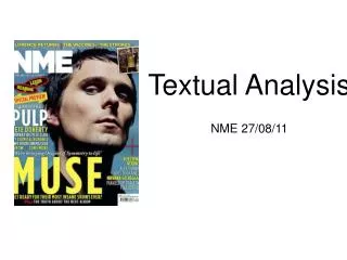
DJ Magazine – Front Cover Analysis • The name of the artist on the magazine is large, bold and clear, making it easy to read from a distance. This will draw in customers to buy the magazine as they will recognise the artist when they see the name. For people who don’t know who the artist is, they can link the bold name to the picture in the background. • The yellow and red make the name stand out against the dark background. An unusual and interesting font has been used for the artists name, this will make people notice it and could have possibly been used to represent his interesting personality. Also the red used in the artists name picks up on the red in the artists top making him more noticeable. • The words “PORTER ROBINSON” is placed in the center of the magazine and is aligned to the left, showing that it is important but it is not taking over from the picture of the artist.
DJ Magazine – Front Cover Analysis • The shot used for the artist was a mid-long shot. His position is not posed but his head is bent slightly to the side to look as if he is moving his head out of the way of the DJ mag logo. Showing that the logo is the most important feature on the magazine as it shows who the magazine is. The picture is very dark and shadowy adding mystery to the picture to entice readers but making the coverlines stand out. The picture is in the center of the magazine so everything is placed around him. Many of the readers will aspire to be like Porter Robinson.
DJ Magazine – Front Cover Analysis • The coverlines on the magazine use specialist language to the genre. This excludes people who do not have any particular interest in the music genre. There are also a lot of artist mentioned on the cover to give the readers a hint as to what is inside. The alternating yellow and white cover lines make the cover look more interesting and keeps the readers engaged. The coverlines are aligned to both the left and the right hand sides of the page so that one side does not took to crowded. One of the coverlines has been placed at the very bottom in the corner where it will not be noticed. The ‘172 tunes reviewed’ coverline is small and not very noticeable which is unusual for a magazine.
DJ Magazine – Contents Page Analysis • The contents page of the magazine contains a variety of colors. It is separated into two sections, the left hand side relates to the coverlines and the right hand side is split into subcategories for the rest of the contents of the magazine. The contents page expands on the coverlines that are featured on the front page, giving more detail on what is inside. The language used is quite informal, for example, “comin’ up”. The use of this language aims the magazine more towards younger people, rather than older people. • The layout is neat and organised so the audience can easily find the article they are looking for. The font used is consistent throughout the magazine, it is quite modern and fits in with the dance music genre of the magazine.
DJ Magazine – Contents Page Analysis • The pictures round the edges of the magazine relate to the articles within the magazine which gives the readers another insight to what the magazine contains. The largest picture on the contents page is of Porter Robinson, which relates to the front cover to show that he is the main feature of the magazine. The colours used in the image are quite dark adding a sense of mystery to the artist, but his pose, clothing and hair shows that he is quite a cool person who many young artists will aspire to be like.
DJ Magazine – Contents Page Analysis • I think that the contents page is well organised, I would use a similar layout when making my magazine. I particularly like the way they have placed the coverlines/main stories in one column and the rest of the magazine in another. This makes it easier to find a particular article. However, I would change the way the pictures are laid out, they make the magazine look slightly messy and should be organised better. The headphones and the DDJ-WeGo controller is very stereotypical of a music magazine, which conforms to Branston’s and Stafford’s representation and stereotypes (2010).
DJ Magazine – Double Page Spread Analysis • The layout of the double page spread is neat and clear. The white writing is clear to read on the black background and stands out. The subheadings are written in an interesting font that makes the magazine much more enjoyable to read. The same font has been used for the main heading of the article. The different sizing of the font makes keeps the readers engaged as it doesn’t look as boring and repetitive as it would if it was just a large block of font. The picture in the background is dark and shadowy, which adds mystery to both the artist and the article. The small picture in the corner of an artist that Porter Robinson worked with makes the text around it much more easily understandable, in relation to the artist Mat Zo.
Mixmag • Mixmag are also a successful worldwide dance music magazine but with a readership of 190,000 and a circulation of 20,817. • Mixmags mission statement is “Mixmag is the worlds biggest dance music and clubbing magazine. Mixmag has the history, the authority and the creativity to give the right brands an authentic association with dance music and club culture”. • Mixmags reader profile is “Mixmag readers are the opinion-formers and leaders in clubbing. They are the ones who make the happening music happen, and the cool products cool within their peer group. They are the first to recommend a new tune and the first on a new fashion trend. They’re at that new cool club very early, and move on before it starts to go cold. Our demographic spans young budding bedroom DJs through to accomplished producers. They’re the best informed about top DJ’s and upcoming tunes, and just have to have the latest mobile (even if their current on is less than six months old). They’re the biggest downloaders of music in the UK. The median age of a Mixmag reader is 24 (72% male, 28% female) and they tend to be urban and single. They have a high disposable income and a high propensity to spend it on: nights out, clothes, music, the latest mobile phones and MP3 players. Nearly 80% do not read another music magazine, and they spend little time watching TV, especially at the weekends”.
Development Hell • Mixmag is published by Development Hell, 90-92 PentonvilleRoad, Islington, London N1 9HS. • Their managing director is Jerry Perkins, the editorial director is David Hepworth and the finance director is David Joseph. • Mixmag was originally published by disco mix club, but as the magazine was developed, the publishers changed.
Mixmag – Front Cover Analysis • Mixmag have placed their main coverline“Boys Noize” directly beneath the title of the magazine. This prevents it from standing out as much, especially if you are looking at it from a distance. It seems to blend with the rest of the magazine as it is in the same colours as the title and the coverlines.However, the font is different to the rest of the magazine which makes it standout more. But by having “Boys Noize” in a large bold font, it is more likely to be noticed. People who like “Boys Noize” will be more likely to buy the magazine, even if they are not regular readers of Mixmag, this is because they have featured a well known and popular artist. I think that the main coverline should be placed closer to the center of the magazine and an unusual font should be used to make it more noticeable.
Mixmag – Front Cover Analysis • The image featured matches the colour scheme of the magazine, but is quite dark and mysterious. There is a slightly smoky look to the background image and there is a lot of red/orange light. Most of the magazine cover is taken up by the main image, leaving a lot of space. I think that the title should be placed closer to the center so it fills some of the space and becomes more noticeable. However, it does make Boys Noize look good, and would entice people to go and see them live.
Mixmag – Front Cover Analysis • The coverlines are aligned to both the left and the right hand sides of the magazine, leaving the center free. There have been many different fonts used on the magazine making it look a bit messy and not very professional, there has also been a lot colours used and different a different layout for most of the coverlines as some are parts are bold and others are not. The language use in the coverlines shows that the magazine is aimed towards young adults, 18+ as most of the language is inappropriate for younger people. The coverlines are all large and noticeable, none of them are small and hidden.
Mixmag – Front Cover Analysis • I think that the cover looks messy and not very professional. The main coverline does not standout very much, and the other coverlines do not match and there fore the cover is not very neat. The language used is not appropriate for younger people and a lot of specialist language has been used to single out those who do not know much about the genre. On the other hand, I like the colour scheme, I think that it goes well and the background matches the rest of the front cover.
Mixmag – Contents Page Analysis • The contents page is spread out over two pages, most of which is taken up by images of the features. A different font has been used again and the text is very small. There has also been a different font used for the title. Overall the layout is clear and quite informative, so you can easily find what you are looking for, the images also give you more of an insight as to what is included. • The two main images do not relate to the main story on the front cover, they are contrasting photos on is of a girl in a club with warm colours, the other is almost black and white, it consists of cool colours and a much more formal looking scene.
Mixmag – Contents Page Analysis • I think that the overall layout of the contents page is clear and well organised. However, I think that the text should be bigger to make it easier to read, and the photos should relate to the front cover more. Also, the page numbers on the photos are hard to read, a clearer font should be used. The main problem with the magazine is that too many fonts are being used. Mixmag should be more consistent to create a more professional look.
Mixmag – Double Page Spread Analysis • The used of colour on the double page spread instantly grabs the readers attention. All of the colours work well together, making more people want to read it. The colours also relate to the front cover. The text is nicely spread out and the article is clear and easily understandable. The enlarged quote on the page opposite the main text relates it to the artist directly. The image relates back to the front cover. The image makes it look as if Alex Ridha is one of the leaders of his style of music. The language is informal and would not be appropriate for children, as the article discusses topics such as drugs. The orange patterns look interesting and are engaging to an audience.