Download
1 / 35
350 likes | 520 Vues
Finding Stories Within Maps. Jeff Blossom Center for Geographic Analysis, Harvard University gis.harvard.edu. Investigative Reporters and Editors Conference June, 2012 Boston, MA. Who I am, what is the CGA, why I’m here Why maps? Types of maps and why they work

E N D
Finding Stories Within Maps Jeff Blossom Center for Geographic Analysis, Harvard University gis.harvard.edu Investigative Reporters and Editors Conference June, 2012 Boston, MA
Who I am, what is the CGA, why I’m here • Why maps? Types of maps and why they work • Maps in investigative journalism • How you can easily create maps for free • Some terminology: Geocoding, choropleth, proportional symbols • Tutorial 1: Rendering your data geographically with proportional symbols and pie charts on the web. • Tutorial 2: Creating a choropleth map in Quantum GIS Talk outline
Cambridge, MA “To support research and teaching that relies on geographic information” The Center for Geographic Analysis, Harvard University
Three main components: Teaching Everything from 2 hour workshops to full semester courses. http://gis.harvard.edu/learn Software Development Many tools and applications developed, the keystone project is WorldMap: http://worldmap.harvard.edu Help Desk / Service Projects One on one consultations with Harvard students, staff, faculty, affiliates to help perform geographic analysis, map creation, and much more. http://gis.harvard.edu/projects The Center for Geographic Analysis, Harvard University
http://www.nieman.harvard.edu My invitee to IRE 2012: 2011 Harvard Nieman Fellow Affiliate John Diedrich of the Milwaukee Journal Sentinel Why I’m here
A well done map can convey enormous amounts of information with an interocular ability – the message hits you right between the eyes! Anyone can benefit from making maps. I teach a class called Geographic Communication Today, that aims to enable any person to make maps for the benefit of their profession http://www.extension.harvard.edu/courses/23443 Why maps?
A MUCH Better map showing where Kansas is in relation to Nevada Nevada Kansas
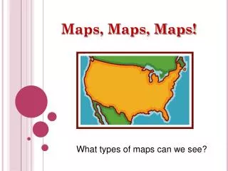
General reference map Thematic map (population) The two major types of maps:
Maps in Investigative Journalism NY Times: http://www.nytimes.com/interactive/dining/new-york-health-department-restaurant-ratings-map.html
Maps in Investigative Journalism http://investigativereportingworkshop.org/investigations/broadband-adoption/htmlmulti/broadband-adoption-map/
Maps in Investigative Journalism The Boston Globe, print edition, June 14th, 2012
Geocoding:The process of assigning geographic coordinates to textual information. > Most commonly associated with addresses. For example: “53 Church St., Cambridge, MA” Time for terminology: Geocoding
Time for terminology: Choropleth Choropleth Map – Shading a value or statistic by area.
Time for terminology: Proportional Symbol Proportional Symbol Map – the size of the symbol represents a measurement or statistic. U.S. Census Bureau, 1970
Time for Action: How to make easily make maps • Tutorial 1: Rendering your data geographically with proportional symbols and pie charts on the web. • Tutorial 2: Creating a choropleth map in Quantum GIS
Tutorial 1 : Rendering your data geographically with proportional symbols and pie charts • Create your data table in Excel, making sure it has descriptive location columns (see slide 21 above). • Select and copy all of your data from Excel, including the header row • Open a web browser, and go to http: /batchgeo.com • Paste your data into the text window on batchgeo. • Click Validate & Set Options • Set the proper Region, Location, City, State, and Zip fields/columns that correspond to your data. Specify a Group By / Thematic field to color your data by a value. • Scroll down and click the Make Google Map under the Geocoding section. Your data will be geocoded, and a map will be created. • Click Save & Continue button. Enter a map title, and your email address. Now this map is saved on batchgeo.com for everyone to view. Copy the link to your map and send it to people, or embed the map into your website. • On your saved map’s web page, scroll down to the very bottom, and click “Download <map name> Map Google Earth (KML)”. Save this KML file, you’ll need it to perform Tutorial 2 on the next slide. KML is a geographic data file type that can be read by many web and desktop mapping applicationis.
We just created an INTERACTIVE proportional symbol WEB MAP with pie charts rendering our data. • Now let’s create a STATIC choropleth map showing organizations per US Congressional District, using DESKTOP geographic information software.
Time for Action: How to make easily make maps • Tutorial 1: Rendering your data geographically with proportional symbols and pie charts on the web. • Tutorial 2: Creating a choropleth map in Quantum GIS
Tutorial 2: Creating a choropleth map in Quantum GIS • Go to the QuantumGIS Workshop page: http://maps.cga.harvard.edu/qgis/ • Click the Install option, choose your operating system, download and install QGIS. • Open QGIS, and add the KML file you created from batchgeo by clicking Layer > Add Vector Layer • Download other U.S. boundary data to put on your map from the U.S. Census: http://www.census.gov/cgi-bin/geo/shapefiles2010/main This data is in shapefile format, a geographic data type that many desktop and web mapping applications can read. • Select Congressional Districts, click Submit. Under the Congressional Districts (111) choice, choose “All states in one national file” and click Download. • Once downloaded, unzip this zip file to your computer. It will extract into several files named tl_2010_us_cd111, one of them being tl_2010_us_cd111.shp (shapefile). • Add this shapefile to QGIS by clicking Layer > Add Vector Layer, browsing to the tl_2010_us_cd111.shp file, and selecting it. • Change the map to a projection customized to show the lower 48 U.S. States by clicking Settings > Project Properties, and under the Coordinate Reference System list choose Projected Coordinate Systems > Lambert Azimuthal Equal Area > US National Atlas Equal Area. Click the box next to the “Enable on the fly CRS transformation” and click OK. • Click Vector > Data Management Tools > Join attributes by Location. Choose tl_2010_us_cd111. as the Target vector layer, and your points from batchgeo as the Join vector layer. Specify “Take summary of intersecting features” and check the Sum box. Click OK to run the tool. The resulting shapefile will have a COUNT field in the attribute table. This is the total number of points in that congressional district. • To symbolize your new layer by COUNT, double click the tl_2010_us_cd111 layer in the map legend, and click the Style tab. Choose a Graduated style, and set the column as COUNT. Choose the number of classes and the mode, and click Classify. Now you have a choropleth map showing total number of points per congressional district! • The map can now be polished for publication and exported to PDF or an image file using the Print Composer. For more on how to do this, go here: http://maps.cga.harvard.edu/qgis/ and choose the Export > Map Print option. Or use the QuantumGIS tutorial and help guide at http://qgis.org
Thank You! Jeff Blossom jblossom@cga.harvard.edu This presentation is online at: http://maps.cga.harvard.edu/ire