Download
1 / 4
40 likes | 145 Vues
0.25. 0.20. 0.15. 0.10. 0.05. 0.00. 21. 18. 15. 12. 9. 6. 3. Supplementary Figure 1. 100. 12-15 alleles Sens: 54% 1-Spec: 66%. 80. <12 alleles Sens: 2% 1-Spec: 15%. >15 alleles Sens: 44% 1-Spec: 19%. 60. Sensitivity (%). 40. 20. 0. 0. 20. 40. 60. 80. 100.

E N D
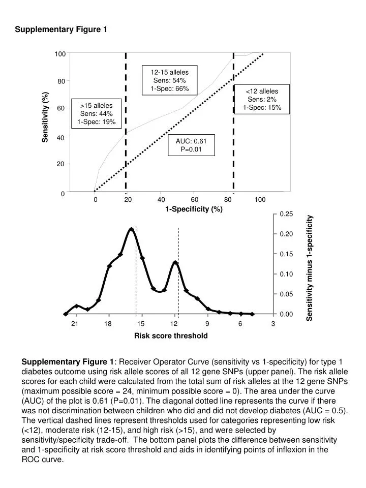
0.25 0.20 0.15 0.10 0.05 0.00 21 18 15 12 9 6 3 Supplementary Figure 1 100 12-15 alleles Sens: 54% 1-Spec: 66% 80 <12 alleles Sens: 2% 1-Spec: 15% >15 alleles Sens: 44% 1-Spec: 19% 60 Sensitivity (%) 40 20 0 0 20 40 60 80 100 1-Specificity (%) AUC: 0.61 P=0.01 Sensitivity minus 1-specificity Risk score threshold Supplementary Figure 1: Receiver Operator Curve (sensitivity vs 1-specificity) for type 1 diabetes outcome using risk allele scores of all 12 gene SNPs (upper panel). The risk allele scores for each child were calculated from the total sum of risk alleles at the 12 gene SNPs (maximum possible score = 24, minimum possible score = 0). The area under the curve (AUC) of the plot is 0.61 (P=0.01). The diagonal dotted line represents the curve if there was not discrimination between children who did and did not develop diabetes (AUC = 0.5). The vertical dashed lines represent thresholds used for categories representing low risk (<12), moderate risk (12-15), and high risk (>15), and were selected by sensitivity/specificity trade-off. The bottom panel plots the difference between sensitivity and 1-specificity at risk score threshold and aids in identifying points of inflexion in the ROC curve.
Supplementary Figure 2 0.75 0.70 0.65 AUC 0.60 0.55 0.50 0.45 T1D in HLA risk children T1D in all children AB in HLA risk children AB in all children Supplementary Figure 2: Box-plot for all area under the curve (AUC) calculated from the receiver operator curve analysis (ROC) for all 4095 possible combinations of the 12 SNPs using diabetes as outcome in children with HLA risk genotypes, diabetes as outcome in all children, using islet autoimmunity as outcome in children with the HLA risk genotypes and islet autoimmunity as outcome in all children.
Supplementary Figure 3 INS (97%) COBL (59%) IL10 (19%) IL18RAP (91%) IL2 (4%) SH2B3R (67%) CTLA4 (99%) KIAA0350 (68%) CD25 (44%) PTPN22 (97%) IFIH1 (89%) PTPN2 (37%) ERBB3 (38%) 0 20 40 60 80 100 0.8 -5 AUC 0.75 -6 0.7 -7 0 20 40 60 80 100 Supplementary Figure 3: The combinations of the 12 genes plus INS genotype which resulted in receiver operator curve AUCs with P-values <0.00001 when diabetes was used as outcome in 291 genotyped HLA risk children are shown as heat maps (n = 117 combinations). The heat maps represent the 116 combinations horizontally for each of the 13 genes listed vertically. Combinations are arranged from highest (left) to lowest (right) AUC, and the corresponding AUC and -log10 p values are provided in the lower panel. The presence of the gene in a combination is indicated as a black bar. The frequency of the gene in the 117 combinations is indicated.
Supplementary Figure 4 100 5-9 alleles Sens: 44% 1-Spec: 60% 80 <5alleles Sens: 3% 1-Spec: 21% >9 alleles Sens: 53% 1-Spec: 19% 60 Sensitivity 40 AUC: 0.73 P<0.00001 20 0 0 20 40 60 80 100 1-Specificity Supplementary Figure 4: Receiver Operator Curve (sensitivity vs 1-specificity) for type 1 diabetes outcome using risk allele scores of 8 gene SNPs in all genotyped children. The 8 genes used to calculate scores were those that provided the highest receiver operator curve AUC for diabetes outcome in the HLA risk children (IFIH1, CTLA4, PTPN22, IL18RAP, SH2B3, KIAA0350, COBL, ERBB3). The risk allele scores for each child were calculated from the total sum of risk alleles at the 8 gene SNPs (maximum possible score = 16, minimum possible score = 0). The area under the curve (AUC) of the plot is 0.73 (P<0.00001). The diagonal dotted line represents the curve if there was no discrimination between children who did and did not develop diabetes (AUC = 0.5). The vertical dashed lines represent thresholds used for categories representing low risk (<6), moderate risk (6-9), and high risk (>9), and were selected by sensitivity/specificity trade-off.