Download
1 / 3

E N D
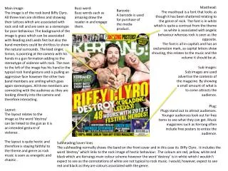
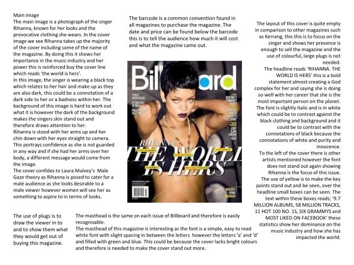
Main image The main image is a photograph of the singer Rihanna, known for her looks and the provocative clothing she wears. In the cover image we see Rihanna takes up the majority of the cover including some of the name of the magazine. By doing this it shows her importance in the music industry and her power this is reinforced buy the cover line which reads ‘the world is hers’. In this image, the singer is wearing a black top which relates to her hair and make up as they are also dark, this could be a connotation of a dark side to her or a badness within her. The background of this image is hard to work out what it is however the dark of the background makes the singers skin stand out and therefore draws attention to her. Rihanna is stood with her arms up and her chin down with her eyes straight to camera. This portrays confidence as she is not guarded in any way and if she had her arms over her body, a different message would come from the image. The cover confides to Laura Mulvey’s Male Gaze theory as Rihanna is posed to cater for a male audience as she looks desirable to a male viewer however women will see her as something to aspire to in terms of looks. The barcode is a common convention found in all magazines to purchase the magazine. The date and price can be found below the barcode this is to tell the audience how much it will cost and what the magazine came out. The layout of this cover is quite empty in comparison to other magazines such as Kerrang, this this is to focus on the singer and shows her presence is enough to sell the magazine and the use of colourful, large plugs is not needed. The headline reads ‘RIHANNA. THE WORLD IS HERS’ this is a bold statement almost creating a God complex for her and saying she is doing so well with her career that she is the most important person on the planet. The font is slightly italic and is in white which could be to contrast against the black clothing and background and it could be to contrast with the connotations of black because the connotations of white and purity and innocence. To the left of the cover there is other artists mentioned however the font does not stand out again showing Rihanna is the focus of this issue. The use of yellow is to make the key points stand out and be seen, over the headline small boxes can be seen. The text within these boxes reads; ‘9.7 MILLION ALBUMS, 58 MILLION TRACKS, 11 HOT 100 NO. 1S, SIX GRAMMYS and MOST LIKED ON FACEBOOK’ these statistics show her dominance on the music industry and how she has impacted the world. The use of plugs is to draw the viewer in to and to show them what they would get out of buying this magazine. The masthead is the same on each issue of Billboard and therefore is easily recognisable. The masthead of this magazine is interesting as the font is a simple, easy to read white font with slight spacing in between the letters however the letters ‘a’ and ‘d’ and filled with green and blue. This could be because the cover lacks bright colours and therefore is needed to make the cover stand out more.
There is a branding logo of the Billboard title, this reminds the viewer what they are reading this also relates to the cover. The colours on this page are all very similar and grouped. They are all rather dull however this gives the page a sophisticated look and the font is very easy to read due to the colour scheme on this particular page. The layout of the contents page is slightly crowded however this shows the magazine will be full on content and therefore is appealing to the reader. The three images at the top show three different recording artists with a number in the bottom left hand corner of each image, this is to show the page number the article about them is on so fan can quickly skip to that page. The left of the sheet is the a chart to show music sales and as Billboard is a magazine based on the US official charts this relates to the music theme. The background is a light grey colour which makes it easy for the black font to be read. The layout of this part is in columns to ease reading and to establish page numbers. The main image is a recording artist crouching down and facing the page and therefore the text. This indicates the reader where to look as the artist is looking there. The image of the artists on the page show who is going to be featured within the magazine therefore giving the audience a incite of what is to come. The title of the page is simply ‘contents’ this show the reader exactly which page they are on. The font is in block print and is black which stands out against a white background.
The font on this double page spread is easily read. The word ‘fiercely’ is in bold to relate to the singer, Beyonce, as she is know for the word firece. The whole headline is in capitals to show importance. The article is split into two columns and therefore is straight forward, the text is in white so it stands out against the purple background but could also be a connotation of innocence and purity. The image on this page is interesting because the singer, Beyonce, takes up a whole page and therefore 50% of the double page spread with a close up facial image. This is a striking image as it allows an instant connection because the singer is looking directly to camera therefore it looks as though she is looking at the reader. It is quite an unusual double page spread because there is only one image and it is a close up however this shows her importance. The closeness of the image shows the confidence of the singer and can also relate to the headline as the word ‘fiercely’ is used and if something is described as fierce it is sure of itself. The colour scheme of this page is simple because the colours used are purple and grey. The purple goes from light at the top to dark at the bottom of the page which could be a connotation of heaven and hell. The singers name is not seen in a large font anywhere on this page this is because the image is enough to know who she is as she has made a huge impact in the music industry and therefore a title explaining who she is is not necessary. At the top of the page, social media links can be seen, this is to appeal to a younger audience and to promote other media options of viewing Billboard magazine.