Download
1 / 13
130 likes | 135 Vues
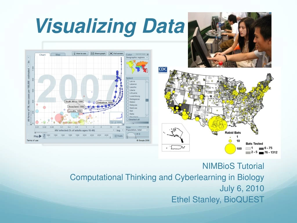
Visualizing Data. NIMBioS Tutorial Computational Thinking and Cyberlearning in Biology July 6, 2010 Ethel Stanley, BioQUEST. Cyberlearning.

E N D
Visualizing Data NIMBioS Tutorial Computational Thinking and Cyberlearning in Biology July 6, 2010 Ethel Stanley, BioQUEST
Cyberlearning “This pedagogical change is not about technology per se. This is not about distance learning… not about students being able to access lectures by some of the world's leading professors... Rather, this represents a change in the relationship between students and teachers in the learning process.” Tapscott, D. and A. D. William. 2010. Innovating the 21st-Century University: It’s Time! EDUCAUSE Review, • 45(1): 16-29 (January/February 2010
“Professors who want to remain relevant will have to abandon the traditional lecture and start listening to and conversing with students — shifting from a broadcast style to an interactive one.” Tapscott, D. and A. D. William. 2010. Innovating the 21st-Century University: It’s Time! EDUCAUSE Review 45(1) :16-29 (January/February 2010)
Cyberlearners use technology to seek answers, but frequently find new questions.
Looking at data: Gapminder http://www.gapminder.org/videos/lung-cancer-statistics/ http://www.gapminder.org/videos/free-statistics-for-democracy/
Group Actvity Go to gapminder.org. Select a category for the y axis. Select time on the x axis. Run the simulation. Any surprises?
Looking at data:Worldmapper • Can download Excel file with data and notes www.worldmapper.org
Pneumonia Deaths - 2002 Pneumonia caused 6.9% of all deaths worldwide in 2002, an average was 634 deaths per million people per year.
Rabies http://www.cdc.gov/rabies/resources/publications/2008-surveillance/wild-animals.html
Visualize your data • Insert data into Google Docs spreadsheet • Add Sheet 2 • Insert Motion Gadget (old version) • Choose the range for data - Sheet1!A1:D30 • Select axes variables • Select color and size of bubbles Google Docs Motion Chart http://docs.google.com/support/bin/answer.py?hl=en&answer=91610