Download
1 / 16
160 likes | 168 Vues
Learn how to make and interpret line graphs and double line graphs. Use these graphs to analyze changes over time and compare data sets.

E N D
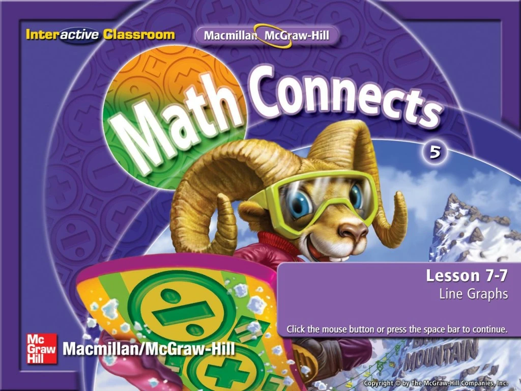
Five-Minute Check (over Lesson 7–6) Main Idea and Vocabulary Example 1: Make and Interpret a Line Graph Example 2: Make and Interpret a Double Line Graph Lesson Menu
I will make and interpret line graphs and double line graphs. • line graph • double line graph Main Idea/Vocabulary
Make and Interpret a Line Graph The table below shows the number of books sold at a bookstore over several months. Make a line graph of the data. Example 1
Make and Interpret a Line Graph Example 1
Make and Interpret a Line Graph The line graph shows the following information: • The number of books sold increased from January to April. • Since April, the number of books sold decreased. Example 1
A B C D A. B. C. D. The table shows the number of visitors to the museum over 6 weeks. Choose the correct line graph that represents this data. Example 1
Make and Interpret a Double Line Graph The table shows the changes in the number of hours of daylight in a day for two cities over several months one year. Make a double line graph of the data. Then use the graph to describe the changes from May 5 to October 5. Example 2
Make and Interpret a Double Line Graph Example 2
Make and Interpret a Double Line Graph • City A and City B have increases and decreases of daylight hours. • For each date, except October 5, there are fewer hours of daylight in City A than in City B. Example 2
A B C D Use the double line graph. Which city had more daylight hours on July 5? On Oct 5? • City B, City B • City B, City A • City A, City B • City A, City A Example 2
End of the Lesson End Lesson
Five-Minute Check (over Lesson 7–6) Image Bank Math Tool Chest Use an Appropriate Graph Resources
(over Lesson 7–6) The table shows the number of different fruits sold one day at Fran’s Fruit Stand. Make a bar graph of the data. Five Minute Check 1
A B C D A. B. C. D. (over Lesson 7–6) Five Minute Check 1b