Download
1 / 42
430 likes | 674 Vues
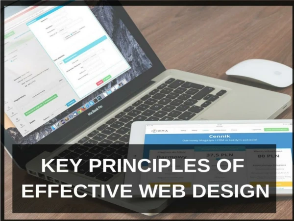
KEY principles of multimedia design. Sorin A. Matei Various classes. PRINCIPLE 1: FORM FOLLOWS FUNCTION (CONTENT), NOT THE OTHER WAY AROUND. Creating multimedia content: More than writing code or displaying pictures

E N D
KEY principles of multimedia design • Sorin A. Matei • Various classes
PRINCIPLE 1: FORM FOLLOWS FUNCTION (CONTENT), NOT THE OTHER WAY AROUND • Creating multimedia content: • More than writing code or displaying pictures • Your are trying to convey a specific type of information or to help the user accomplish a specific mission • IN THE EASIEST AND MOST INTUITIVE manner possible • The form of your content should facilitate this process, it cannot be a goal by itself • The cool factor is important but only if subordinated to your main mission
PRINCIPLE 2 DISCOVER AND DEFINE THE FUNCTION OF YOUR MULTIMEDIA PRODUCT • What do you want to accomplish with this content? • Possible types of content: • Informational • Entertainment • Task-oriented (perform a service, sell a product, etc) • For each type of content there should be a specific mission: • ON-LINE CONTENT • NEWSPAPER – to provide in a web environment “all the news that’s fit to print” • E-comerce/Corporate: to sell products and create identity • GAMES, MOVIES: To transport you to a make-belief world • There is no “pure” information, entertainment or task-oriented content – thus, multiple missions, but they are usually organized into a hierarchy • Define the content in a user-centric manner • Function and mission should be defined not in the abstract, but in view of satisfying an expected viewer/user • Who is going to be my typical user?
PRINCIPLE 3: LESS IS MORE Offer on the “front-page” gateways for each major type of user, organized around a common theme • For most real world and corporate content products missions are multiple and users diverse • DO NOT confound this with offering a smorgasbord of information • Organize the content around a single, clear information path with possible jump-off points • How do they stack up? • SONY.com, TOSHIBA.com, TIMEWARNER.com, DISNEY.com, NASA.gov, www.publius.org
PRINCIPLE 4: ORGANIZE CONTENT HIERARCHICALLY Draft pre-design lists of elements that your imagined typical user will need on the content platform • Organize the lists (information clumping) • Hierarchically • By class (type) • Alphabetically • Chronologically
PRINCIPLE 5: SUBVERT HIERARCHY Do not get bogged down in very intricate hierarchical/nested pages • Give access to as many elements on your content as possible • MOST IMPORTANT: Display or link most important information right from the beginning • HAVE THE USER IN YOUR MIND ALL THE TIME
PRINCIPLE 6: DEGRADE GRACEFULLY • You never have complete control over the way in which the viewer will see your content • Stuff gets “ported”, translated, repurposed • Construct content around a simple and sturdy basic structure, use simple protocols and widely accepted content formats. • Familiarity and usability of a format takes precedence over “cool” factors, unless the technology you are proposing is truly revolutionary
PRINCIPLE 7: A PICTURE IS WORTH A THOUSAND WORDS & A MOVING IMAGE EVEN MORE PROVIDED • The picture is good, appropriate for the context and does not get in the way • The movie is short, well edited and conveys a message • Images are complemented by text, music, sound, to make the experience complete
PRINCIPLE 8: USE CONVENTIONS AND STICK TO THEM Use conventional colors for different sections • Use icons and clip-art consistently • Be conservative: use pre-existing metaphors, do not invent new ones unless they are very, very, very compelling • For navigation: • Links and buttons that go to links should look like navigation devices • Label everything clearly and in plain English (abstain from cute nicknames) • Use icons with caution
PRINCIPLE 9: PLACE THE content IN SPACE AND TIME Include on interface, especially in informational contents: • When was the content created • What geographic or spatial area it is related to • Location and contact modalities for all people, organizations, etc. mentioned in the content that you think would benefit from being contacted
PRINCIPLE 10: USE SOUNDBITES AND KEYWORDS Stuff the text with the words you would like the people to remember and nothing more • Use words in the text people might use in a search on Google
PRINCIPLE 11 • NEVER MATCH COLORS ON YOUR content THAT YOU WOULD NOT MATCH IN YOUR CLOTHING • Avoid clashing colors / use complementary colors • Use a limited color palette for each interface • For interfaces with a lot of text that is meant to be read in more than a few seconds use black text on white background • Link the body of the text off the main screen • Use a colors to mark section and level in the section • Use red like animals do, as a sign of attractiveness or danger • Use black for stylish, high contrast contents, do not use for regular, text rich contents
The planning process • Some of the information you need for defining the content is obvious, some is not • Before starting on creating the content you have to spell out everything you need to know yourself about the subject the content refers to • This will help you formulate the mission of the content, its audience, its functionality and scope
1st Ungraded exercise Analyze the Sony.com website using the following question list: • Does form follow function? • Is the function of the website clearly presented? • Does it apply the “less is more” principle effectively • Does it organize content hierarchically? • Does it subvert hierarchy, when necessary? • Can the content be transported to simpler devices • Does it use pictures effectively? • Does it use easily recognizable conventions? • Does it place content in space and time? • Does it use effective wording? • Does the color scheme look good? Write up your answers in a paragraph format explaining how the site meets these requirements. The exercise is due next week, on January 20th. Although not graded, the exercise is mandatory. Failing to turn it in will result in a 50 point deduction from the class score.
Pre-design Interview • You need to ask your client (or yourself) a number of clear and direct questions that will determine: • Why do you want to create the content? • What should it do? • Who should it address? • What is to be done to accomplish that? • By whom and by what due date? • NOTE: Ask many probing questions, try to find out all that you need to find out from the client.
Strategic planning document • Distills the information found in the Pre-design interview, • This is your contract with the client, in which you specify what is to be done • Deals with two types of issues: • General • Specific • Mission statement (general, broad goals): • What does this type of content want to accomplish in the grand scheme of things? • Who is it going to address? • Objectives (specific, concrete aims) • What does the content want to accomplish concretely, in deliverable terms? • Implementation • What are the deliverables? • Actions • What is to be done to produce the deliverables? • Monitor and feedback • How are we going to make sure that the product achieves its goals
Content Map A simple diagram, depicting the pages (sections) and the relationships between them Mental Maps content map
Storyboard • Rough diagrams of each main page or master pages to be used on the content • Organized in a stack • Leaf through the pages as if you were navigating through the content
USABILITY PRINCIPLES • DON’T MAKE ME THINK • When you look at an interface everything should be self-evident • People should be able to navigate a webpage or GUI (graphic user interface) without being conscious of their decisions • The process should be “natural” • “Thinking” is the process of figuring out the meaning of various page elements • It’s a bad thing and you should stay away from it
Why “thinking” is bad If people start “thinking:” • They lose track of what they came to the page for OR • They get bored OR • Confused AND WILL MOVE ON • Remember: everything is to be understood in one glance • “On the web competition is just a click away”
How do people use multimedia content? • When confronted by an interface, people act on impulse • People are impatient: they are not willing to spend more time at an interface than they need to • How much time are they willing to spend? • Very little!
Interfaces and the art of scanning • People go to a webpage with a very specific goal (need) in mind and they expect to satisfy that need (goal) right away—instant gratification • They get easily frustrated if the page does not serve them that ONE thing they are looking for • This thing should be available at a glance, with minimum reading and reasoning
The navigation process • SCAN • SATISFICE • MUDDLE THROUGH
Fact of life 1: We don’t read computer screens. We scan them. Reasons: It’s a habit • We never read everything, that’s how we deal with most printed materials other than textbooks (or especially with those!) • Reading stuff off screens is hard We advance through visual hops anchored by “hot spots” (graphics) • People go to a webpage looking for something that resembles (no matter how remotely) what you are looking for and IS CLICKABLE Page 21, 2nd figure
Fact of life 2: People do not make optimal choices, they satisfice • People do not reason about “the best choice” • They choose the first reasonable option • Reasons: hurry, no penalty for being wrong, no benefit from being right, guessing is more fun
Fact of life 3: People don’t figure out how things work. They muddle through • People use a lot (and wrongheaded) guesswork • They forge ahead and learn how to use a device or content through trial and error
What is the web experience closest to? • Rank the following experiences according to their similarity to the web surfing experience: • Reading a newspaper • Glancing at a billboard by the side of the highway at 60 mph • Surfing through TV channels • Reading a book • Playing a game
All of them but mostly… • A billboard
COROLLARY: • Everything should be made available to us in a snap and should be brainless
Layout principles • MAKE A STRONG, ONE GLANCE IMPRESSION • Just like in a billboard, the viewer should understand with one look what is going on • FIRST THINGS FIRST • Rule of newspaper headlines: the more important something is, the more prominent • Use bold and distinctive fonts but do not break the unity of the content • ORGANIZE THINGS HIERARCHICALLY • Things related logically should be related visually • Things that are subordinated to other things should be nested visually in them • Good organization reduces the “thinking” process
Gaming/computing conventions • On the web web, just like in other computing experiences, we use conventions • These should be self-evident and in general use • They include: layout, buttons, search engines, forms, etc • They are part of user’s repository of learned behaviors • Chinese language test of convention use (page 35) – your page should still be usable, even if translated into Chinese, just by knowing what the content is about • E.g. try to use the Chinese interface of yahoo to check your email
What all well-behaved interfaces should look like • All webpages should include: • Clearly defined areas • Header (content ID and name), text, navigation areas (General and local), indicators of location (if necessary) • Hyperlinks that are obviously so • They should all be invitingly “clickable” • Search boxes that are simple and prominent (if necessary) • NOTE: KISS-keep it simple stupid
To make sure that everything is OK apply the TRUNK TEST • From Krug, page 87 • Imagine that you’ve been blindfolded and locked in the trunk of a car, then driven around and dumped on the stoop of a webpage deep in the bowels of the Internet. If the page is well designed you should be able to answer these questions without hesitation: • What kind of content is this? (content ID) • What page I am on? (Page name) • What are the major sections of this content? (Sections) • What are my options at this level? (Local navigation) • Where am I in the scheme of things? (“You are here” indicators) • How can I search?
Organizing your interface • Header • Conveys the main idea of the content; is an “ideogram” (like a Chinese character) • Establishes content identity (content ID) • Needs a title and a TAGLINE • the title of the content should be metaphorical and easy to remember • the tagline should be descriptive, it explains what the content is all about • The tagline can be complemented by a first, clear to understand paragraph on the page, but it should not replace it
Page essentials continued-Text Eliminate needless words • Text should be treated as if it were optional: the user should be able to use the content even if a mysterious virus erases all the text • Text is a bonus feature on the main pages, it adds (a little bit) of depth to the content • Text is, however, important on informational contents • Text should be easy to read and broken down into small paragraphs • All text should be broken down into columns, no column should be larger than 400 pixels • Use headers and subheaders generously but not frivolously • DO NOT insert hyperlinks in the text – except for blogging, where this has become a convention in and by itself • (it’s like someone is shooting a pistol next to your ear when you are reading the newspaper) • Do not make headers into links UNLESS the header is followed by very little text • Create small links on the side • Blend text with pictures (break down monotony) • Long bodies of texts (articles, etc.) should be available in a print-ready format (preferably pdf)—make sure text width fits on printed page
First important principle of writing text for multimedia • Write your copy BEFORE starting to design the page • Content should drive form • Write in short bursts, soundbite-like • Everything (or most everything) should be memorable
Second important principle of writing text for multimedia • Stuff your page with keywords and phrases likely to appear in search engine searches • Search engines parse your content for keywords, which will be matched with your content when queries are sent to the search engine
Third important principle of writing text for multimedia • Happy talk must die • Space on the screen is precious because a user’s attention is short • Do not waste space with needless happy talk • Get to the point and stick with it • Don’t carry an idea for more than a few sentences • Instructions must die • If you feel like you need to explain your users what they should do with the navigation or graphic elements on the interface, this is a sign that your design sucks • Instructions should be limited to a few words (see page 48) • Technical instructions (downloading, etc) are, however, useful
Navigation bars and tools as maps • Embed “where pages are” in their design • Navigation bars are essential for orienting the visitor in space • When well designed, they tell you where you are • To serve as navigation aides bars should: • Look like navigation devices (follow conventions) • Should be located where they are expected to be located (across the top or on the left side of the page) • Be immediately intuitive – buttons or obvious links • Should run throughout the content—except for entry page and forms • They should highlight where the user is right now • An alternative version is that of breadcrumbs (display the path to the page e.g. Yahoo directory)—Always put them at the top
Navigation bars • They should be comprehensive and not include too many hierarchical levels (1 or max 2) • Combine a main navigation bar with a secondary, section specific, navigation bar that appears only in pages specific to a section • Use simple image maps and tabs, most resilient and easy to recognize • They should always have a “home” button (better, yet, link the header to the homepage throughout the content)
Navigation • Let’s analyze some contents: • Krug example: Productopia page 126 • Read the text, look at the screenshots and summarize the conclusion of the analysis in a few bullet points
Productopia today • Go to the productopia content today • What do you notice? • What happened to the content?