Download
1 / 30
310 likes | 545 Vues
Chapter 2 Presenting Data in Charts and Tables. Why use charts and graphs? Visually present information that can’t easily be read from a data table. Many details can be shown in a small area.

E N D
Chapter 2Presenting Data in Charts and Tables Why use charts and graphs? • Visually present information that can’t easily be read from a data table. • Many details can be shown in a small area. • Readers can see immediately major similarities and differences without having to compare and interpret figures.
Computer software can be used to create charts and graphs: • SPSS • MINITAB • Ms. Excel • Ms. Visio • Others
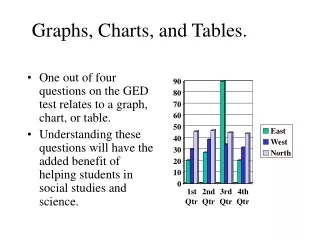
Bar chart • Bar chart and pie chart are often used for quantitative data(categorical data) • Height of bar chart shows the frequency for each category • Bar graphs compare the values of different items in specific categories or t discrete point in time.
Pie chart • The size of pie slice shows the percentage for each category • It is suitable for illustrating percentage distributions of qualitative data • It displays the contribution of each value to a total • It should not contain too many sectors-maximum 5 or 6
The ordered array The sequence of data in rank order: • Shows range (min to max) • Provides some signals about variability within the range • Outliers can be identified • It is useful for small data set Example: • Data in raw form: 23 12 32 567 45 34 32 12 • Data in ordered array:12 12 23 32 32 34 45 567 (min to max)
Tabulating Numerical Data: Frequency Distribution • A frequency distribution is a list or a table…. • It contains class groups and • The corresponding frequencies with which data fall within each group or category Why use a Frequency Distribution? • To summarize numerical data • To condense the raw data into a more useful form • To visualize interpretation of data quickly
Organizing data set into a table of frequency distribution: • Determine the number of classes The number of classes can be determined by using the formula: 2k>n -k is the number of classes -n is the number of data points Example: Prices of laptops sold last month at PSC: 299, 336, 450, 480, 520, 570, 650, 680, 720 765, 800, 850, 900, 920, 990, 1050, 1300, 1500
In this example, the number of data points is n=18. If we try k=4 which means we would use 4 classes, then 24=16 that is less than 18. So the recommended number of classes is 5. • Determine the class interval or width -The class interval should be the same for all classes -Class boundaries never overlap
-The class interval can be expressed in a formula: Where i is the class interval, H is the highest value in the data set, L is the lowest value in the data set, and k is the number of classes. In the example above, H is 1500 and L is 299. So the class interval can be at least =240.2. The class interval used in this data set is 250 • Determine class boundaries: 260 510 760 1010 1260 1510 • Tally the laptop selling prices into the classes: Classes: 260 up to 510 510 up to 760 760 up to 1010 1010 up to 1260 1260 up to 1510
Compute class midpoints: 385 635 885 1135 1385 (midpoint=(Lower bound+ Upper bound)/2) • Count the number of items in each class. The number of items observed in each class is called the class frequency: Laptop selling Frequency Cumulative Freq. price9($) 260 up to 510 4 4 510 up to 760 5 9 760 up to 1010 6 15 1010 up to 1260 1 16 1260 up to 1510 2 18
Step-and-leaf • A statistical technique to present a set of data. • Each numerical value is divided in two parts—stem(leading digits), and leaf(trailing digit) • The steps are located along the y-axis, and the leaf along the x-axis.
Stem Leaf 29 9 33 6 45 0 48 0 52 0 57 0 65 0 68 0 72 0 76 0 80 0 85 0 90 0 92 0 99 0 105 0 130 0 150 0
Histogram • A graph of the data in a frequency distribution • It uses adjoining columns to represent the number of observations(frequency) for each class interval in the distribution • The area of each column is proportional to the number of observations in that interval
Polygon • A frequency polygon, like a histogram, is the graph of a frequency distribution • In a frequency polygon, we mark the number observations within an interval with a single point placed at the midpoint of the interval, and then connect each set of points with a straight line.
Ogive—a graph of cumulative frequency Ogive example:
Exercises • The price-earnings ratios for 24 stocks in the retail store are: 8.2 9.7 9.4 8.7 11.3 12.8 9.2 11.8 10.8 10.3 9.5 12.6 8.8 8.6 10.6 12.8 11.6 9.1 10.4 12.1 11.5 9.9 11.1 12.5 • Organize this data set into step-and-leaf display • How many values are less than 10.0? • What are the smallest and largest values
Exercises 2. The following stem-and-leaf chart shows the number of units produced per day in a factory. • 8 1 4 1 • 6 2 • 01333559 9 • 0236778 16 • 59 18 • 00156 23 10 36 25
How many days were studied? • How many values are in the first class? • What are the smallest and the largest values? • How many values are less than 70? • How many values are between 50 and 70?
3. The following frequency distribution represents the number of days during a year that employees at GDNT were absent from work due to illness. Number of Number of Days absent Employees 0 up to 4 5 4 up to 8 10 8 up to 12 6 12 up to 16 8 16 up to 20 2
What is the midpoint of the first class? • Construct a histogram • Construct a frequency polygon • Interpret the rate of employee absenteeism using the two charts