Download
1 / 35
360 likes | 487 Vues
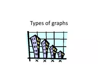
Types of Graphs. FREQUENCY CHART. A table that lists each data item with its frequency. Frequency. LINE PLOT. Used to display data by placing an “x” for each response along a number line . BAR GRAPH. A graph used when comparing amounts. (parts to parts). LINE GRAPH.

E N D
FREQUENCY CHART A table that lists each data item with its frequency.
LINE PLOT Used to display data by placing an “x” for each response along a number line.
BAR GRAPH A graph used when comparing amounts. (parts to parts)
LINE GRAPH A graph used to show changes over time.
HISTOGRAM A type of bar graph that displays the data in intervals.
WeeklyTV Viewing 60 40 Number of People 20 0-2 3-5 6-8 Hours
HISTOGRAM Calories of Soup-in-a-Cup
LINE PLOT The following grades were made on the last test. Display them in a line plot. 7 26 13 85 54 98 9
CIRCLE GRAPH A graph used to show parts of a whole.
SCATTERPLOT A graph used to show that there is a relationship between two different sets of information.
Arm Span verses Height • Measure your height in inches • Measure the distance of your arm span. • Record the data in your graphing calculator in List 1 for arm span, List 2 for height.
Box and Whisker • Shows the distribution of data along a number line • Related to medians, which divide data into two equal parts • Good to make comparisons between items
Box and Whisker Plots 1 2 3 4 5 6 7 8 9 10 11 12 13 14 15 16 17 18 19 20 21 22 23 24 25 26 27 28 29 30 31
Measures of Variation • Are used to describe distribution of data.
Quartiles • Values that divide a set of data into four equal parts. • **Remember that the Median separates a set of data in two equal parts
Lower & Upper Quartiles • The median of the lower half of a set of data is the lower quartile or LG • The median of the upper half of a set of data is the upper quartile or UQ.
Interquartile Range • This is the range of the middle half of the data. It is the difference between the upper quartile and the lower quartile.
Outliers: data that is more than 1.5 times the value of the interquartile range beyond the quartiles
Box and Whisker Plots Interquartile Range Lower Quartile Upper Quartile 1 2 3 4 5 6 7 8 9 10 11 12 13 14 15 16 17 18 19 20 21 22 23 24 25 26 27 28 29 30 31
Four Color Activity for Box and Whisker Plots • Sort the four color cards into groups where you have a match of statistics, data, graph, conclusion. • Record your groups on the recording sheet.
Stem and Leaf Plot • Shows data items in order
What type of graph would be best for the following types of data?
According to the U.S. Department of the Interior, 997 species of the world’s animals are endangered.
Find the median of the finishing times (in seconds) for the 100-meter dash at a recent track meet.