Download
1 / 81
810 likes | 1.14k Vues
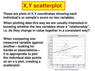
X,Y scatterplot. These are plots of X,Y coordinates showing each individual's or sample's score on two variables. When plotting data this way we are usually interested in knowing whether the two variables show a "relationship", i.e. do they change in value together in a consistent way?.

E N D
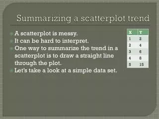
X,Y scatterplot These are plots of X,Y coordinates showing each individual's or sample's score on two variables. When plotting data this way we are usually interested in knowing whether the two variables show a "relationship", i.e. do they change in value together in a consistent way? When comparing one measured variable against another—looking for trends or associations— it is appropriate to plot the individual data points on an x-y plot, creating a scatterplot.
A scatter plot is a type of graph that shows how two sets of data might be connected. When you plot a series of points on a graph, you’ll have a visual idea of whether your data might have a linear, exponential or some other kind of connection. Creating scatter plots by hand can be cumbersome, especially if you have a large number of plot points. Microsoft Excel has a built in graphing utility that can instantly create a scatter plot from your data. This enables you to look at your data and perform further tests without having to re-enter your data. For example, if your scatter plot looks like it might be a linear relationship, you can perform linear regression in one or two clicks of your mouse.
If the relationship is thought to be linear, a linear regression line can be calculated and plotted to help filter out the pattern that is not always apparent in a sea of dots (Figure 3).
In this example, the value of r (square root of R2) can be used to help determine if there is a statistical correlation between the x and y variables to infer the possibility of causal mechanisms. Such correlations point to further questions where variables are manipulated to test hypotheses about how the variables are correlated.
Students can also use scatterplots to plot a manipulated independent x-variable against the dependent y-variable. Students should become familiar with the shapes they’ll find in such scatterplots and the biological implications of these shapes.
A concave upward curve is associated with exponentially increasing functions (for example, in the early stages of bacterial growth).
In ecology, a species-area curve is a relationship between the area of a habitat, or of part of a habitat, and the number of species found within that area.
A sine wave–like curve is associated with a biological rhythm.
A sine wave–like curve is associated with a biological rhythm. Figure 1: Predator-Prey Curve
Elements of effective graphing Students will usually use computer software to create their graphs. In so doing, they should keep in mind the following elements of effective graphing: • A graph must have a title that informs the reader about the experiment and tells the reader exactly what is being measured. • The reader should be able to easily identify each line or bar on the graph.
Big or little? For course-related papers, a good rule of thumb is to size your figures to fill about one-half of a page. Readers should not have to reach for a magnifying glass to make out the details. Compound figures may require a full page
• Axes must be clearly labeled with units as follows: ––The x-axis shows the independent variable. Time is an example of an independent variable. Other possibilities for an independent variable might be light intensity or the concentration of a hormone or nutrient. ––The y-axis denotes the dependent variable— the variable that is being affected by the condition (independent variable) shown on the x-axis.
Intervals must be uniform. For example, if one square on the x-axis equals five minutes, each interval must be the same and not change to 10 minutes or one minute. The intervals do not have to be the same on each axis… they represent different quantities. If there is a break in the graph, such as a time course over which little happens for an extended period, it should be noted with a break in the axis and a corresponding break in the data line.
Tick marks - Use common sense when deciding on major (numbered) versus minor ticks. Major ticks should be used to reasonably break up the range of values plotted into integer values. Within the major intervals, it is usually necessary to add minor interval ticks that further subdivide the scale into logical units (i.e., a interval that is a factor of the major tick interval). For example, when using major tick intervals of 10, minor tick intervals of 1,2, or 5 might be used, but not 4. –– It is not necessary to label each interval. Labels can identify every five or 10 intervals, or whatever is appropriate. ––The labels on the x-axis and y-axis should allow the reader to easily see the information.
Parts of a Graph: This is an example of a typical line graph with the various component parts labeled in red.
More than one condition of an experiment may be shown on a graph by the use of different lines. For example, the appearance of a product in an enzyme reaction at different temperatures can be compared on the same graph. In this case, each line must be clearly differentiated from the others—by a label, a different style, or colors indicated by a key. These techniques provide an easy way to compare the results of experiments.
Figure 3: Release of reducing sugars from alfalfa straw by crude extracellular enzymes from thermophilic and nonthermophilic fungi.
• The graph should clarify whether the data start at the origin (0,0) or not. The line should not be extended to the origin if the data do not start there. In addition, the line should not be extended beyond the last data point (extrapolation) unless a dashed line(or some other demarcation) clearly indicates that this is a prediction about what may happen.
Scatterplot A scatterplot is a useful summary of a set of bivariate data (two variables), usually drawn before working out a linear correlation coefficient or fitting a regression line. It gives a good visual picture of the relationship between the two variables, and aids the interpretation of the correlation coefficient or regression model.
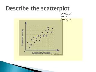
Each unit contributes one point to the scatterplot, on which points are plotted but not joined. The resulting pattern indicates the type and strength of the relationship between the two variables. The following plots demonstrate the appearance of positively associated, negatively associated, and non-associated variables: Positive correlation Negative correlation No correlation
A scatterplot can be a helpful tool in determining the strength of the relationship between two variables. If there appears to be no association between the proposed explanatory and dependent variables (i.e., the scatterplot does not indicate any increasing or decreasing trends), then fitting a linear regression model to the data probably will not provide a useful model. Positive correlation Negative correlation No correlation
Correlation Statistics – allow one to determine/describe the relationship between variables. a. Linear Regression – Line of best fit used to express the relationship between two variables and predict potential outcomes based on a given value for a variable. The line of best fit follows the familiar equation of y = mx + b, where b is the y intercept and m is the slope of the line. ii. A steep slope indicates a strong effect. iii. A shallow slope indicates a weak effect. iv. A negative slope indicates a negative effect. That is an increase in X results in a decrease in Y. v. The line of best fit can be used to predict a value of one variable given a value for the other variable.
Linear Regression Linear regression attempts to model the relationship between two variables by fitting a linear equation to observed data. One variable is considered to be an independent (explanatory) variable, and the other is considered to be a dependent variable. For example, a modeler might want to relate the weights of individuals to their heights using a linear regression model. R2 is a statistic that will give some information about the goodness of fit of a model. In regression, the R2 coefficient of determination is a statistical measure of how well the regression line approximates the real data points. An R2 of 1 indicates that the regression line perfectly fits the data.
A valuable numerical measure of association between two variables is the correlation coefficient, which is a value between -1 and 1 indicating the strength of the association of the observed data for the two variables.
Correlation positive
A positive correlation indicates a positive association between the variables (increasing values in one variable correspond to increasing values in the other variable), while a negative correlation indicates a negative association between the variables (increasing values is one variable correspond to decreasing values in the other variable). A correlation value close to 0 indicates no association between the variables.
Correlation in Linear Regression The square of the correlation coefficient, R², is a useful value in linear regression. This value represents the fraction of the variation in one variable that may be explained by the other variable. Thus, if a correlation of 0.8 is observed between two variables (say, height and weight, for example), then a linear regression model attempting to explain either variable in terms of the other variable will account for 64% of the variability in the data. The correlation coefficient also relates directly to the regression line Y = a + bX for any two variables. Because the least-squares regression line will always pass through the means of x and y, the regression line may be entirely described by the means, standard deviations, and correlation of the two variables under investigation.
A linear regression line has an equation of the form: x is the independent variable y is the dependent variable m is slope of the line is b b is the intercept (the value of y when x = 0)
Least-Squares Regression The most common method for fitting a regression line is the method of least-squares. This method calculates the best-fitting line for the observed data by minimizing the sum of the squares of the vertical deviations from each data point to the line (if a point lies on the fitted line exactly, then its vertical deviation is 0). Because the deviations are first squared, then summed, there are no cancellations between positive and negative values.
Given a scatter plot, we can draw the line that best fits the data
There are two tests for correlation: the Pearson correlation coefficient ( r ), and Spearman's rank-order correlation coefficient (rs ). These both vary from +1 (perfect correlation) through 0 (no correlation) to –1 (perfect negative correlation). If your data are continuous and normally-distributed use Pearson, otherwise use Spearman.
What is the Pearson Correlation Coefficient? Correlation between variables is a measure of how well the variables are related. The most common measure of correlation in statistics is the Pearson Correlation (technically called the Pearson Product Moment Correlation or PPMC), which shows the linear relationship between two variables. Two letters are used to represent the Pearson correlation: Greek letter rho (ρ) for a population and the letter “r” for a sample. R2 is a statistic that will give some information about the goodness of fit of a model. In regression, the R2 coefficient of determination is a statistical measure of how well the regression line approximates the real data points. An R2 of 1 indicates that the regression line perfectly fits the data.
Correlation between variables is a measure of how well the variables are related. The most common measure of correlation in statistics is the Pearson Correlation (technically called the Pearson Product Moment Correlation or PPMC), which shows the linear relationship between two variables. Two letters are used to represent the Pearson correlation: Greek letter rho (ρ) for a population and the letter “r” for a sample.
In linear least squares regression with an estimated intercept term, R2 equals the square of the Pearson correlation coefficient between the observed and modeled (predicted) data values of the dependent variable.
What are the Possible Values for the Pearson Correlation? Results are between -1 and 1. A result of -1 means that there is a perfect negative correlation between the two values at all, while a result of 1 means that there is a perfect positive correlation between the two variables. A result of 0 means that there is no linear relationship between the two variables.
What are the Possible Values for the Pearson Correlation? You will very rarely get a correlation of 0, -1 or 1. You’ll get somewhere in between. The closer the value of r gets to zero, the greater the variation the data points are around the line of best fit. High correlation: 0.5 to 1.0 or -0.5 to 1.0 Medium correlation: 0.3 to 0.5 or -0.3 to 0.5 Low correlation: 0.1 to 0.3 or -0.1 to -0.3
Pearson Product Moment (PPM) Correlation – unit-less value ranging from –1.0 to +1.0 that describes the goodness of fit of the relationship between two variables. i. An |r| value of 1.00 represents a perfect correlation. ii. An |r| value above 0.85 represents a very high correlation. iii. An |r| value of 0.70 – 0.84 represents a high correlation. iv. An |r| value of 0.55 – 0.69 represents a moderate correlation. v. An |r| value of 0.40 – 0.54 represents a low correlation. vi. An |r| value of 0.00 – 0.39 represents no correlation.
In statistics, the Pearson product-moment correlation coefficient (sometimes referred to as the PPMCC or PCC, or Pearson's r) is a measure of the linear correlation (dependence) between two variables X and Y, giving a value between +1and−1 inclusive. It is widely used in the sciences as a measure of the strength of linear dependence between two variables. It was developed by Karl Pearson from a related idea introduced by Francis Galton in the 1880s.
What Do I Have to Consider When Using the Pearson product-moment correlation? The PPMC does not differentiate between dependent and independent variables. For example, if you are investigating the correlation between a high caloric diet and diabetes, you might find a high correlation of 0.8. However, you could also run a PPMC with the variables switched around (diabetes causes a high caloric diet), which would make no sense. Therefore, as a researcher you have to be mindful of the variables you are plugging in. In addition, the PPMC will not give you any information about the slope of the line — it only tells you whether there is a high correlation.
Real Life Example Pearson correlation is used in thousands of real life situations. For example, scientists in China wanted to know if there was a correlation between spatial distribution and genetic differentiation in weedy rice populations in a study to determine the evolutionary potential of weedy rice.
Real Life Example The graph below shows the observed heterozygosity of weedy rice plotted against the multilocus outcrossing rate. Pearson’s correlation between the two groups was analyzed, showing a significant positive correlation of between 0.783 and 0.895 for weedy rice populations.
Analysis of 4999 Online Physician Ratings Indicates That Most Patients Give Physicians a Favorable Rating Kadry B, Chu LF, Kadry B, Gammas D, Macario A - J. Med. Internet Res. (2011) Figure 2: Pearson correlation comparing overall rating versus staff rating (n = 4999, Pearson correlation, r = .715, P < .001).
Impulsivity, gender, and the platelet serotonin transporter in healthy subjects f1-ndt-6-009: A) Positive correlation between the Bmax and the cognitive complexity factor in men (Pearson correlation = 0.378, P = 0.006). B) Negative correlation between the Kd and the motor impulsivity factor in men (Pearson correlation = −0.673, P = 0.023).
Comparison Between Dynamic Contour Tonometry and Goldmann Applanation Tonometry new method to measure IOP Figure 1: Pearson correlation analysis of intraocular pressure (IOP) measurements obtained by Goldmann tonometry and dynamic contour tonometry (n=451, R=0.853, p<0.001).
Which of these has the highest Pearson coefficient? R=0.987 R=0.999 Fig4: Correlation analysis of the EndoPredict test results in the seven different pathology laboratories. a–g Results of the individual laboratories. h Pearson correlation coefficients
Making an XY plot with a regression line and error bars with EXCEL
How to Create a Linear Regression Equation with Microsoft Excel A scatter plot will show you where your points lie will give you a visual clue about whether your data is linear, exponential or some either type of relationship. Therefore, if you aren’t sure your data is linear in nature, create a scatter plot.
Finding a linear regression equation via a scatter plot and a trendline.