Download
1 / 30
300 likes | 502 Vues
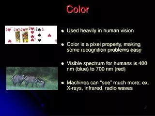
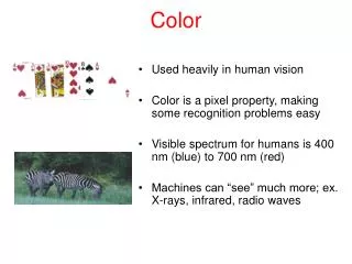
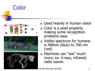
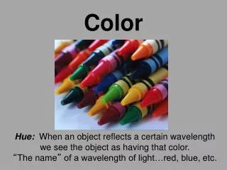
Color. Modified by Georgia Agricultural Education Curriculum Office September 2005. Why study color?. It is the most important element of a design It is one of the few visual design elements that people notice. Properties of Color. Hue: property that gives a color a name (ex: red)

E N D
Color Modified by Georgia Agricultural Education Curriculum Office September 2005
Why study color? • It is the most important element of a design • It is one of the few visual design elements that people notice
Properties of Color • Hue: property that gives a color a name (ex: red) • Value: measurement of the amount of light reflected from an object • Intensity: brightness or concentration of a color
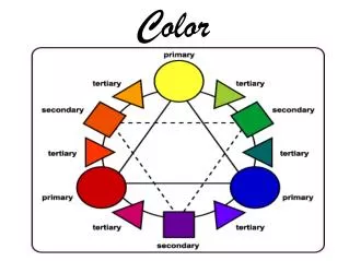
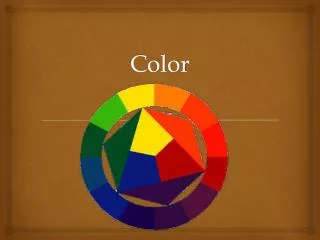
The Color Wheel • Contains three categories of colors • Primary Colors: red, yellow, and blue; all other colors can be mixed from the primary colors • Secondary Colors: orange, green, violet; mixture of equal amounts of two primary colors • Tertiary (Intermediate) colors: made by mixing a primary color with the adjacent secondary color (ex: red-orange). When naming, the primary color is always named first.
Red Orange Purple Yellow Blue Green
Changing the Value of a Color • Value can be changed by adding black or white to a color • Adding black produces a shade • Adding white produces a tint
Changing the Intensity of a Color • Colors can be dulled or neutralized to produce a tone • Adding gray to a color will create a tone • Mixing a color with its complement will also create a tone • Placing complementary colors next to each other will increase intensity
Psychological Effects of Color • Warm Colors: red, orange, yellow • associated with sun, heat, and fire • evoke warm and happy feelings • warm colors will dominate when in an arrangement • Cool Colors: blue, green, violet • associated with grass, water, ice • create restful, soothing feelings • fade into background of a design
White • Blends easily with other colors • Adds brightness and contrast • Portrays elegance and sophistication
Red • Embodies strength and dominance • Can often become overpowering if used too much
Pink • Combines well with other colors • Light pink portrays romance and femininity • Bright and deep colored pinks draw more attention than pastel tints
Orange • Radiant color • Often used for autumn and Halloween designs • Tints or shades of orange (such as peach or rust) blend well with other colors
Yellow • Vibrant and highly visible color • Cheery and sunny • Combines well in a design but if used alone can become monotonous
Green • Serves as a natural background color • Green containers don’t attract attention and are very common • Natural color for foliage plants in a design
Blue • Peaceful, quiet, and cool • Recedes into the background of a design • Large quantities of dark blue can be depressing
Purple (Violet) • Color of royalty • Can be seen as either a warm or cool color depending on the accompanying colors • when mixed with reds, the blueness of purple is evident and it becomes cool • when mixed with blues, the redness of purple is evident and it becomes warm
Balance • Dark colors are heavier than light colors • Putting darker colors at the base of a design will add balance
Depth • Using a combination of warm and cool colors will maximize depth • This combination causes warm colors to advance forward and cool colors to recede into the background
Focal Point • Bright colors immediately attract attention • Focal points can be created by simply using contrasting colors
Rhythm • Using similar colors throughout a bouquet or design creates rhythm • If the same or corresponding colors are used as a focal point and again throughout an arrangement, eye movement is increased
Harmony & Unity • Achieved by the repetition of colors throughout a design • Using similar colors pulls the design together
Monochromatic • Uses variations of a single hue • To avoid boredom, make sure to include various tints, tones, and shades of the hue
Analogous • Color scheme incorporating three or more colors that are next to each other on the color wheel • Can include the hue as well as tints and tones of the hue
Complementary • Two hues that are directly opposite of each other on the color wheel • Complementary colors intensify each other
Split-Complementary • Composed of a hue and the two colors adjacent to its complement • Ex: yellow paired with blue-violet and red-violet
Triadic • Use of three colors equidistant on the color wheel • Can often be difficult to use in a design • Ex: red, blue, and yellow
Double-Complement • Uses a total of four colors (two pairs of complements) • This scheme can offer a variety of visual effects
Alternate Complement • Use of a triad plus the complement of one of the colors in the triad • Ex: yellow, red, blue, and violet
Tetrad • 4 colors equidistant on the color wheel • Ex: yellow, violet, blue-green, and red-orange
What influences color selection? • Seasons or holidays • Special Occasions (ex: weddings) • Symbolism • Favorite Colors • Existing Colors