Download
1 / 69
720 likes | 956 Vues
Human-Computer Interaction (HCI). Mario Č agalj University of Split 2013/2014. Basic Visual Design Principles. Assembled from: Robin Williams “Non-Designers Design Book” Colin Stewart: “ Visual Design The good kind of VD ”, 2009. Visual d esign.

E N D
Human-Computer Interaction (HCI) MarioČagalj University of Split 2013/2014.
Basic Visual Design Principles Assembled from: Robin Williams “Non-Designers Design Book”Colin Stewart: “Visual DesignThe good kind of VD”, 2009.
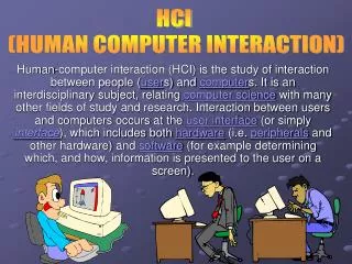
Visual design • Visual design = organizing the appearance of something • Applies to anything visual: • web page design • displaying information (charts, graphs, reports) • maps, brochures, birthday cards • code formatting • smartphone application • etc.
Visual design principles • We already know that excellent visual design and design in general requires some artistic ability, but a reasonably good design can be achieved by following some basic principles • For visual design, we have the following 4 principles: • Contrast • Repetition • Alignment • Proximilty • You can remember these by the acronym CRAP
CRAP Contrast • make different things different • brings out dominant elements • mutes lesser elements Repetition • repeat design throughout the interface • consistency • creates unity Alignment • visually connects elements • creates a visual flow Proximity • groups related elements • separates unrelated ones
Proximity • Design principle #1: proximity • things that are related should be grouped close together • things that are not related should be separated • When several items are in close proximity to eachother, they become one visual unit rather than severalseparate units • This helps organize information, reducesclutter, and gives the content consumer a clear structure confusing or disorderly state or collection
Proximity • An example of bad proximity • Which heading applies to the items in gray – "Services" or "Resource Centre"? • not clear from the spacing
Proximity • The same web with better proximity • Immediately clear which items the menu headings apply to • Physical closeness implies a relationship
Proximity • bad proximity: the subheading and the article have a huge space between them • they don't look like they're related
Proximity • the same web page, with better proximity
Proximity • a page with good proximity:
Proximity • the areas in red borders contain related content • they are separated from other areas • also, it is clear what each heading applies to
Proximity • another example of good proximity
Proximity – whitespace • a related concept to proximity is that of whitespace • whitespace refers to any empty space between visual elements • it is not necessarily white, but it will be if the background colour is white
Proximity – whitespace • an example of bad whitespace (not enough): • in the menu on the left, there is almost no space between the menu items
Proximity – whitespace • the same page, with better whitespace:
Proximity– too many separate items • How many times doesyour eye stop to look at something? • Where do you begin reading? • In the middle, probably,because that phrase is boldest • What do you read next—left to right? • What happens when you get to the bottom-right corner,where does your eye go? • Do you wander around making sure you didn’t miss any corners?
Proximity– too many separate items • Now that there are two bold phrases, where doyou begin? • Do you start in the upper left? Do you start in the center? • After you read those two items, where do you go? • Pehaps you bounce back and forth between the words in bold • Do you know when you’re finished?
Proximity– too many separate items • By groupingsimilar elements into one unit, several things instantlyhappen: • The page becomes more organized • You understand where tobegin reading the message, and you know when you are finished • Andthe “white space” (the space around the letters) automatically becomesmore organized
Summary of proximity • When several items are in close proximity to each other, they become onevisual unit rather than several separate units • Items relating to each othershould be grouped together • The basic purpose of proximity is to organize content • More likely to be read • How to get it • Count the number of visual elements (units) on the page by counting the number of times you eye stops • If more than some reasonable number, see which elements can be grouped toghether into closer proximity to become one visual unit
Alignment • Design principle #2: alignment • nothing should be placed onthe page arbitrarily • every item should have a visual connection withsome thing else on the page • Straight lines give a more organized appearance • Aligned items result is a stronger cohesive unit • even when aligned elements are physically separated from each other,there is an invisible line that connects them, both in your eye and in your mind
Alignment • an example of bad alignment:
Alignment • the same web page, with better alignment:
Alignment • more bad alignment:
Alignment • the same web page, with better alignment:
Alignment • a web page with good alignment:
Alignment • as a general rule, left and right alignment work best – particularly for paragraphs of text • center alignment is terrible for paragraphs, but can work for things other than text • some examples of good center alignment:
Alignment – the bussiness card example • centraly aligned text – the edges are soft • right aligned text – creates hard edge on the right • the hard edge gives strength to this layout The invisible line connects the separate pieces of text
Alignment – find a strong line and stick to it • There is a strong line along the left edge of the text and the left edge of the image • Which one do you use? Why? • Between the text and the image, there is “trapped” white space, and the white space is an awkward shape
Alignment – find a strong line and stick to it • Now the strong line on the right side of the text and the strong line on the left side of the image are next to each other, making each other stronger
Summary of alignment • Nothing should be placed on the page arbitrarily • Every element should havesome visual connection with another element on the page • Unity • To make all the elements on the page appear to be unified, connected, and interrelated, there needs to be some visual tie between them • Even if the separate elements are not physically close, the can appear connected, related with the other information • How to get it • Always find something elese on the page to aligne with, even if the objects are far away from each other
Repetition • Design principle #3: repetition • visual elements that have the same purpose or level of importance should look the same • Repeat some aspect of the design throughout the entire piece • If there are too many different-looking things on a web page, it will not look like everything belongs on the same page - it will not look cohesive • The repetitive element may be font, a thick line, color, design element, ... anything that a reader will visually recognize
Repetition • an example of bad repetition:
Repetition • there are two examples of bad repetition on the previous slide: • the menu items on the left all have a light yellow background – except for the items under the "Service", which have a gray background • all these items are in the same menu – they should all have the same appearance
Repetition • the same page, with better repetition:
Repetition • another example of bad repetition:
Repetition • the same page, with better repetition:
Repetition • an example of good repetition:
Repetition • everything with the same purpose/importance looks the same – fonts, colours, icons
Repetition • another example of good repetition: • note the weather icons – even though all four icons are different, they are made up of identical parts (clouds, rain drops, lightning)
Repetition – slides bla bla asdf bla blaasdf asdfas bla balalskfa fačsdkf a asldjfa sldkfjasd fs the menu items on the left asdfkja aslkd asd lasd flkas dfalksd sdfaj alsdkjf alsdkfj a slkas Repetition helps organize the information: it helps guide the reader through the pages; it helps unify the design. • bla bla asdf • bla blaasdf asdfas • bla balalskfa fačsdkf a • asldjfa sldkfjasd fs • the menu items on the left • asdfkja aslkd asd • lasd flkas dfalksd • sdfaj alsdkjf • alsdkfj a slkas
Repetition – the bussiness card example • When you get to the end of the information, does your eye wander off the card? • How about now? • Do you find it bounces back and forth between the bold elements? • That is the point of repetition – it ties a card toghether, it provides unity
Summary of repetition • Repetition of visual elements throughout the design unifies and strengthens a piece • Repetition ties together otherwise separate parts • The purpose of repetition is to unify and to add visual interest • How to get it • Think of repetition as being consistent (recall consistency design principle)